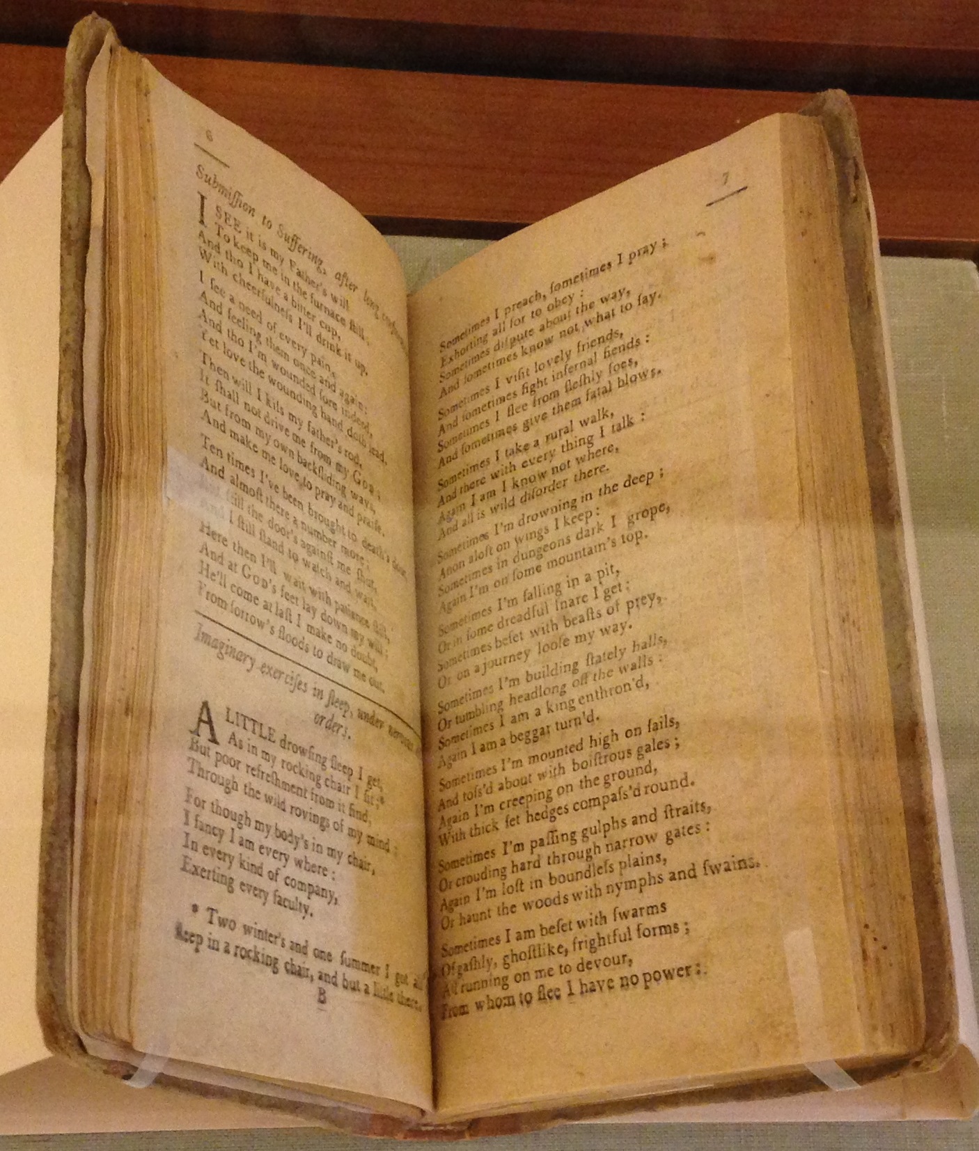
U.Va.’s Final Exercises have concluded, and Grounds is quiet this week. Shortly the summer session will begin (as well as the inevitable summer construction projects), and both temperature and humidity will, no doubt, rise. Under Grounds it is busyness as usual as we catch up with what so far has been a banner spring for acquisitions. Following is a random selection of some early printed books newly added to our shelves.
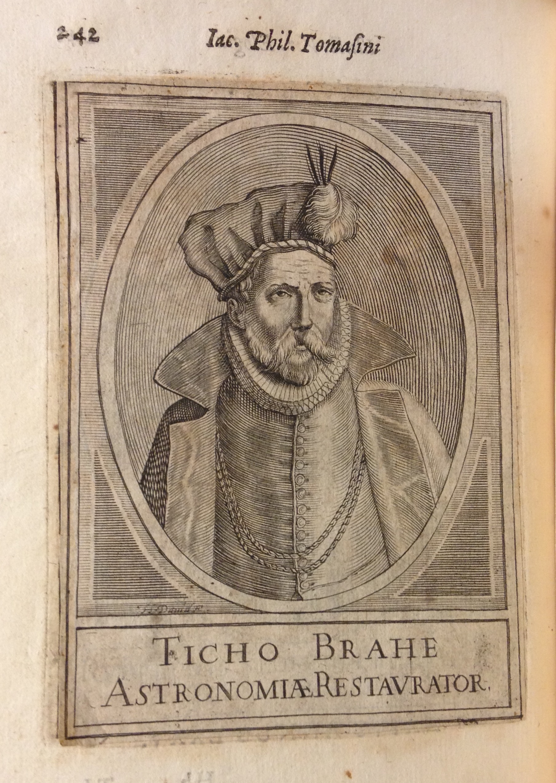
A stellar eclipse! This engraved portrait of astronomer Tycho Brahe is actually a cancel slip pasted over another engraved portrait inadvertently printed on the wrong leaf. Note how the lower left corner is lifting upward, and the engraved border of the underlying portrait is visible at left. Giacomo Filippo Tomasini, Illustrium virorum elogia iconibus exornata (Padua, 1630), p. 242. (CT1122 .T6 1630)
Giacomo Filippo Tomasini’s Illustrium virorum elogia iconibus exornata (Padua, 1630) is a collection of biographies of noted scientists, astronomers, doctors, jurists, and theologians, most of whom lived in Padua and taught at its famous university. Of special note are the bibliographies of each subject’s writings, and the fine full-page engraved portraits by the French artist Jérôme David. Indeed, it was the engraved portrait of Danish astronomer Tycho Brahe that caught our eye in a bookseller’s booth at the New York International Antiquarian Book Fair last month. Unbeknownst to the dealer, this portrait is actually a cancel pasted over a different engraved portrait inadvertently printed in the wrong place! During the hand-press period, serious printing errors were typically corrected by “cancelling” an entire leaf and replacing it with a corrected replacement leaf or, as here, by pasting a cancel slip over the portion needing correction. Text cancels are fairly common in early printed books, but a cancel illustration is rarely encountered.
![Engraved reproduction of the famous Dove Mosaic discovered by Giuseppe Alessandro Furietti at Hadrian's Villa and now in Rome's Capitoline Museum. Furietti believed it to be the actual mosaic created by Sosus for the royal palace at Pergamon, as described by Pliny the Elder in his Natural History. Giuseppe Alessandro Furietti, De musivis (Rome, 1752), plate [1]. (NA3750 .F8 1752)](https://smallnotes.internal.lib.virginia.edu/wp-content/uploads/2014/05/X1.jpg)
Engraved reproduction of the famous Dove Mosaic discovered by Giuseppe Alessandro Furietti at Hadrian’s Villa and now in Rome’s Capitoline Museum. Furietti believed it to be the actual mosaic created by Sosus for the royal palace at Pergamon, as described by Pliny the Elder in his Natural History. Giuseppe Alessandro Furietti, De musivis (Rome, 1752), plate [1]. (NA3750 .F8 1752)
De musivis (Rome, 1752), by the Italian antiquarian and cleric Giuseppe Alessandro Furietti, is one of the earliest scholarly works devoted to Roman mosaics. Written just as the rediscovery of Pompeii and Herculaneum was inspiring new interest in Greek and Roman antiquities, Furietti’s work summarizes what was then known about Roman mosaics, incorporating new findings from Furietti’s own excavations at Hadrian’s Villa. Of particular interest are Furietti’s notes on the musivarii (the Roman artisans responsible for the figurative portions of mosaics), as well as his comments on mosaic art in Italy since the fall of the Roman Empire.
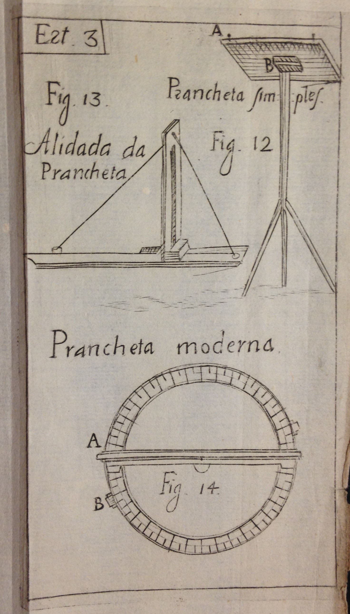
A cartographer’s tools, from Manoel de Azevedo Fortes, Tratado do modo o mais facil, e o mais exacto de fazer as cartas geograficas (Lisbon, 1722), plate 3. (GA102.3 .F67 1722)
Special Collections is well known for its distinguished cartographic holdings—particularly of maps and atlases concerning the discovery and exploration of North America—and recently we added the perfect complement: one of the earliest printed manuals on mapmaking. Cartography had long been an essential skill for military engineers and surveyors, who could turn to printed works in their fields for guidance, but manuals specifically directed at cartographers were a late development. Manoel de Azevedo Fortes’s rare Tratado do modo o mais facil, e o mais exacto de fazer as cartas geograficas … (Lisbon, 1722) was the first such manual in Portuguese. Fortes based his work in part on French manuals. Although he writes in part for a military audience, Fortes directs this work primarily at fellow members of Portugal’s Royal Academy of History who desire to complement their writings with maps. Of particular interest are his comments on cartographic symbols and map coloring.
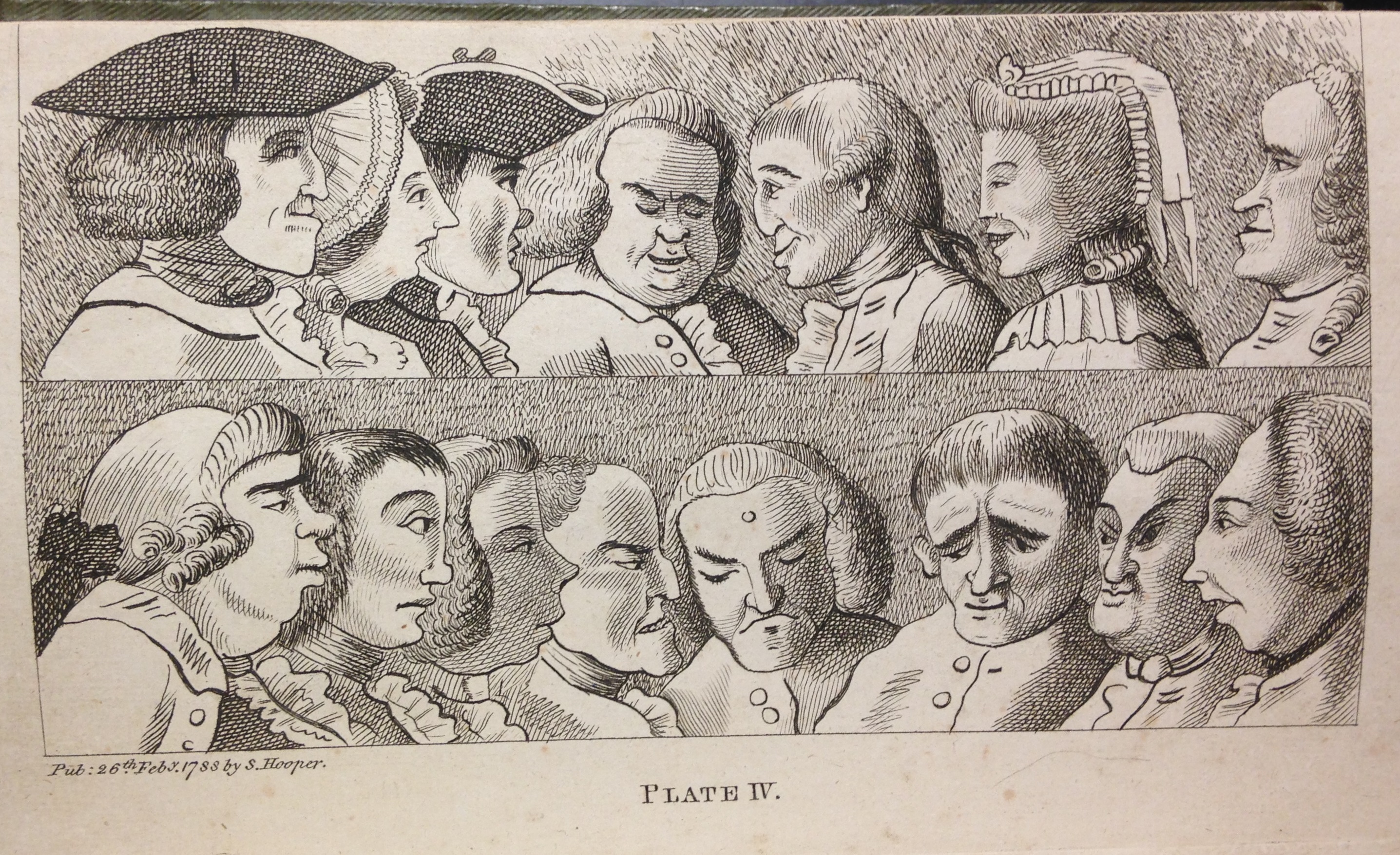
A lesson in caricature: examples of various noses, profiles, and head shapes. Francis Grose, Rules for drawing caricaturas, 2nd ed. (London, 1796), plate IV. (NC1320 .G76 1796)
We have also acquired another early manual on an entirely different subject: the art of caricature. A well known English antiquary and scholar of English slang, Francis Grose (1731-1791) was also an amateur artist who delighted in “comic painting.” In Rules for drawing caricaturas: with an essay on comic painting, Grose sought to explain how artists such as Hogarth and Gilpin manipulated the human form and visage for comic effect. This second, expanded edition, published posthumously in London in 1796, includes 21 plates, seventeen of which were etched by Grose himself. Most are caricatures of himself and his fellow antiquaries.
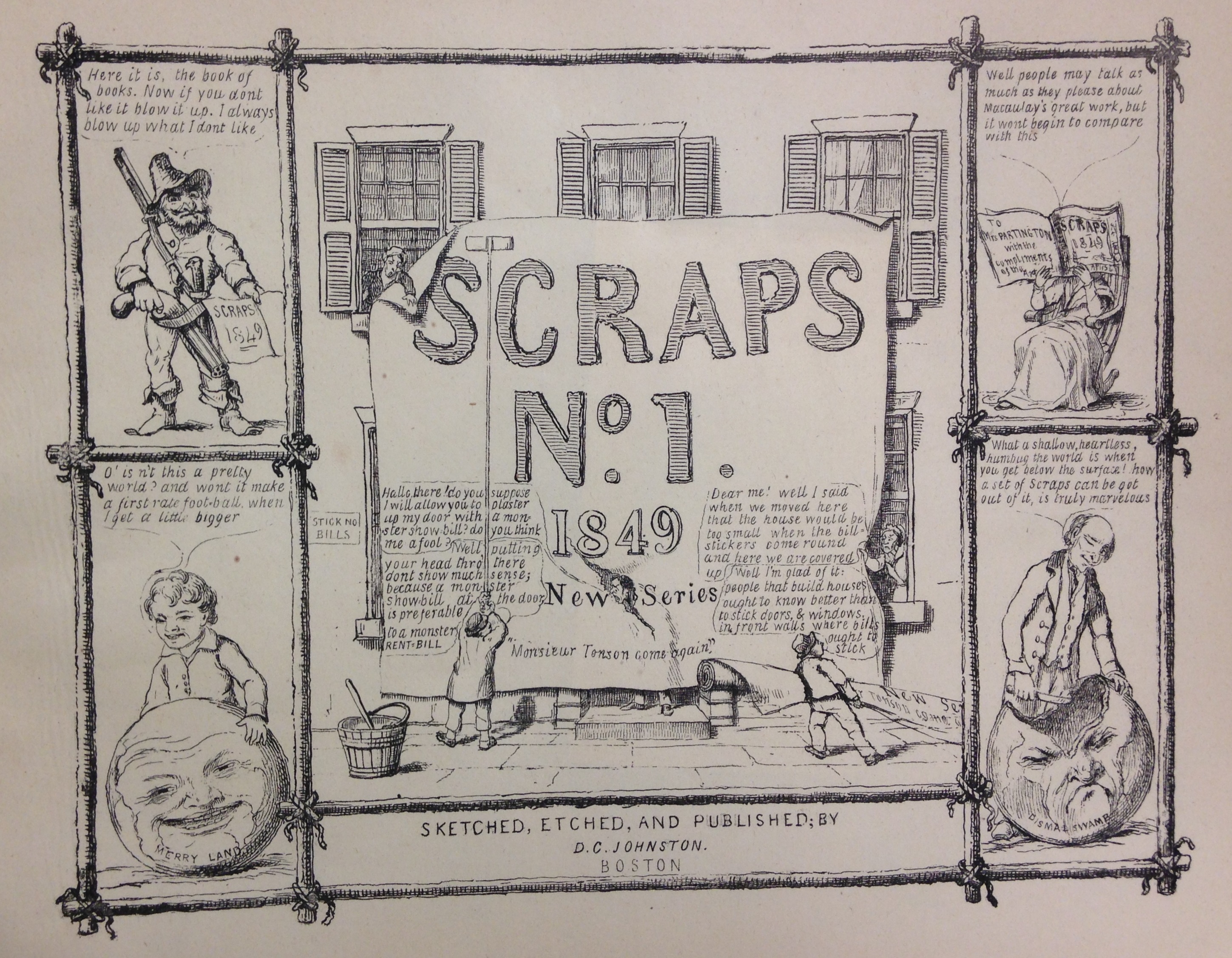
Front cover of David Claypoole Johnston, Scraps no. 1, new series (Boston, 1849). (E166 .J65 1849)
The art of caricature soon took root in the United States, thanks in part to the influence of English émigré artists. One of the most famous antebellum American cartoonists was David Claypoole Johnston (1798-1865), who excelled in many artistic media. Some of his best cartoon “Scraps” were published from 1828 to 1849 in a series of numbered portfolios, of which we recently acquired two. Their etchings poke fun at contemporary events such as the Mexican-American War, emerging issues such as women’s rights, contemporary fads such as phrenology, and, of course, the art world.
One of the cartoon “scraps” in David Claypoole Johnston, Scraps no. 1, new series (Boston, 1849) (E166 .J65 1849)
![Two stages in the creation of a lithographic image, from Alphonse Chevallier, Mémoire sur l’art du lithographe (Paris, [1829]) (NE2420 .C54 1829)](https://smallnotes.internal.lib.virginia.edu/wp-content/uploads/2014/04/B5.jpg)

![The books are marvelous specimen collections in their own right. Incidentally, we believe the ancient author of the concept of humours, Galen, would put his stamp of approval on the layout of the recto of this page. From Pen and Brush Lettering and Practical Alphabets (London: Blandford Press, [1947].](https://smallnotes.internal.lib.virginia.edu/wp-content/uploads/2014/04/curtismasculine.jpg)
![A manual alphabet from a collection of ornamental alphabets, Recueil d'alphabets, dedié aux artistes (Paris & New York: L. Turgis jeune, [ca. 1845?]. (NK3600 .B65 1845)](https://smallnotes.internal.lib.virginia.edu/wp-content/uploads/2014/03/D7.jpg)