
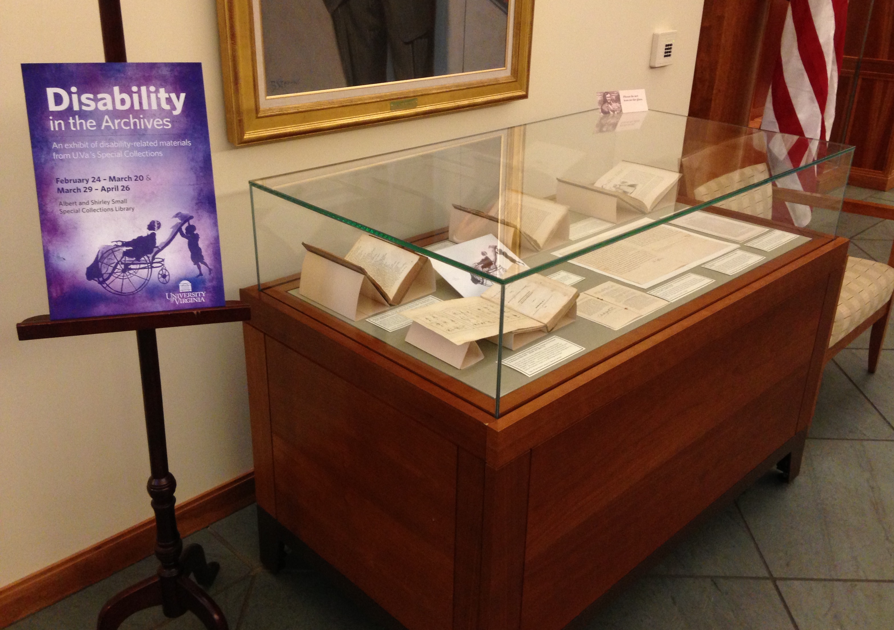
“Disability in the Archives,” case 1
On February 27-28 U.Va. hosted “Disabling Normalcy,” an interdisciplinary conference organized by Christopher Krentz, Associate Professor of English and Director of American Sign Language. In conjunction with the conference, Prof. Krentz and graduate student Philip Timmerman prepared an exhibition, “Disability in the Archives,” which is on view in the first floor gallery of the Small Special Collections Library through April 26. Drawn entirely from our holdings, the exhibition features books, manuscripts, and photographs relating to the deaf, blind, physically handicapped, and mentally ill.
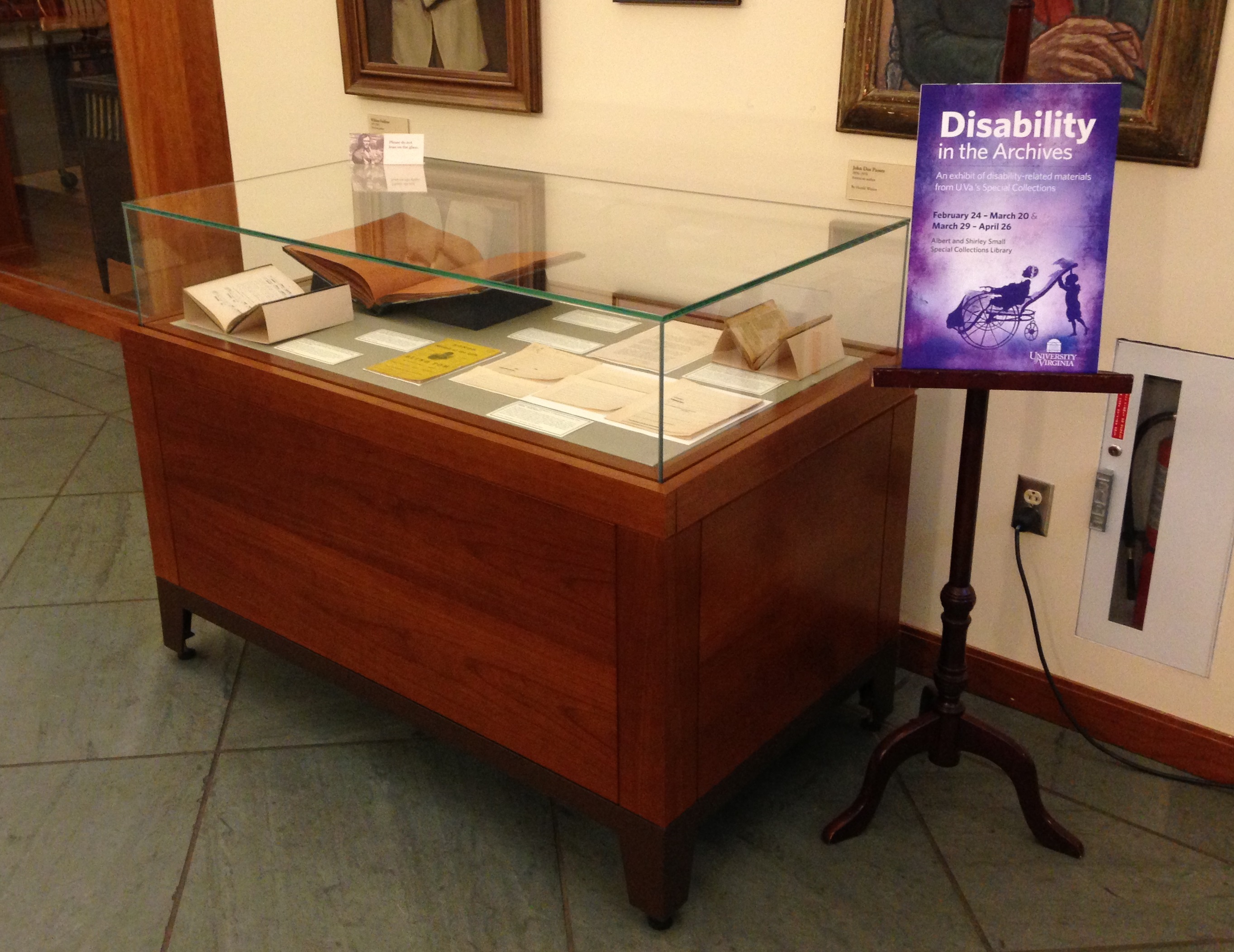
“Disability in the Archives,” case 2
The exhibition includes several recent acquisitions, some obtained before Prof. Krentz proposed the exhibition and others acquired since, partly with the exhibition in mind. In this post we feature a few of these items, including several omitted from the exhibition for want of space.
Efforts to educate the blind and vision-impaired received a major boost in the early 19th century with the invention of various tactile reading systems. Although Louis Braille’s dot system has become the international norm, raised letter systems were standard in the United States until the early 20th century. The first to be introduced was “Boston line,” an adaptation by Dr. Samuel Gridley Howe of a Scottish raised-letter alphabet. Much as a type designer adjusts letterforms for legibility, Howe adapted the shapes of letters and numerals so that, when embossed in paper in high relief, they could be more easily distinguished by touch. In 1835 Howe established a press at the New England Asylum for the Blind in Boston (now the Perkins School for the Blind in Watertown, Mass.), where he proceeded to print many raised-letter books for the blind.
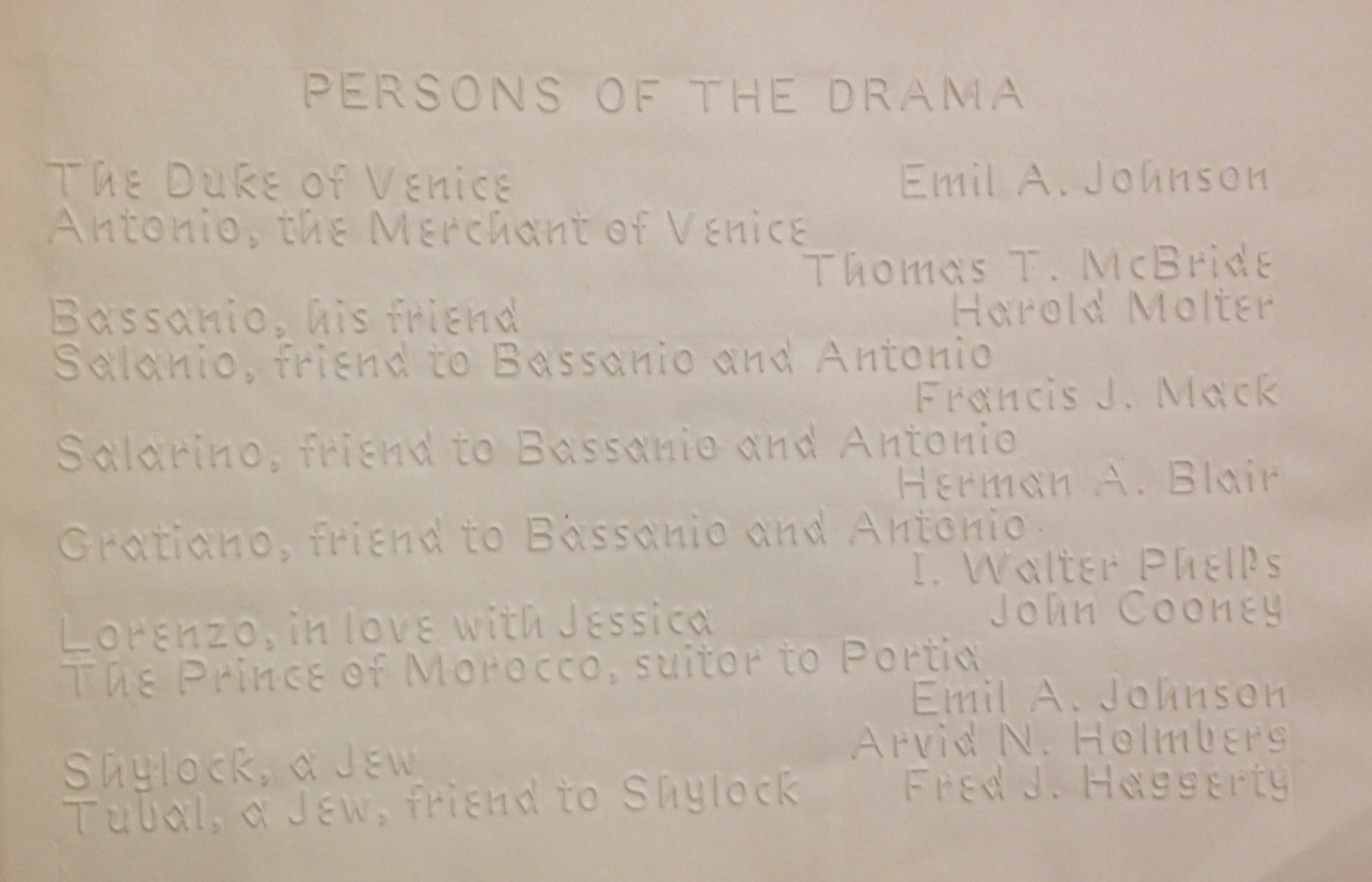
Cast list for a benefit performance of Shakespeare’s The Merchant of Venice, by the “Perkins Players” of the Perkins School for the Blind in Watertown, Mass., May 1917. This raised-print program was set in Boston line and printed at the school. (HV1796 .M46 P4 1917)
We recently added an unusual Boston line imprint to our Joseph M. Bruccoli Great War Collection: a theater program for two benefit performances of Shakespeare’s The Merchant of Venice, held in May 1917 at the Perkins School and featuring Perkins students as actors, musicians, and dancers. Proceeds went to the American, British, French, Belgian Permanent Blind Relief War Fund, which assisted Allied soldiers blinded in battle.
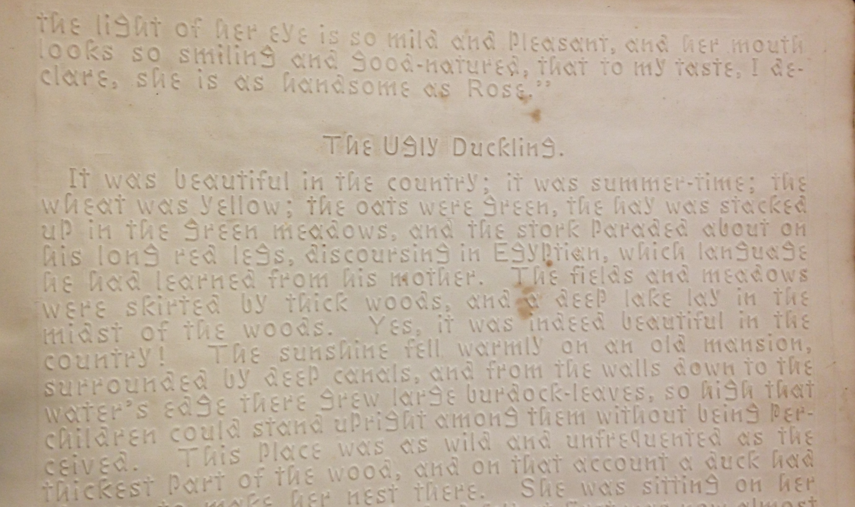
Hans Christian Andersen’s The Ugly Duckling, from Fancies of Child-Life (Louisville, Ky.: American Printing House for the Blind, 1877). (PZ7 .F1997 1877)
Following the Civil War, the American Printing House for the Blind in Louisville, Kentucky, became the leading American supplier of raised-letter texts. The APHB employed a modified form of Boston line for its publications until 1893, when Braille was first introduced. At the Boston International Antiquarian Book Fair we acquired a copy of the 1877 APHB edition of Fancies of Child-Life, a collection of children’s stories by Hans Christian Andersen and Harriet Beecher Stowe. This copy was sent to the Virginia Institute for the Deaf, Dumb, and Blind in Staunton, Va., where in 1893 it was presented as a school prize “For learning to read in one Session” to Edgar Hickam. A blind resident of Maces Spring, Va. (in the extreme southwest region bordering Tennessee), Hickam was well known locally as a musician and piano tuner, though celebrity would fall, not to him, but to his neighbors, the Carter Family.
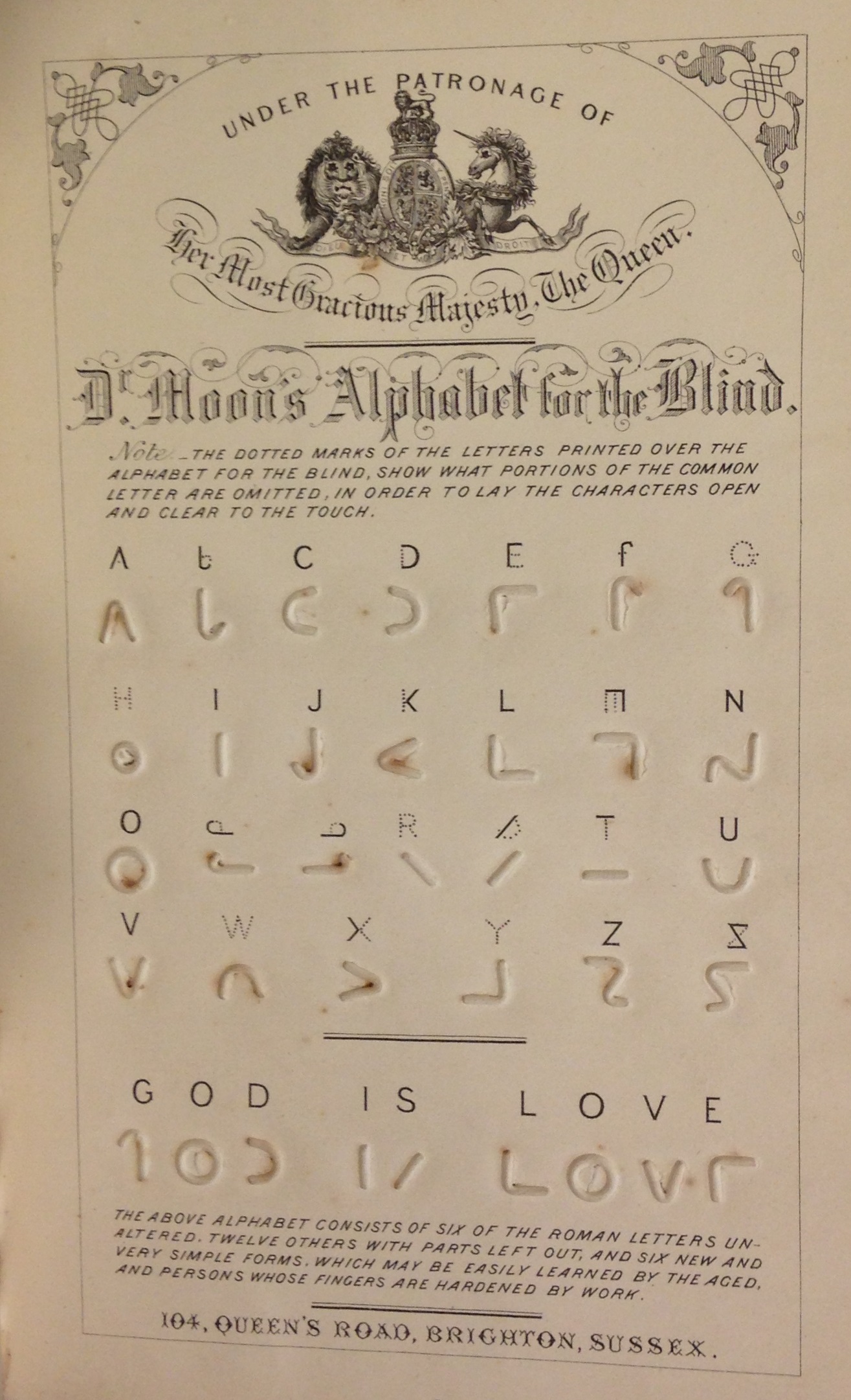
The Rev. William Moon’s simplified manual alphabet, in Light for the blind: a history of the origin and success of Moon’s system of reading (embossed in various languages) for the blind (London: Longmans & Co., 1873). (HV1678 .M84 1873)
Perhaps Boston line’s primary shortcoming was that it adopted essentially the same rather complex letterforms employed for written and printed texts. Hence publications in Boston line are more easily read by eye than by touch. In 1847 the Rev. William Moon of Brighton, England, invented a simplified alphabet better suited to touch. It consisted of “six of the roman letters unaltered, twelve others with parts left out, and six new and very simple forms, which may be easily learned by the aged, and persons whose fingers are hardened by work.” Moon’s Light for the blind (London, 1873) describes his invention, provides a list of available publications, and chronicles his labors on behalf of the blind.
We know far less about the history of mapmaking for the blind, and embossed maps are very uncommon. Hence we were delighted to acquire at the California International Antiquarian Book Fair a fine copy of a world atlas for the blind published in Germany in the mid-1930s. The challenge was a straightforward one: how to convert two dimensions into three so that cartographic information could be conveyed by touch? Here the solution was to emboss maps in high relief on durable kraft paper. Geographic and topographic features are differentiated as follows: coastlines by dotted lines, political boundaries by dashed lines, rivers by solid lines, oceans by a uniform pattern of small dots in low relief, and so on, with captions added in Braille.
![A manual alphabet from a collection of ornamental alphabets, Recueil d'alphabets, dedié aux artistes (Paris & New York: L. Turgis jeune, [ca. 1845?]. (NK3600 .B65 1845)](https://smallnotes.internal.lib.virginia.edu/wp-content/uploads/2014/03/D7.jpg)
A manual alphabet from a collection of ornamental alphabets, Recueil d’alphabets, dedié aux artistes (Paris & New York: L. Turgis jeune, [ca. 1845?]. (NK3600 .B65 1845)
Last month we acquired a rare mid-19th century alphabet book, with a dual Paris & New York imprint, consisting of 24 lithographic plates bearing elaborate ornamental alphabets. These were intended as inspiration for artists, signmakers, and others seeking out-of-the-ordinary letterforms. Imagine our surprise to find on the penultimate plate the standard manual alphabet on which various sign languages used by the deaf (including American Sign Language) are based.
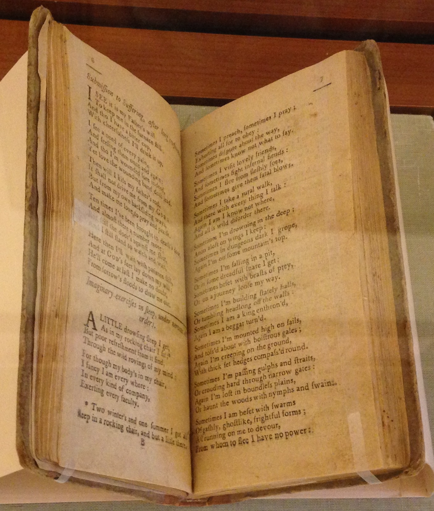
“Nervous disorder” conveyed in verse, in Miscellaneous reflections. In Verse (Greenfield, Mass.: Thomas Dickman, 1792) (BD420 .F52 1750 no. 2)
Early autobiographical accounts of battles with mental illness are quite rare, and recently we acquired one for the Clifton Waller Barrett Library of American Literature. In 1792, in the small town of Greenfield, Mass., Thomas Dickman printed Miscellaneous reflections. In verse. Mostly written at sundry times, when under long confinement by a complication of nervous disorders. Only three copies are recorded of this 40-page pamphlet, written “by a valetudinary” (whose identity remains unknown) and “printed by request of friends of that class.” Most of the poems are religious in nature, but the initial poems are extraordinary for attempting to convey, in verse, the author’s experience of being in a state of “nervous disorder.”