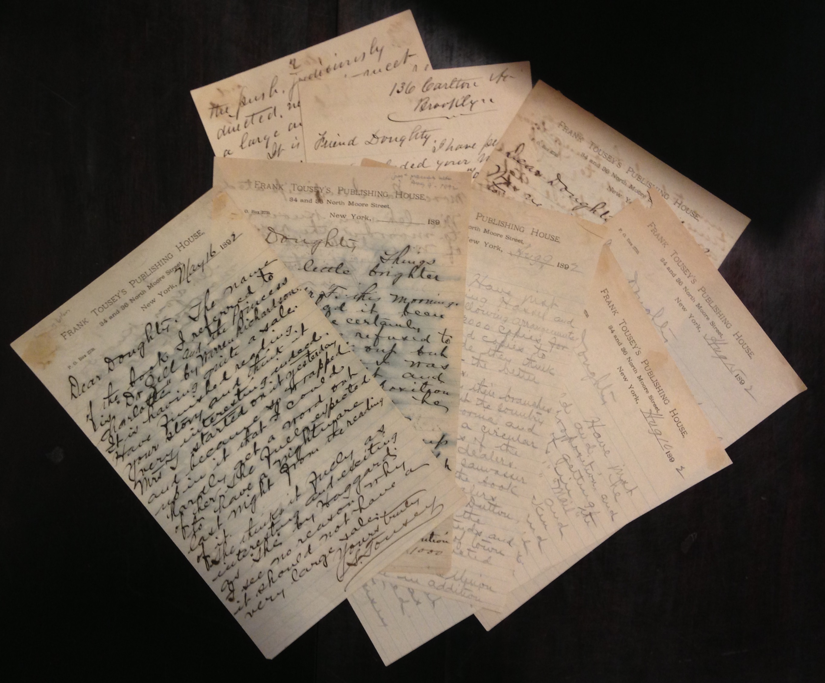
What, no book tour? Francis W. Doughty and his agent Sinclair Tousey scheme to place copies of Doughty’s science fiction novel, Mirrikh, or, a woman from Mars (1892) in the hands of eager readers. (MSS 15790)
Followers of “This Just In” will know of the Small Special Collections Library’s deep interest in primary sources relating to all aspects of publishing, whether from the perspective of author, publisher, bookseller, reader, or even censor. Here we present a diverse miscellany of relevant items spanning three centuries and two continents, all acquired in recent months.
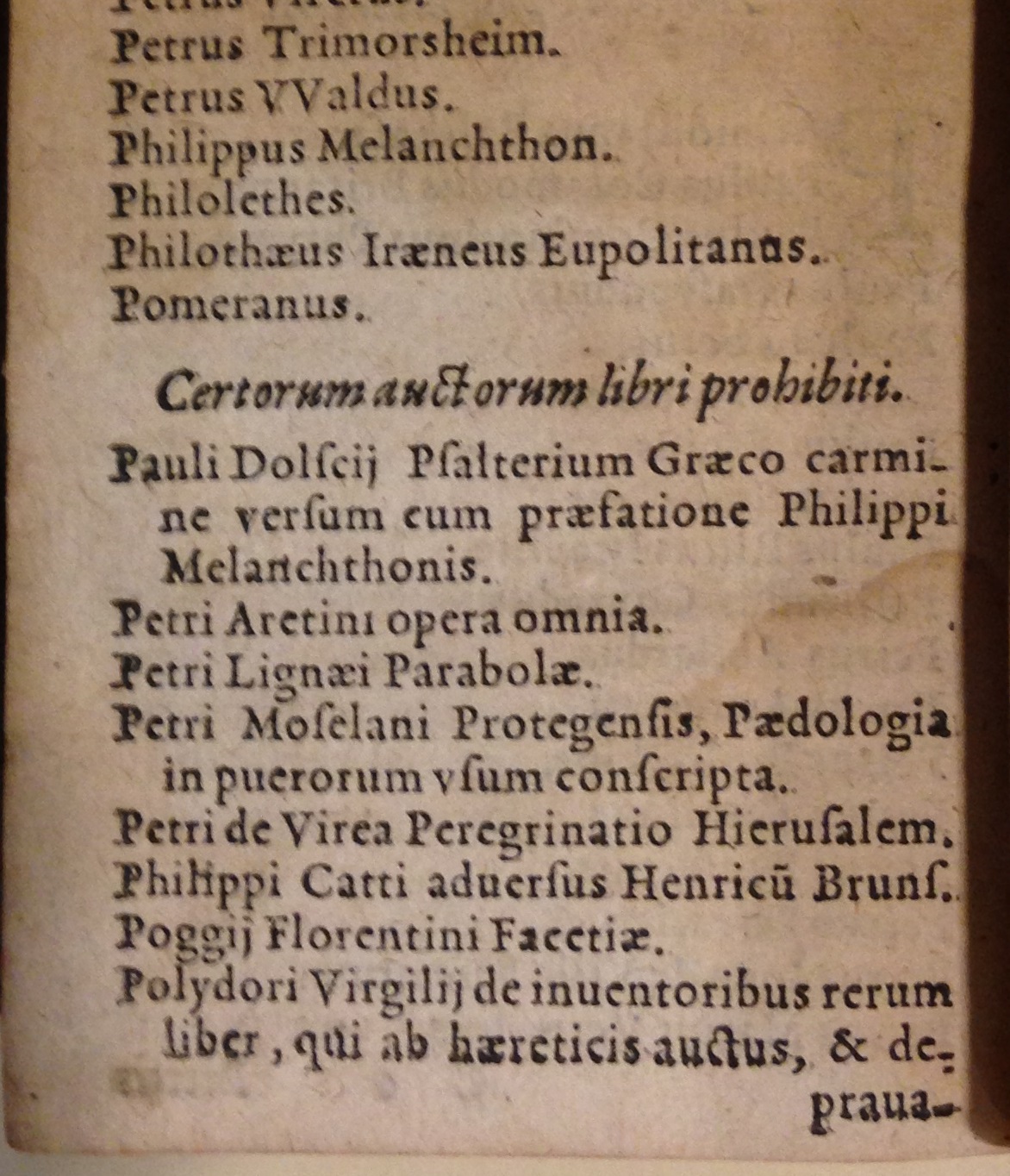
In bad company: Pietro Aretino joins Philipp Melanchthon, Poggio Bracciolini, and Polydore Vergil on the Roman Catholic Church’s Index of prohibited books. This 1569 pocket edition of the Index Librorum Prohibitorum was issued in Cologne. (BX830 1545 .A2 1569 no. 2)
One of several key achievements of the Council of Trent (1545-1563) was the creation of a central mechanism by which the Roman Catholic Church could restrict the publication and dissemination of works considered heretical, immoral, and anti-clerical. The first official listing of such works—the Index Librorum Prohibitorum—appeared in 1559, with a substantially revised edition following in 1564; the Index was regularly updated until 1966. Finding to our surprise that U.Va. had no pre-19th century edition of this landmark text, we obtained a rare 1569 Cologne reprint of the 1564 edition in handy pocket format, bound (as often) with a complementary edition of the Tridentine canons and decrees. The Index begins with the ten rules governing the selection of prohibited works, followed by a comprehensive alphabetical listing of banned titles, or more often simply the names of the many authors whose entire oeuvre was proscribed.
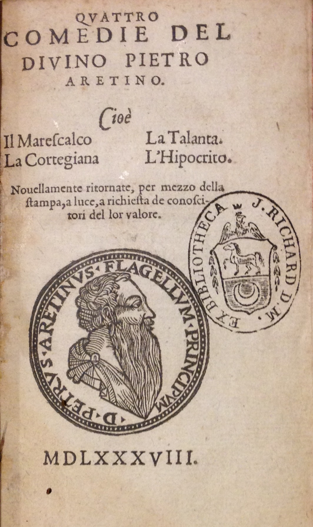
The truth is in the type: this imprintless 1588 edition of Petro Aretino’s Quattro comedie was printed, not in Italy, but in London by Elizabethan printer John Wolfe. (PQ4563 .A4 1588)
Instead of preventing the publication of forbidden texts, the Index simply shifted the printing elsewhere while guaranteeing a steady readership among those fortunate enough to obtain copies clandestinely. One of many publishers to profit from the ban was the enterprising John Wolfe (1548?-1601) who, during the 1580s and 1590s, printed in London (of all places) a number of proscribed Italian works for export to the European continent. Wolfe’s surreptitious editions either lack his name and place of publication—as in his 1588 edition of Pietro Aretino’s Quattro comedie—or bear false imprints, but the typography reveals their true origins.
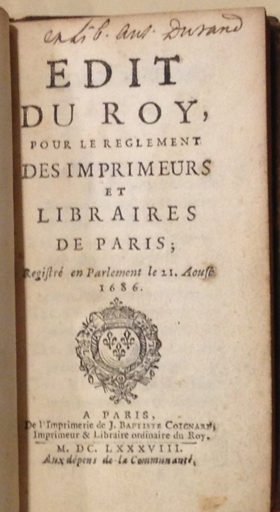
Rules to live by: a comprehensive set of regulations governing all members of the Paris book trades. Published in 1688 in a small format suitable for carrying around in one’s pocket. (Mini KJV5973 .A35 1688)
Rarely have printers been entirely free of regulation, and a key theme of “book history” is the ways in which printers have adapted to the various legal and economic constraints placed on their activities. We were fortunate to obtain fine copies with notable provenance—from the libraries of book historians Graham Pollard and Giles Barber—of the two earliest comprehensive sets of regulations governing the Parisian book trades. The first, promulgated in 1686, contains sections pertaining to printers, booksellers, typefounders, apprentices, journeymen, correctors at press, colporteurs, privileges, and other matters, as well as a separate set of regulations governing the bookbinding trade. The second is the greatly expanded revision approved in 1723.
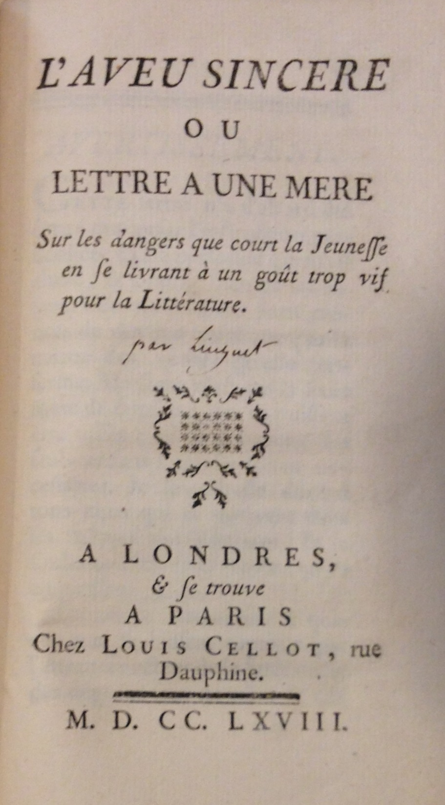
Heed the advice of M. Linguet: neither a lover of literature nor a writer be! (PQ1977 .D63 P5 1760 no. 2)
Historians have traced to the 18th century the rise of authorship as a professional occupation, and it was not long before budding authors could find career advice in print. In 1768 Simon Nicolas Henri Linguet, a lawyer and denizen of the Parisian equivalent of Grub Street, published anonymously L’aveu sincere ou, lettre a un mere sur les dangers que court la jeunesse en se livrant à un gout trop vif pour la littérature. Written in the form of advice directed at a parent, Linguet spells out at length the bitter disappointments awaiting those who envisage a literary as a path to wealth and social advancement. Linguet was of course unable to follow his own advice, eventually dying, not of poverty, but on the guillotine for his opinionated writings.
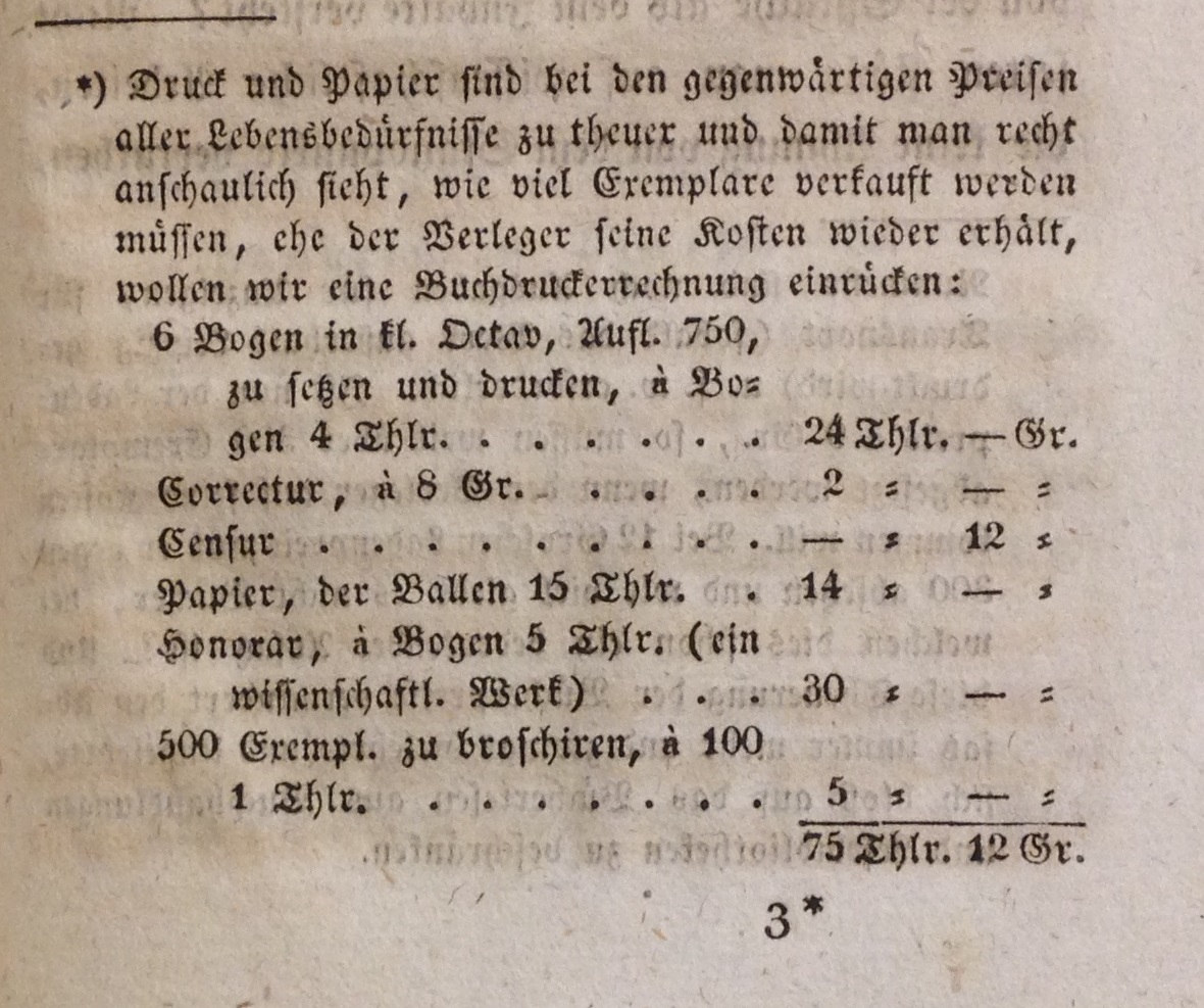
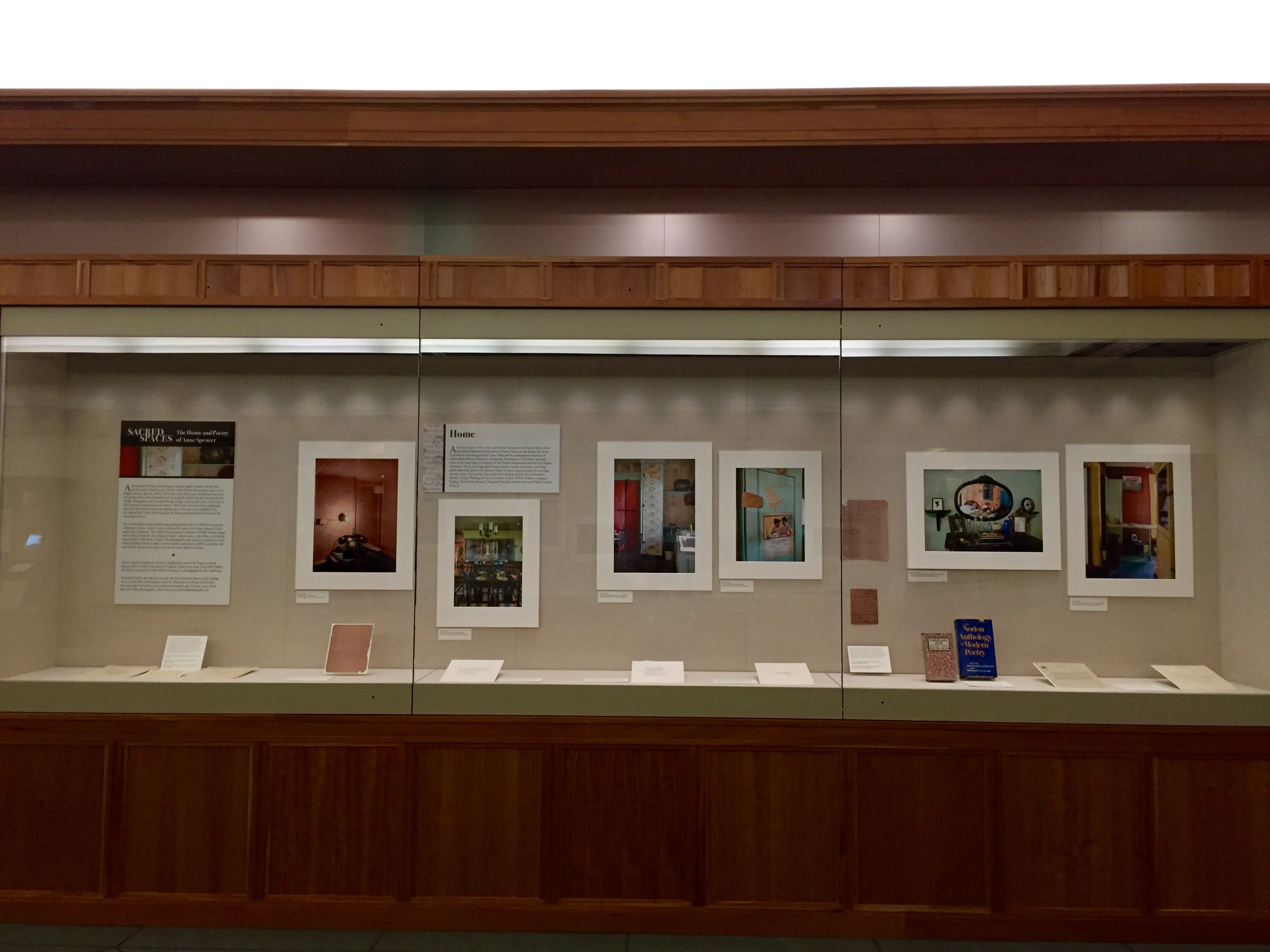
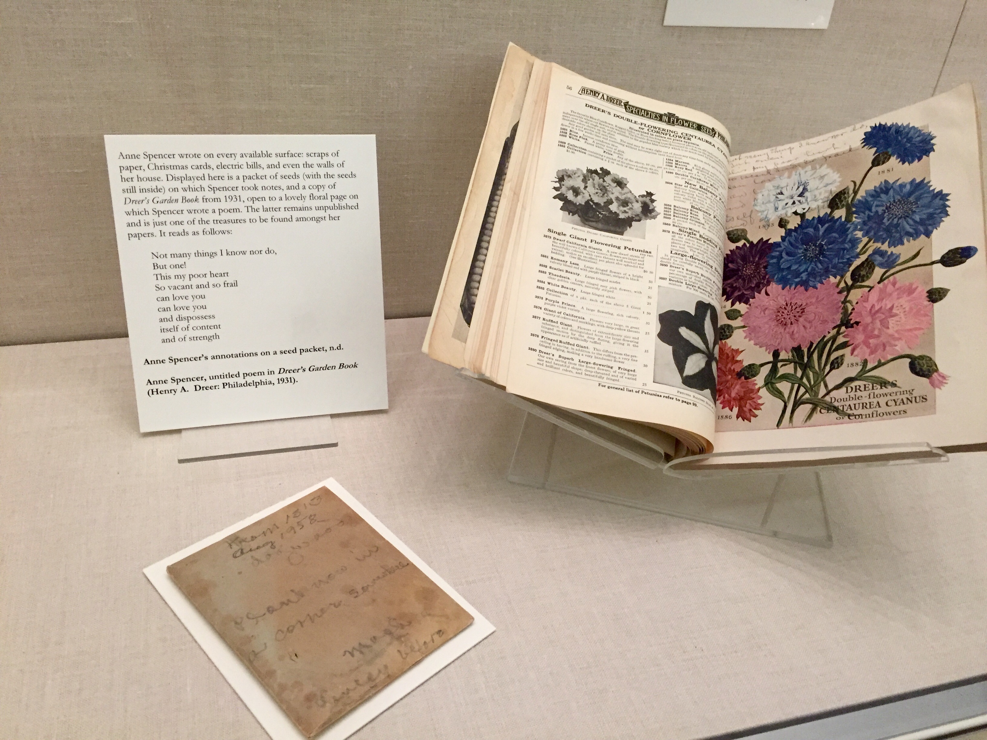
What it cost in 1825 to publish 750 copies of a 96-page octavo book in Leipzig; from Johann Adam Bergk’s Der Buchhändler oder Anweisung, wie man durch den Buchhandel zu Ansehen und Vermögen kommen kann (Leipzig, 1825). (Z313 .B474 1825)
If not writing, perhaps bookselling is the career for you? This spring we obtained two very rare early 19th-century German how-to manuals for booksellers (who at that time often dabbled in publishing, too). Der Buchhandel von mehreren Seiten betrachtet was written and self-published in 1803 by the Weimar bookseller Johann Christian Gädicke. Although quite revealing on the specifics of running a bookshop, it is invaluable for its detailed exposition of the contemporary publishing business: selecting titles, dealing with authors and how much to pay them, obtaining financing, choosing paper and designing the publication, marketing one’s imprints &c. Johann Adam Bergk’s Der Buchhändler (Leipzig, 1825) offers similar advice, including breakdowns of the costs for printing a typical book.
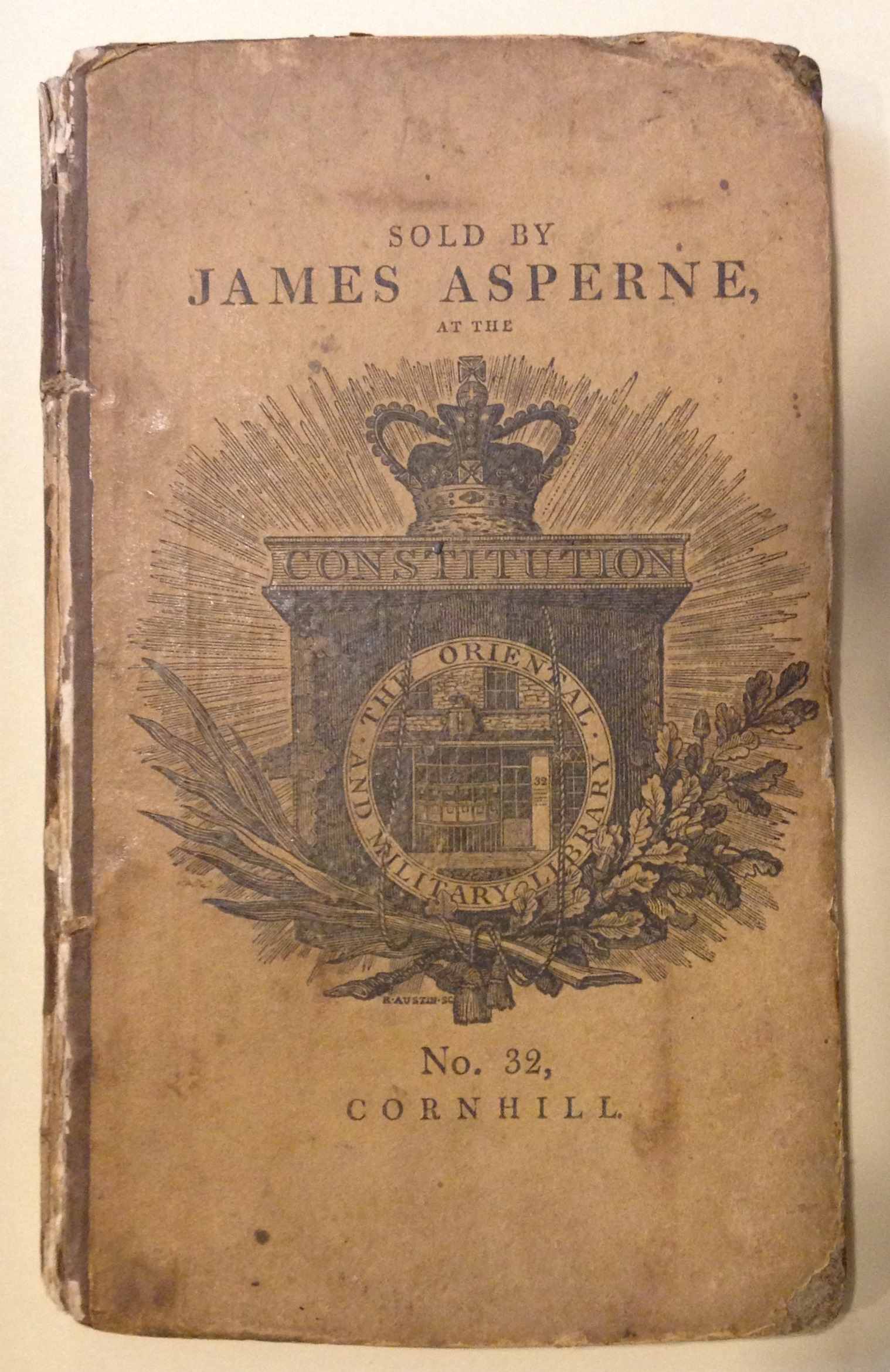
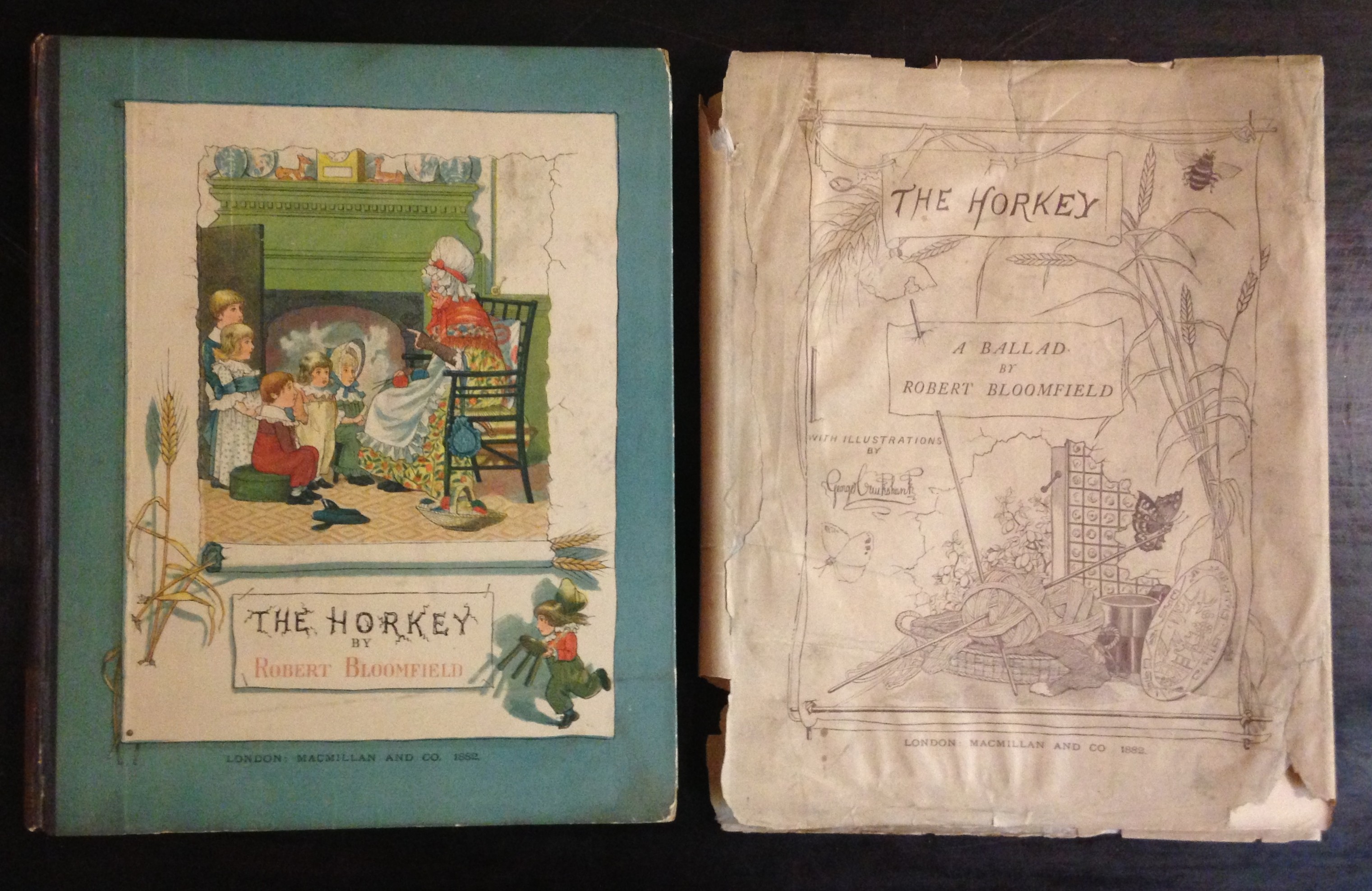
An unusual London bookseller’s retail binding, ca. 1806, on a copy of Robert Bloomfield’s Wild flowers; or, pastoral and local poetry (London: Printed for Vernor, Hood, and Sharpe, and Longman, Hurst, Rees, and Orme, 1806). The front board consists of a printed advertisement for bookseller James Asperne; the binding also bears Asperne’s bookseller’s label on the rear pastedown. (PR4149 .B6 W5 1806)
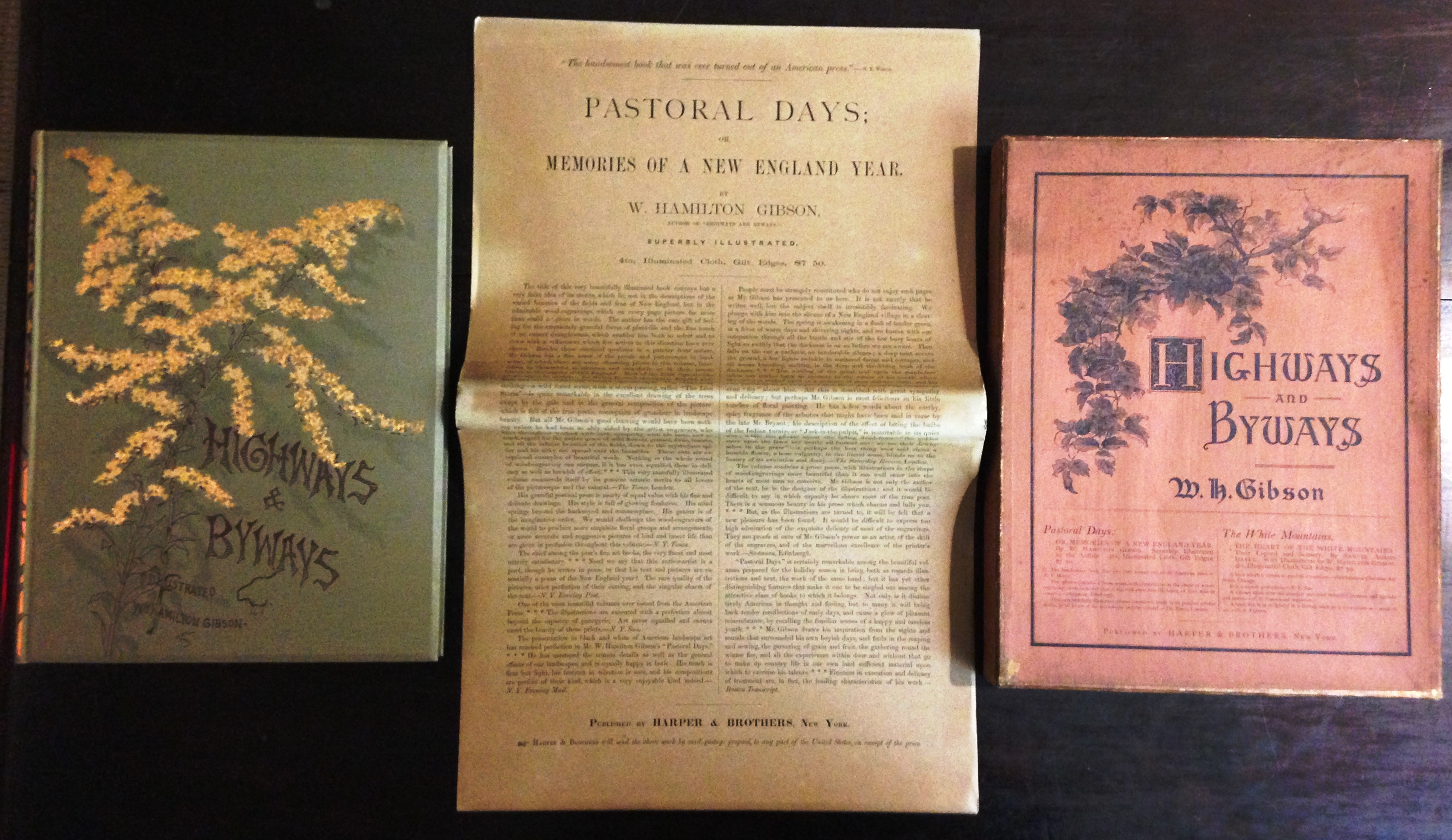
Other tricks of the bookselling and publishing trades are revealed through the books themselves. The early 19th century was a time of transition between retail bookbindings (added to some copies of an edition at the bookseller’s direction) and uniform publisher’s bindings (placed on most or all copies at the publisher’s direction). Recently we acquired a very unusual hybrid on a copy of Robert Bloomfield’s Wild flowers; or, pastoral and local poetry (London, 1806). The London bookseller James Asperne obtained some copies for stock, then had them bound in a retail binding of paper-covered boards. The front cover, however, consists of a large printed advertisement for his business. Nearly 40 years later, the New York publishers Harper & Brothers creatively addressed the perennial problem of how to move slow-selling titles out of the warehouse. Their solution was to bind unsold sheets, not in boards or cloth, but in inexpensive printed paper covers, and to market these titles for 25 cents each in a “Pocket Editions of Select Novels” series. Our newly acquired copy of James K. Paulding’s Westward ho! consists of the original first edition sheets, dated 1832 on the title page, reissued in paper covers dated 1845.
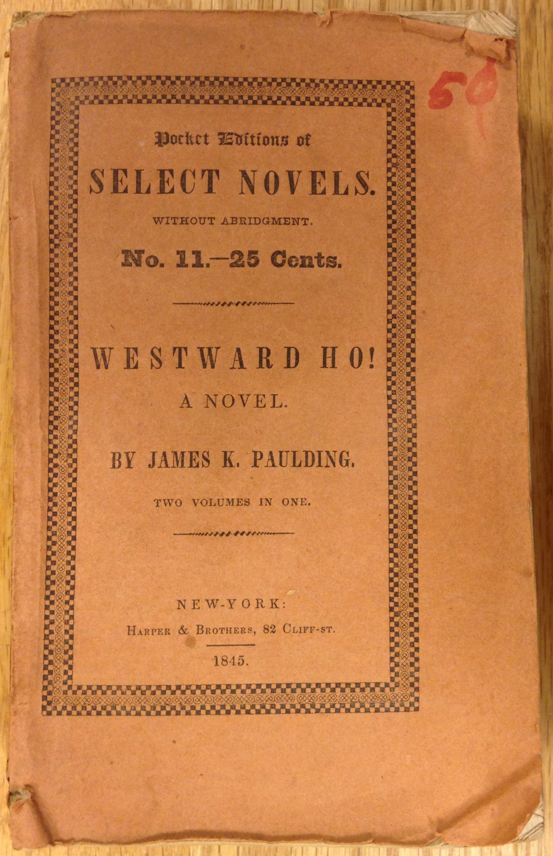
James K. Paulding’s novel Westward Ho!, published in 1832, evidently was not the success Harper & Brothers anticipated. In 1845 unsold sheets (with title pages dated 1832) were reissued in less expensive form in the “Pocket Editions of Select Novels” series, dated 1845 on the paper covers.
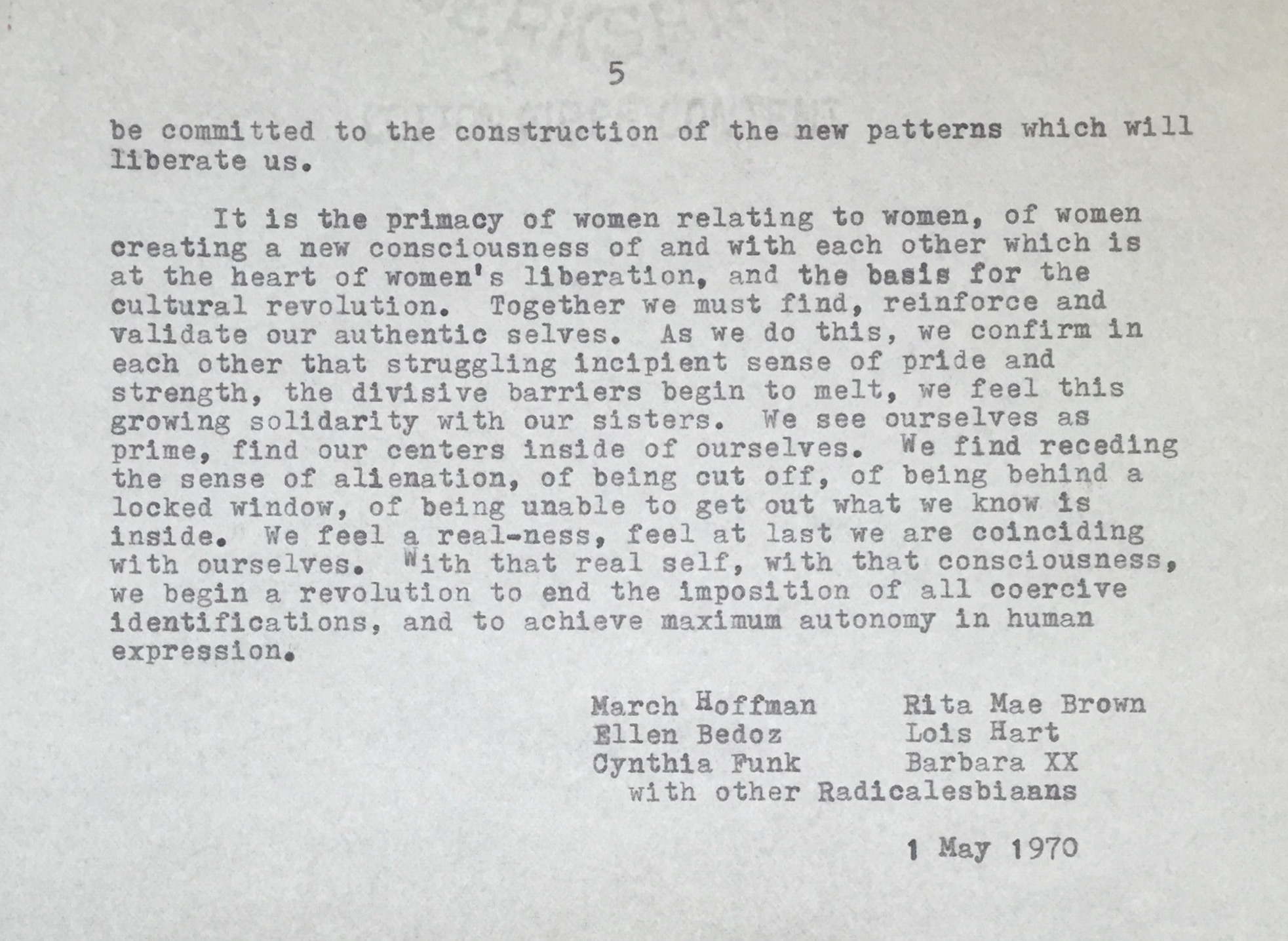
Our Clifton Waller Barrett Library of American Literature is world renowned for the extent and quality of its literary manuscripts and related correspondence. Two new additions help to illuminate different aspects of the late 19th-century publication process. In 1894 author Frank R. Stockton—perhaps best known for “The Lady, or the Tiger,” submitted the typescript of a science fiction story, “The Magic Egg,” to The Century Magazine. At editor Richard Watson Gilder’s urging, Stockton tightened up the original, ambiguous ending. The original typescript we acquired includes both endings as well as numerous other editorial revisions.
Frank Stockton’s revised ending for his short story, “The Magic Egg” (1894). (MSS 15768)
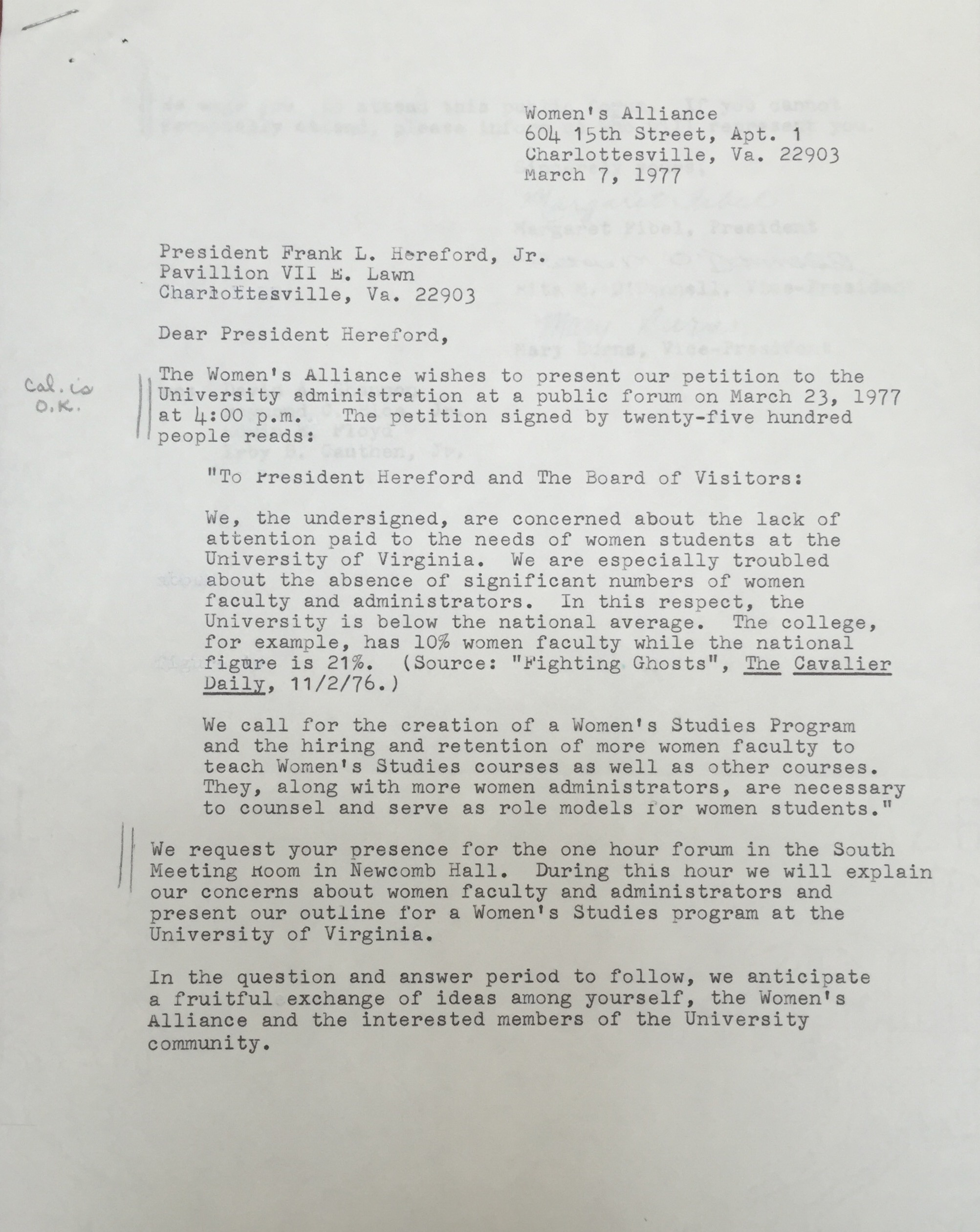
Francis W. Doughty (1850-1917) was a prolific author of “dime novel” detective fiction as well as early science fiction tales. For the Barrett Library we have acquired a series of letters from 1892 detailing Doughty’s negotiations with the American News Company—a powerful distributor of popular, mass market fiction—concerning his science fiction/lost race novel, Mirrikh, or, a woman from Mars. Doughty’s agent, Sinclair Tousey, provided regular updates on the number of copies ordered, marketing plans, and efforts to obtain reviews in influential newspapers.

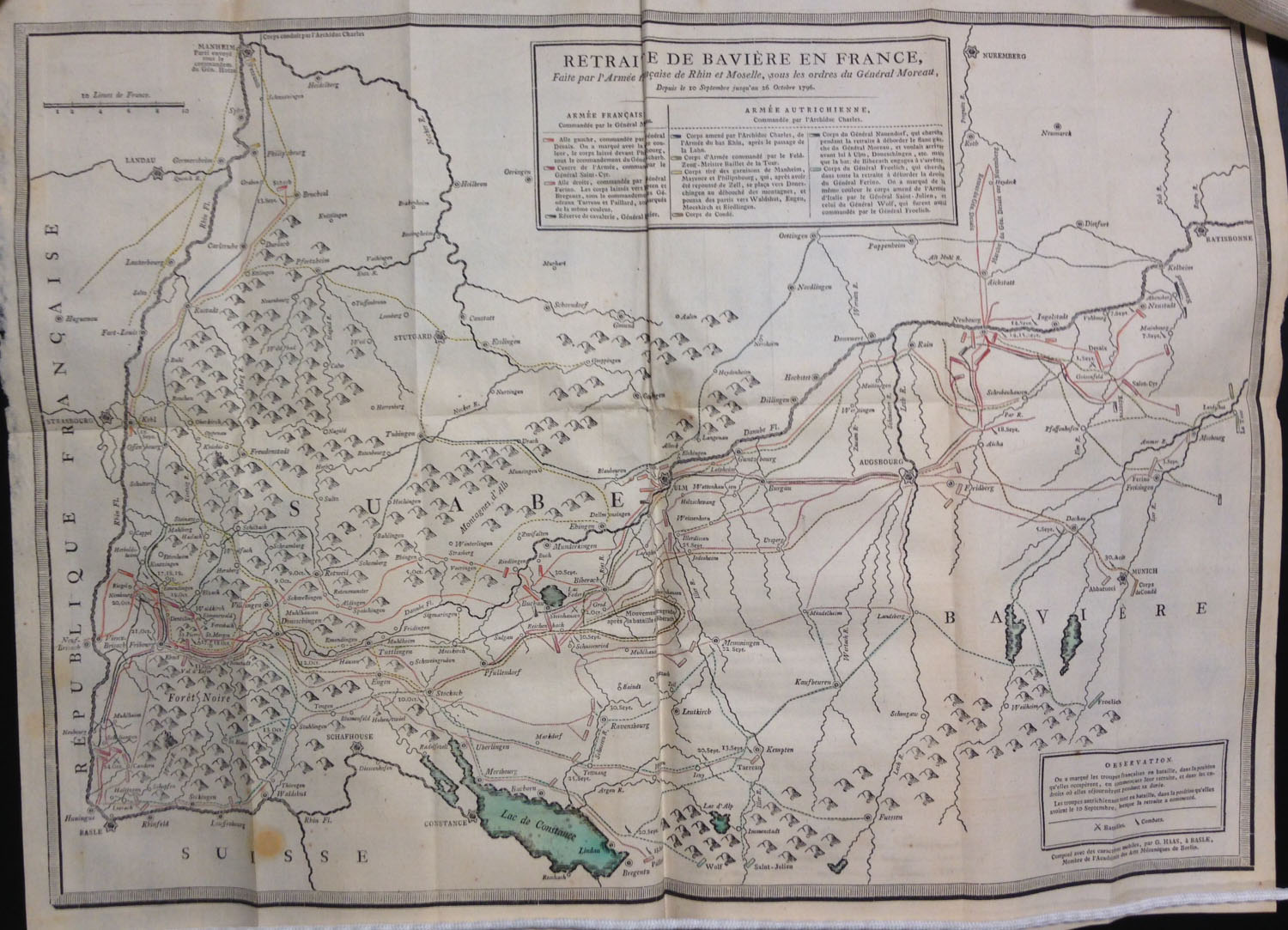
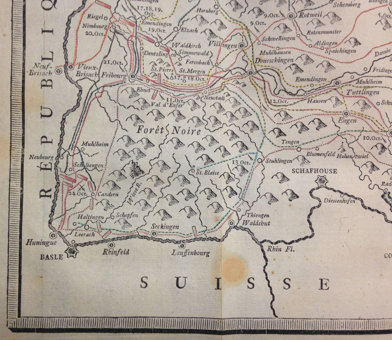
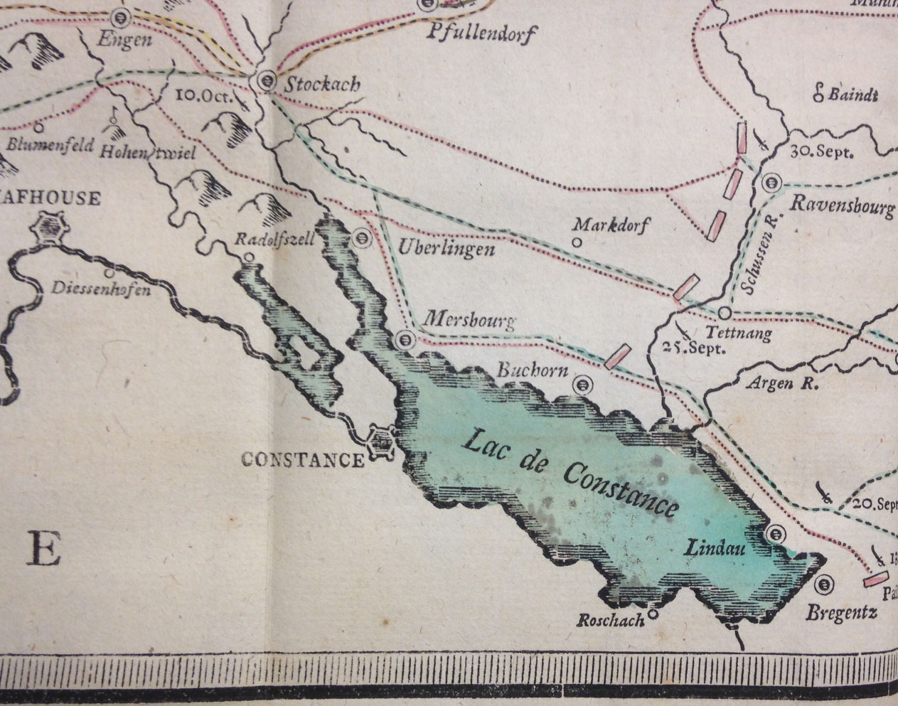
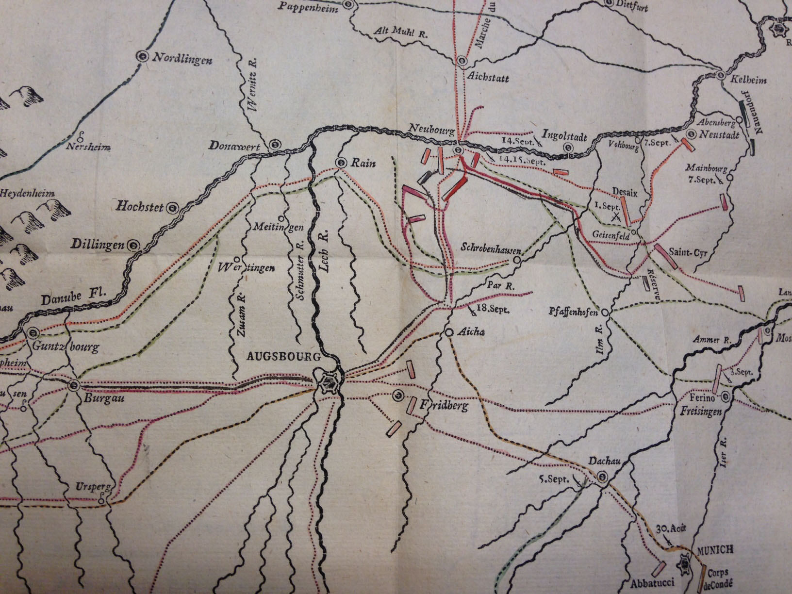
![The map, "composed with movable types," bears the imprint of G[uillaume, i.e. Wilhelm] Haas, the Basel [Switzerland] typefounder who cut and cast the special cartographic font.](https://smallnotes.internal.lib.virginia.edu/wp-content/uploads/2015/02/Map2.jpg)
![Public lands in Illinois: January 17, 1839 ... [Vandalia, Ill., 1839] (A 1839 .I55)](https://smallnotes.internal.lib.virginia.edu/wp-content/uploads/2014/11/MG1.jpg)
![Augustus Q. Walton [i.e. Virgil Stewart], A history of the detection, conviction, life and designs of John A. Murel ... (New York, 1839) (A 1839 .W26)](https://smallnotes.internal.lib.virginia.edu/wp-content/uploads/2014/11/MG2.jpg)
![The grant of the Venezuelian Emigration Company, with full explanation of their laudable object ... [St. Louis?, 1866] (A 1866 .G73)](https://smallnotes.internal.lib.virginia.edu/wp-content/uploads/2014/11/MG4.jpg)