Virginia Festival of the Book 2013: Special Collections Edition

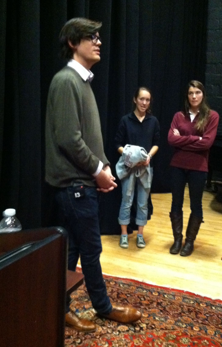
Every third week of March, hundreds of authors and bibliophiles sojourn in Charlottesville, immersing themselves in book culture at the Virginia Festival of the Book.  The Special Collections Library was well represented in this year’s festival.  Both of our curators (and fellow bloggers) Molly Schwartzburg and David Whitesell, as well as Honorary Curator and Director of the Rare Book School Michael Suarez, gave talks on a wide array of subjects, including the history of an abolitionist print, seventeenth- and eighteenth-century Spanish dramas, miniature and artist books, and e-books.  U.Va. alum and former Special Collections student employee Lex Hrabe also made three appearances at the festival, sharing with area school students the inner workings of his young adult thriller, Quarantine: The Loners.

The Print That Changed the World: The Description of the Slave-Ship Brookes

The Rare Book School hosted this lecture by U.Va. Professor and Honorary Curator Michael Suarez, S.J., which described the circulation and history of the famous, or should we say, infamous, original diagram depicting enslaved Africans in the stowage of the British slave-ship Brookes. Special Collections’ copies of the print from 1791 and 1808 were on display.
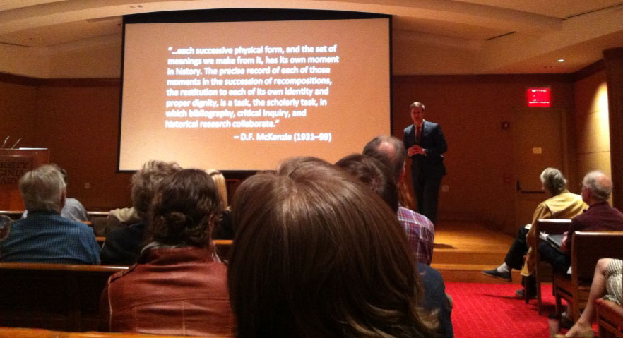
Michael Suarez gives his talk on the publication history of the printing of the stowage of the slave ship Brookes to a packed audience in the Harrison-Small Auditorium, 21 March 2013. (Photograph by Nicole Bouche)
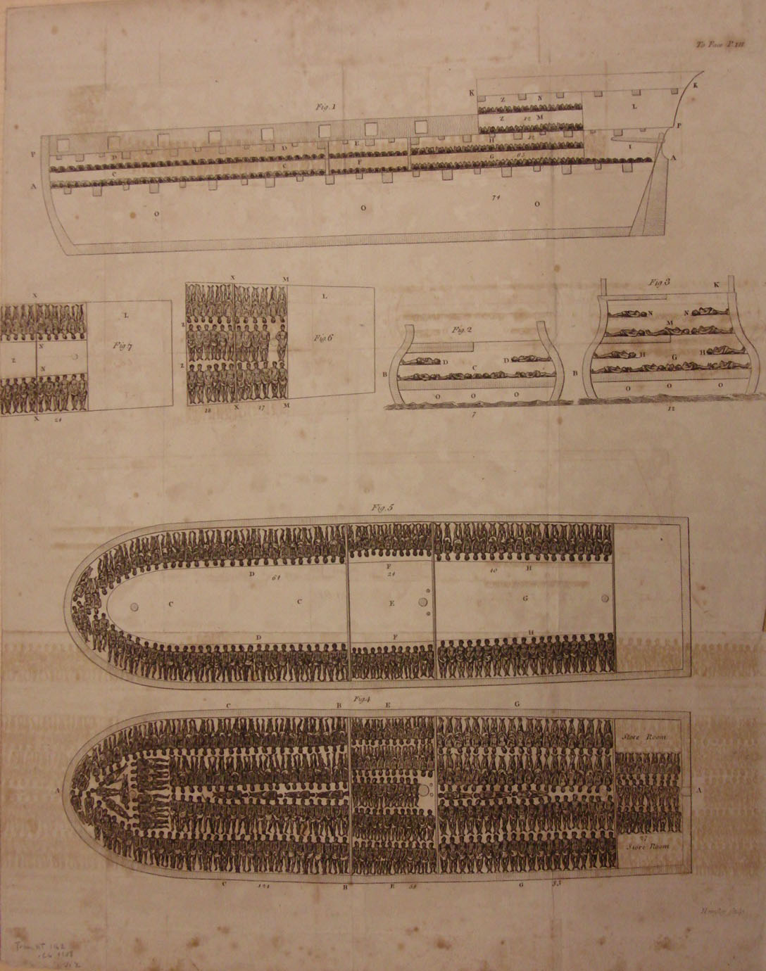
Special Collections has three plates of the “Stowage of the British Slave Ship Brookes.” Featured is our 1808 print, originally from volume two of Thomas Clarkson’s The History of the Rise, Progress, and Accomplishment of the Abolition of the Slave-trade by the British Parliament (HT1162 .C6 1808 v.2. Photograph by Petrina Jackson)
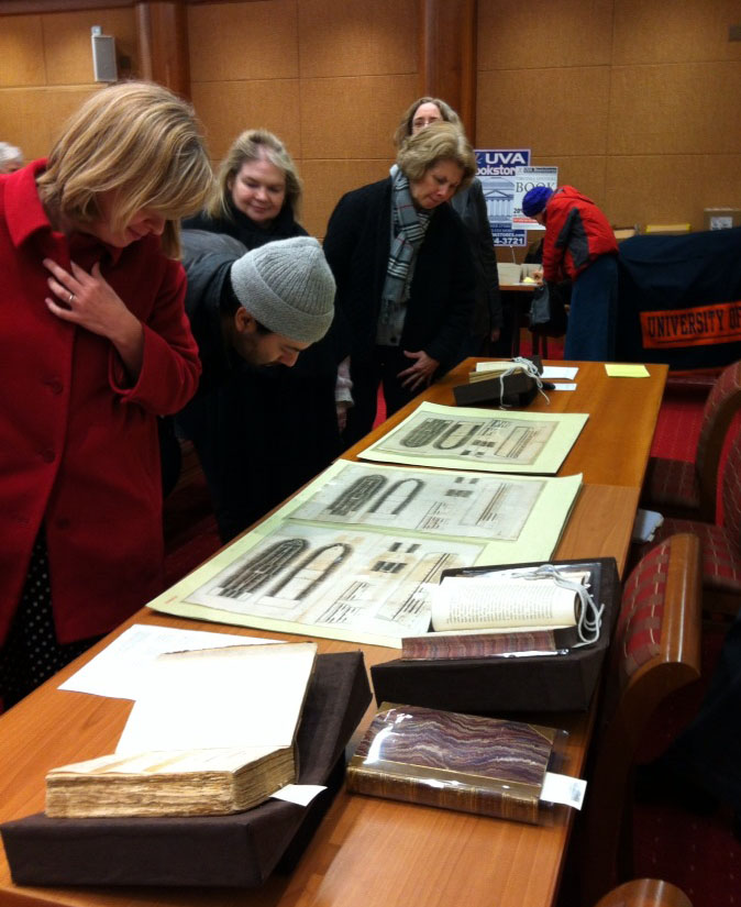
Audience members view Special Collections’ “Stowage of the British Slave Ship Brookes” prints and the books from where they originated. (Photograph by Nicole Bouché)

Lope de Vega Meets Shakespeare: Spanish Golden Age Drama Bibliography Considered

David Whitesell’s lecture, which was hosted by the Bibliographical Society of the University of Virginia, focused on the bibliography of seventeenth- and eighteenth-century Spanish drama.  He provided an introduction to Spanish Golden Age drama, explained some key challenges of the genre’s bibliographers, described how proponents of the New Bibliography have addressed these challenges, and closed with a case study of how the methods of analytical bibliography might advance the understanding of Spanish Golden Age drama and its reception.
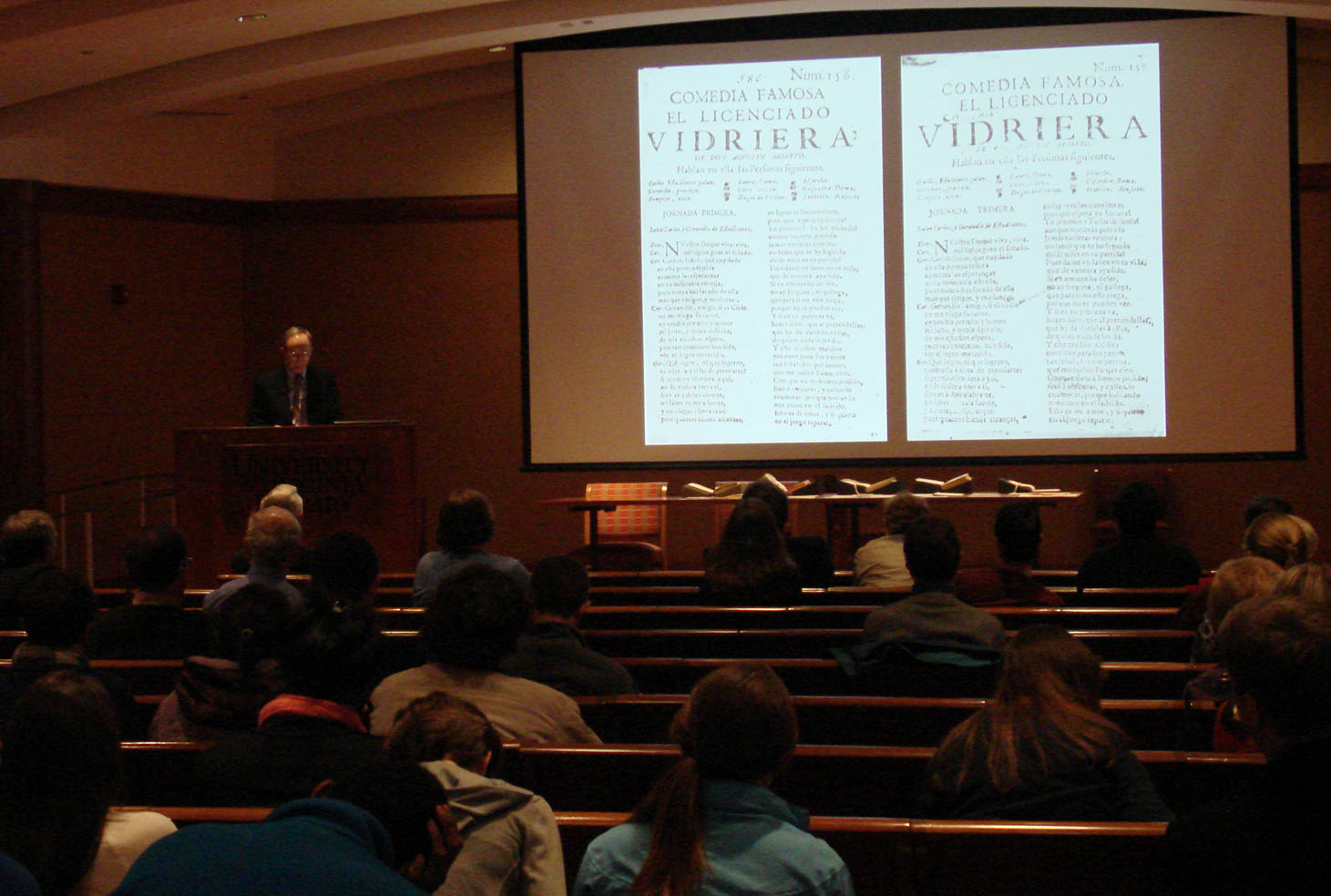
David Whitesell gives his well-received talk on viewing bibliography through Spanish Golden Age drama in the Harrison-Small Auditorium, 22 March 2013. (Photograph by Petrina Jackson)
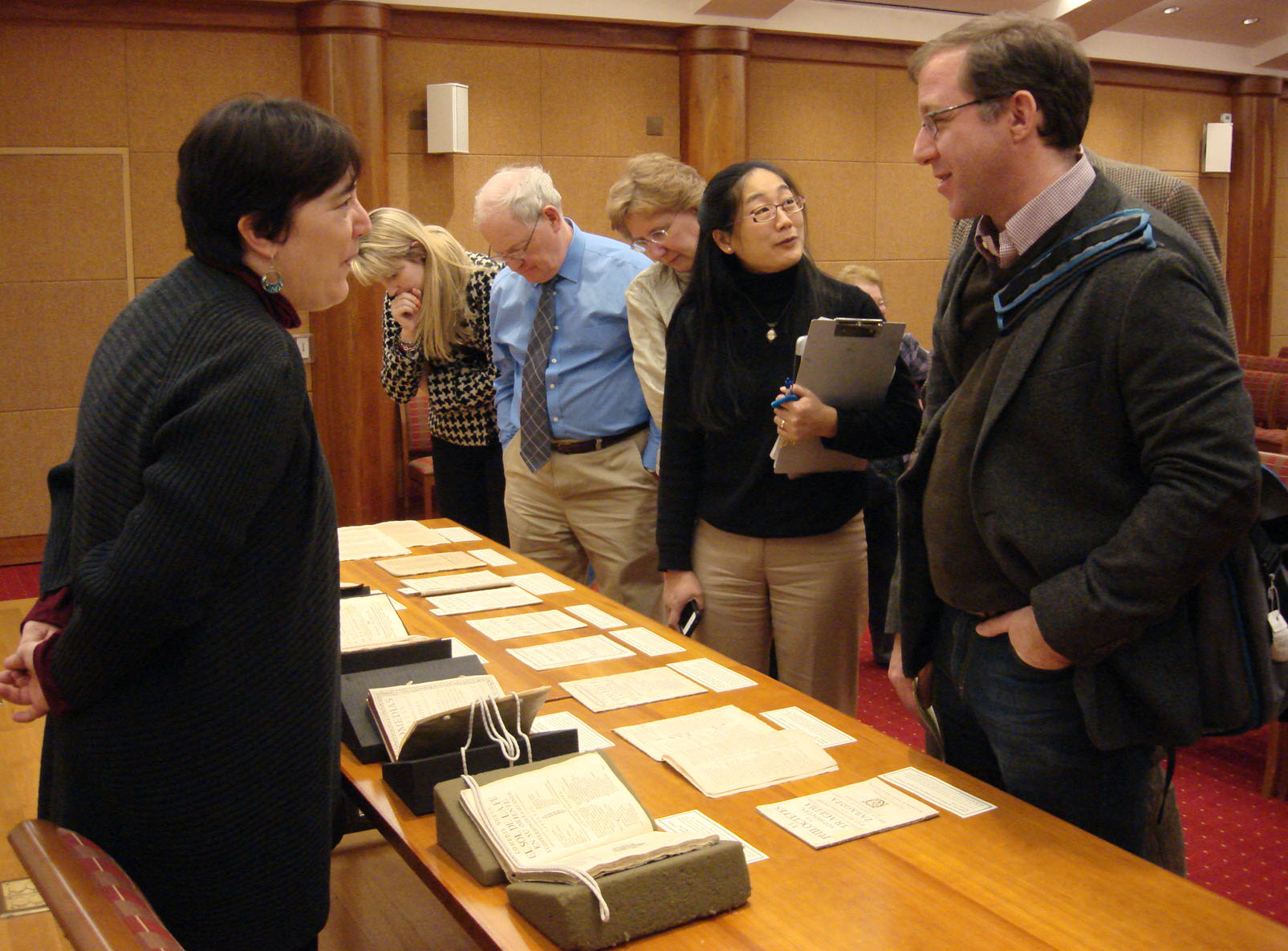
Special Collections Director Nicole Bouché and Associate Professor of English Andy Stauffer chat as audience members view examples from David Whitesell’s personal collection of seventeenth- and eighteenth-century Spanish plays. (Photograph by Petrina Jackson)
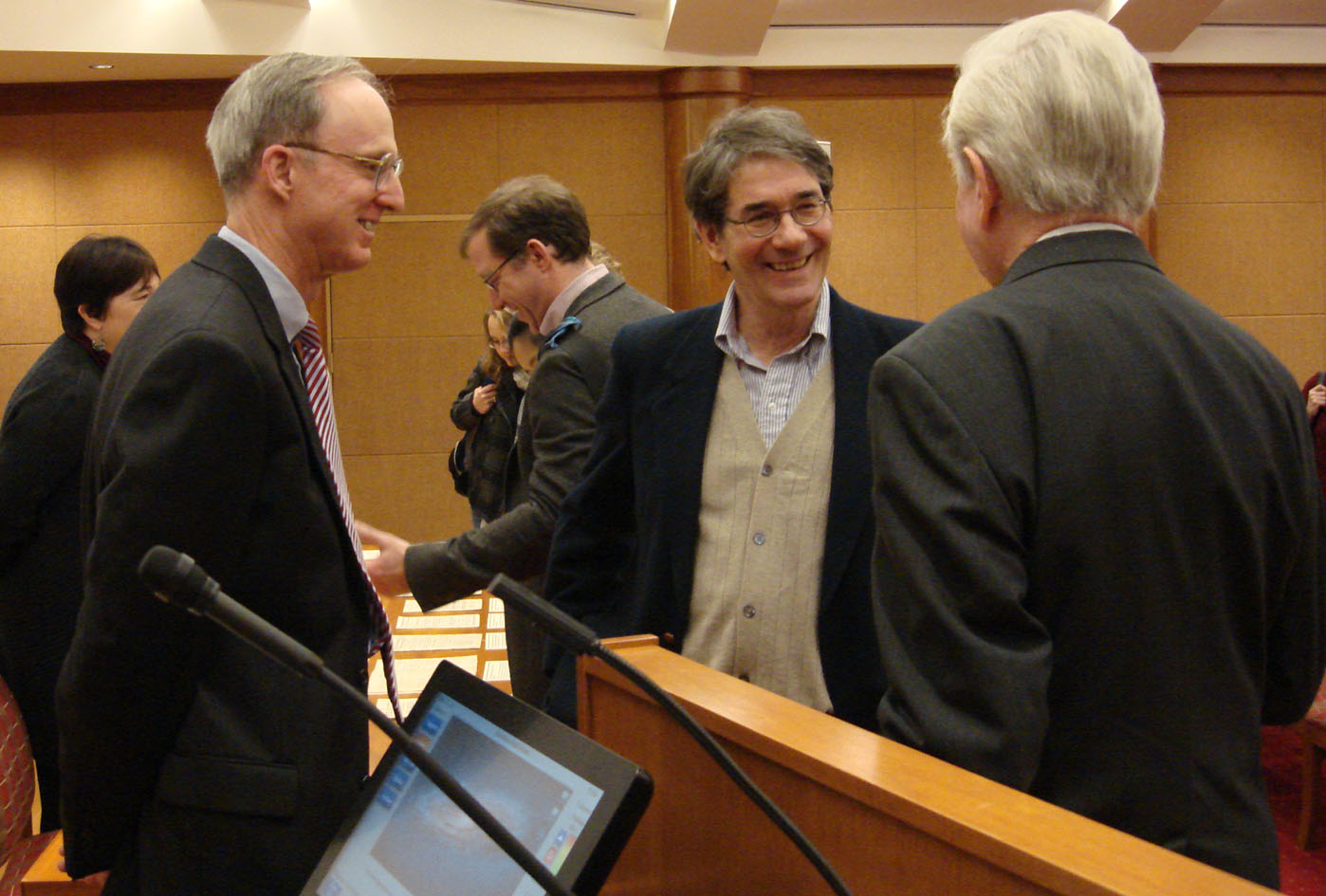
David Whitesell, Michael Dirda, and G. Thomas Tanselle share a laugh after the talk (in foreground from left to right). Michael Dirda is a Pulitzer Prize-winning book critic for the Washington Post, and G. Thomas Tanselle is the President of the Bibliographical Society of the University of Virginia. (Photograph by Petrina Jackson)

The Codex is Not the Only Book: the iPad, the Poet, and the Artist and Monumental Ideas in Miniature Books

Molly performed at two Virginia Festival of the Book events on the same day: first as a panelist and second as an exhibition guide.

The panel, “The Codex is Not the Only Book,” featured Virginia poet Mary-Sherman Willis, Charlottesville publisher Katherine McNamara, and Molly. The three discussed the 2012 ebook of Willis’s poem Caveboy, illustrated by Collin Willis and designed and published by McNamara at Artist’s Proof Editions. It was published around the same time as a limited-edition print book, which contains the same text but a radically different overall design; this volume was designed and produced by Collin Willis for Artist’s Proof.

As a panelist, Molly discussed her long-standing interest in how readers perceive e-books and how special collections libraries should begin thinking about preserving examples for the long term—a project that the field is just beginning to consider. She spoke about the ways that reading an ebook like Caveboy raises questions in the reader about the lines between the roles of the writer, publisher, and the software platform—in this case, Apple’s iAuthor. And she described some of the questions special collections librarians are asking themselves about creating a historical record of the digital revolution in book production—could a library actually acquire an ebook, rather than simply purchase access to a file? If so, where would that ebook end, and the interface begin? How will researchers look back at the early ebook phenomenon in twenty, fifty, or five hundred years?

Hosted by the member artists of Virginia Arts of the Book Center, Molly gave an engaging exhibition talk on Monumental Ideas in Miniature Books, a travelling exhibition that features 87 miniature books by artists from eight countries.  In her talk, she discussed the artistry of books and the relationships between miniature books, altered books, and artists’ books.

Molly Schwartzburg discusses Envelope Journal No. 3 by Jesse Alan Brown with exhibition viewers. Brown’s work is made of No. 3 coin envelopes, magnetic clasps, and PVA adhesive. (Photograph by Petrina Jackson)
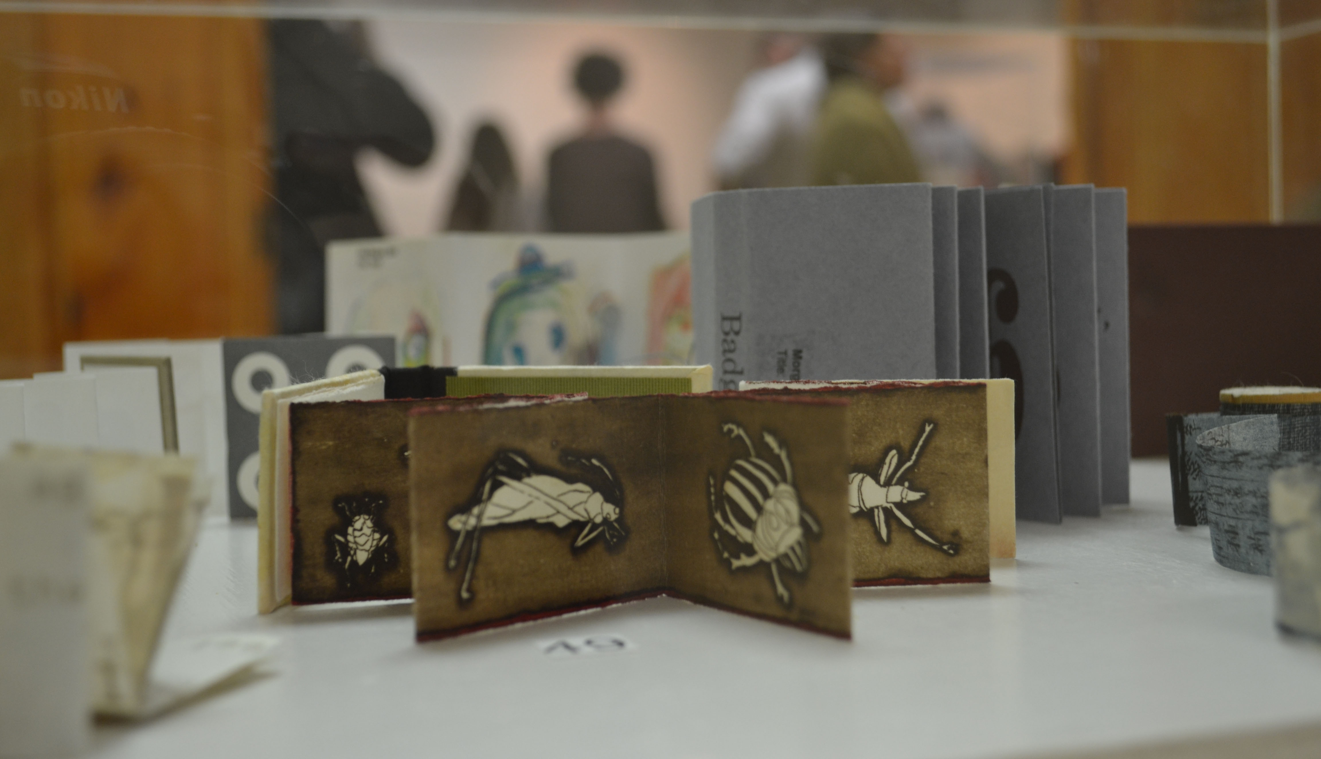
Insects by Sarojini Jha Johnson is featured in the foreground of the case. (Photograph by Tessa Currie)
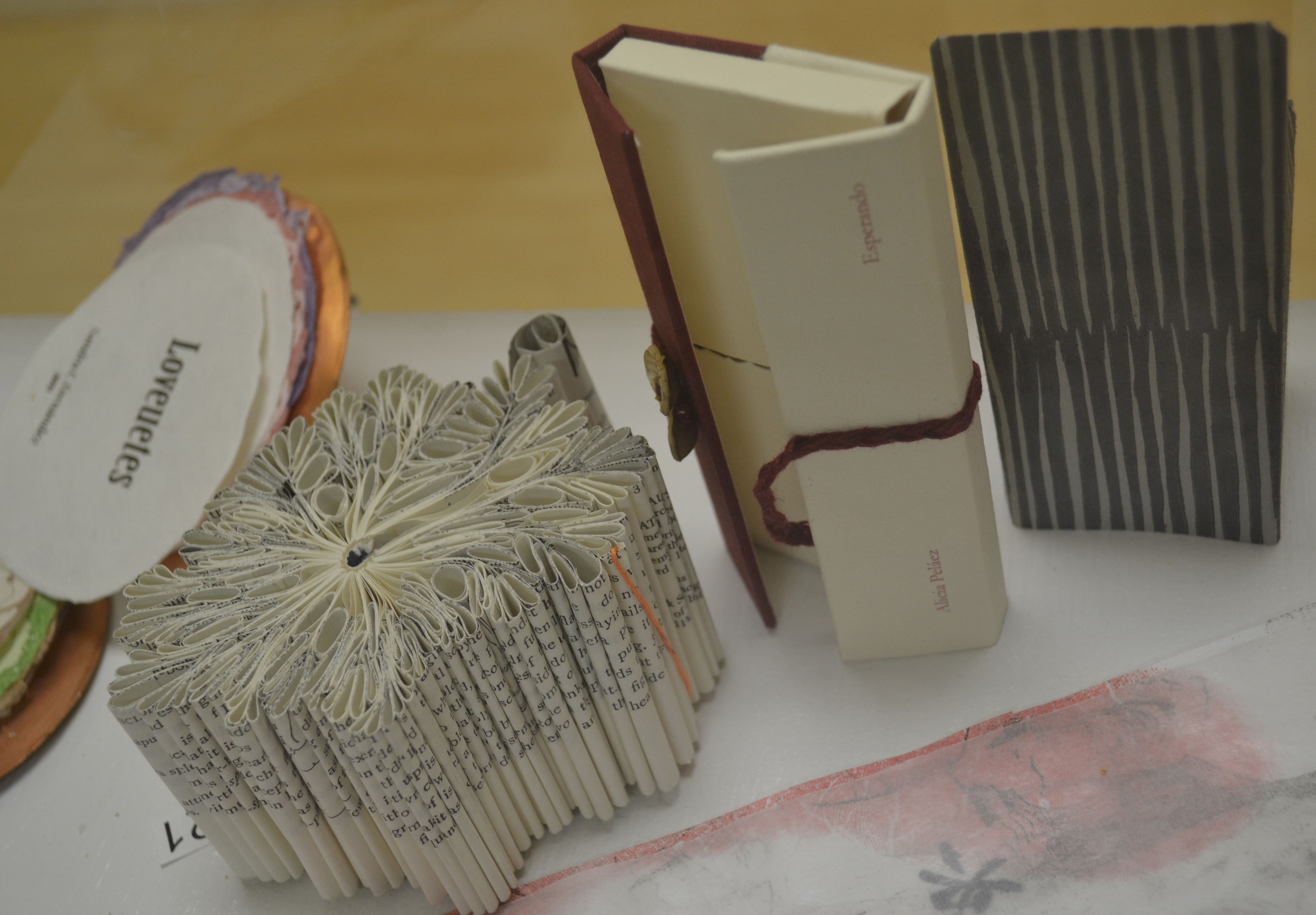
Stefanie Dykes’ altered book, Querl, and Alicia Pelaez Camazon’s artist book, Esperando, appear prominently in the foreground of this case. (Photograph by Tessa Currie)

Unlikely Heroes in Youth Adult Books

U.Va. graduate (Class of 1999), former Special Collections student employee, and author Lex Hrabe was a panelist for the Saturday session at the book festival. During the week, he had given talks to two schools, including his alma mater St. Anne’s-Belfield (Class of 1995), and was a panelist for Unlikely Heroes in Youth Adult Books.  Lex is one half of Lex Thomas, the pen name for the writing team of Lex Hrabe and Thomas Voorhies.  The duo wrote the young adult thriller Quarantine: The Loners, which was the subject of his talks.  Lex’s proud mother Margaret Hrabe is the reference coordinator for the Albert and Shirley Small Special Collections Library!
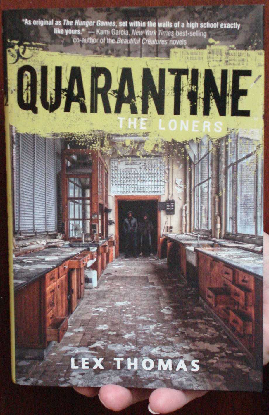
The YA novel Quarantine: the Loners is first in a trilogy, and was published in July 2012;  book two Quarantine: the Saints will be in bookstores on July 9th of this year. (PZ7 .T366998 Qud 2012. Photograph by Petrina Jackson)
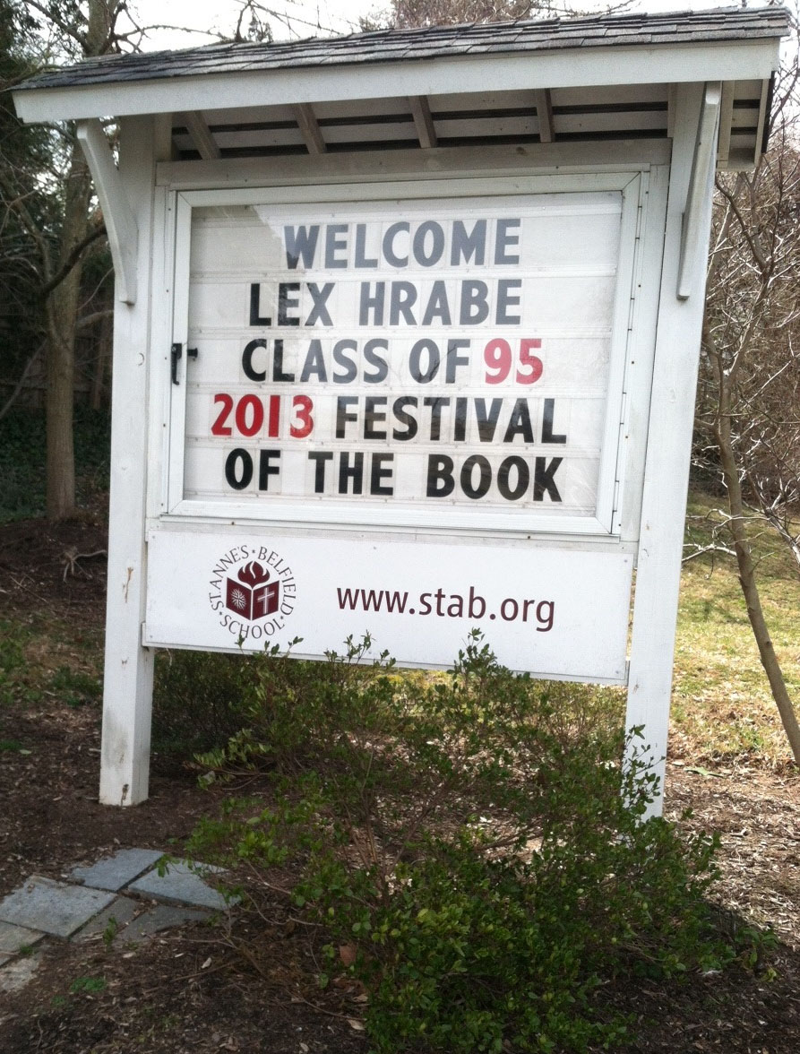
Sign at St. Anne’s Belfield School announcing author and alum Lex Hrabe ’95 for his book talk (Photograph by Margaret Hrabe)

Lex Hrabe talks to students at St. Anne’s-Belfield. (Photograph by Margaret Hrabe)

We hope you all get to join us next year at the Virginia Festival of the Book.  Be sure to check out Special Collections’ involvement!


The Great and Powerful Baum and Denslow

Before the 1902 Broadway stage production, the 1939 MGM movie, the 1974 African-American retelling The Wiz, the 1995 parallel novel of the witches’ stories, Wicked, and Disney’s Oz the Great and Powerful (which, by the way, is bringing in profits worthy of all of the riches of the Emerald City) there was the children’s novel, The Wonderful Wizard of OzThe Wonderful Wizard of Oz was written by L. Frank Baum, illustrated by W. W. Denslow, and published by the George M. Hill Company in 1900.

Special Collections houses a number of remarkable Oz-related items, including several copies of the first edition of The Wonderful Wizard of Oz, of which two are presentation copies from the author: one with sweet notes to his son and one to a colleague’s child.

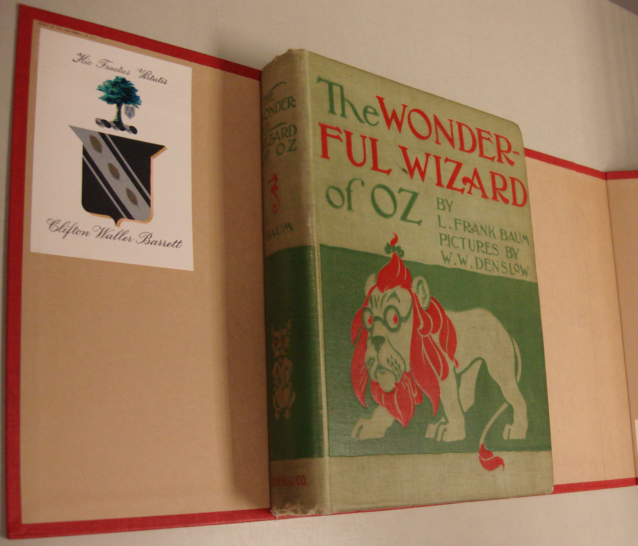
Featured is a first edition, first issue of the book with its original light green cloth cover, stamped in dark green and red. The newest film invents a backstory for the cowardly lion. (PS3503.A9228 W6 1900, Clifton Waller Barrett Library of American Literature. Photograph by Petrina Jackson)

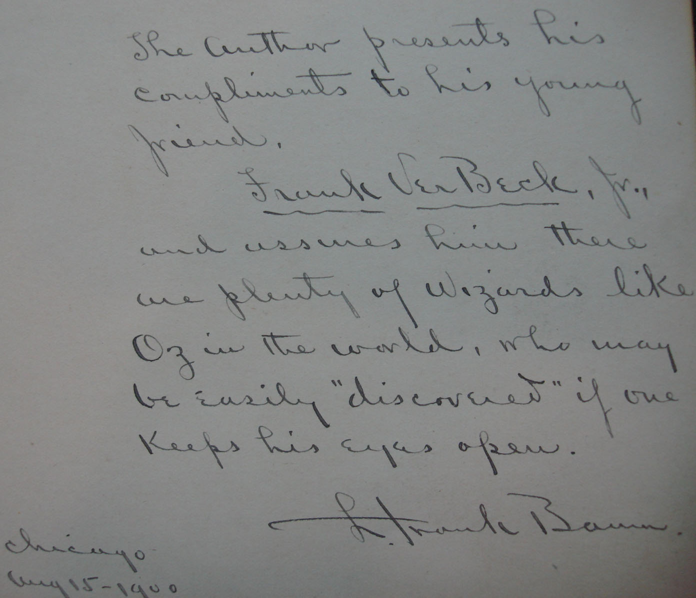
Baum inscribed a special message to a young reader on the endpaper of this first edition of The Wonderful Wizard of Oz. The boy was likely the son of the illustrator Frank VerBeck, who illustrated Baum’s book, The Magical Monarch of Mo. To VerBeck, he writes, “The author presents his compliments to his young friend, Frank VerBeck, Jr., and assures him there are plenty of Wizards like Oz in the world, who may be easily ‘discovered’ if one keeps his eyes open. L. Frank Baum. Chicago Aug 15-1900.” (PS3503.A9228 W6 1900, Clifton Waller Barrett Library of American Literature. Photograph by Petrina Jackson)


Page 63 of this first edition is inscribed “To ‘Earle’ With my most sincere regards From M.G.M’s cowardly Lion Bert Lahr.” (PS3503.A9228 W6 1900, Clifton Waller Barrett Library of American Literature. Photograph by Petrina Jackson)

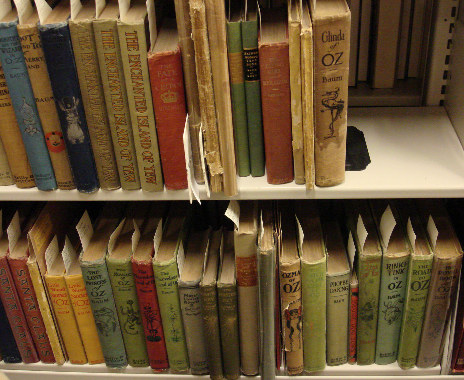
L. Frank Baum wrote eighteen books and short stories about the world of Oz.  Special Collections has several first and early editions of sixteen of the Oz series books, and many of them have the bookplate of Roland Baughman, who was a collector of L. Frank Baum first edition books, manuscripts, correspondence, and original drawings of “Oz” illustrators.  Columbia University’s Special Collections holds the Roland Orvil Baughman Collection about L. Frank Baum, 1871-1961.  Baughman served as the head of Columbia University’s Special Collections Department from 1946 until his death in 1967.

Here is a sampling of the dozens of first and early editions of L. Frank Baum’s “Oz” books in our stacks. (Photograph by Petrina Jackson)

Our Oz materials are not limited to first-edition books: also to be found are the screenplay from the 1939 MGM movie, items related to the “Oz” stories, and books and drawings of its first illustrator, W. W. Denslow.

Our Baum holdings also include movie magic! A horizontal view of the stacks shows the screenplays of the 1939 movie, The Wizard of Oz, and MGM’s copies of the early Broadway production, for which the musical was based. (Photograph by Petrina Jackson)

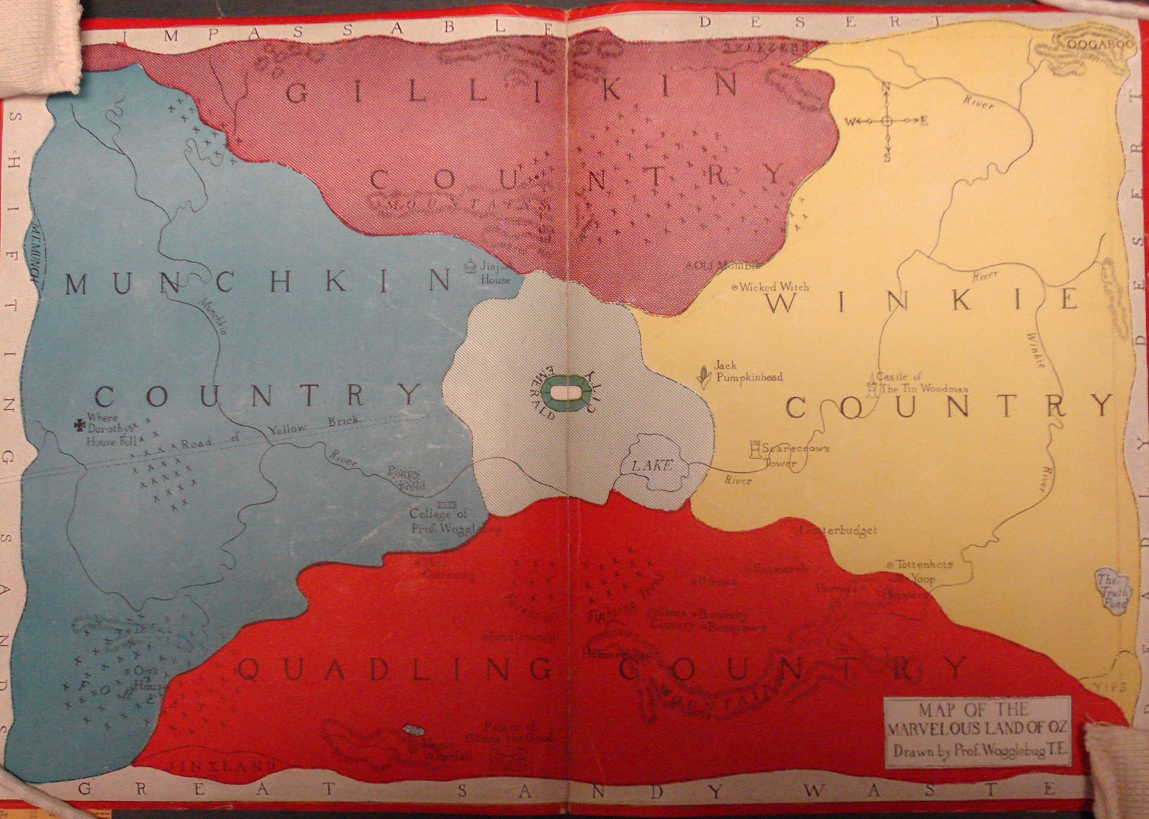
The Map of the Marvelous Land of Oz is the first printed map of Oz and appeared as the endpapers of Baum’s 8th Oz book, Tik-Tok of Oz ,1914. Note where Dorothy’s house fell in Munchkin Country, aka Munchkinland. Special Collections owns an unusual loose copy of the map. Viewers of the most recent Oz film will recognize Quadling Country, since the Quadlings play an important role in the new film’s plot. (PS3503.A9228 T3821, Clifton Waller Barrett Library of American Literature. Photograph by Petrina Jackson)

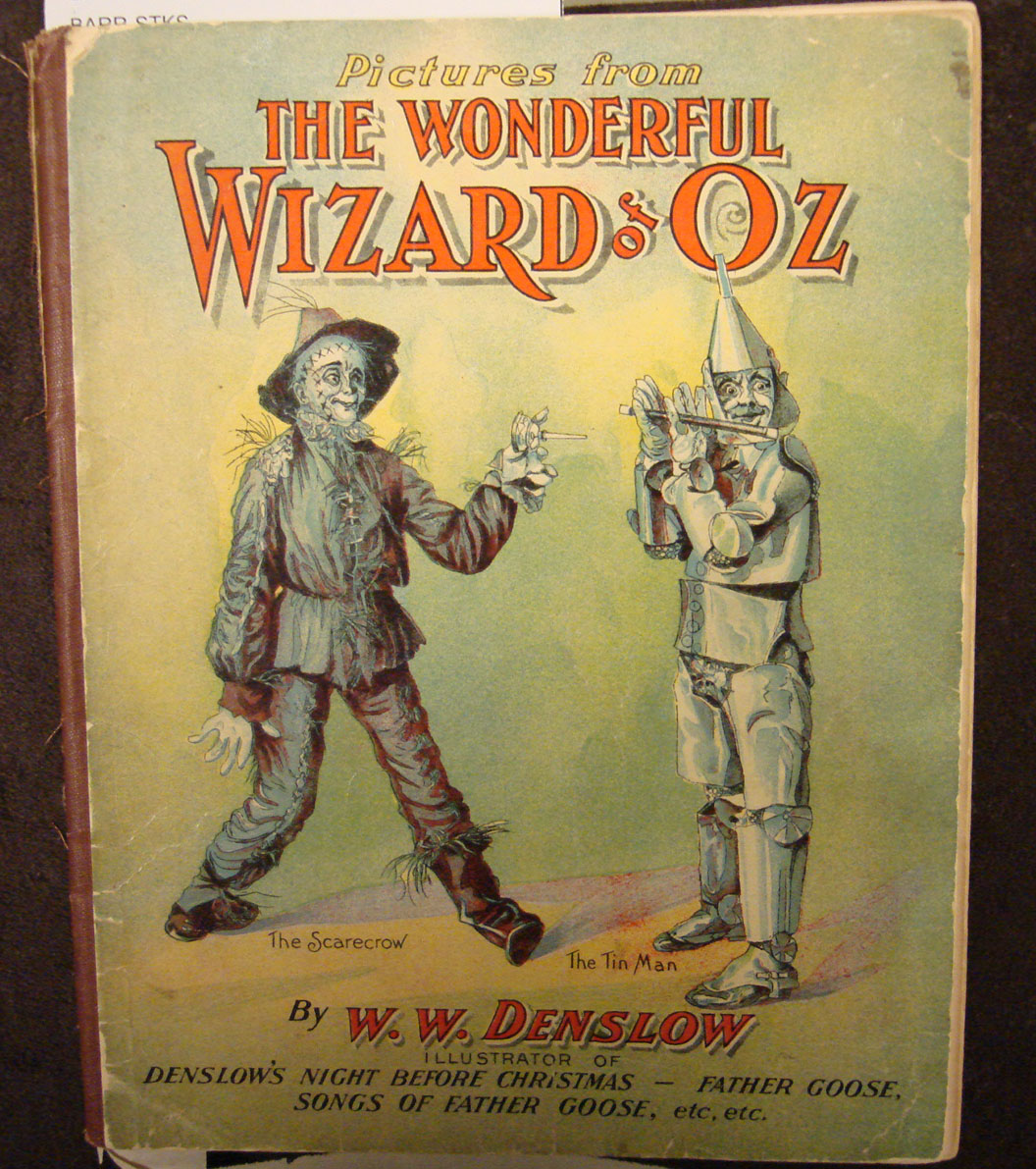
W. W. Denslow’s Pictures from the Wonderful Wizard of Oz. (PS3503.A9228 W66, Clifton Waller Barrett Library of American Literature. Photograph by Petrina Jackson)

Denslow collaborated with Baum on four books, including the first of the Oz series, The Wonderful Wizard of Oz and Father Goose, His BookFather Goose was a true collaboration between the author and the illustrator and resulted in a bestselling children’s book of nonsensical poetry and stylized characters.  The same company that produced The Wonderful Wizard of Oz published Father Goose in 1899.  Its success helped to make the Wizard of Oz possible.

Perhaps the most important Oz-related materials in Special Collections have nothing to do with Oz itself, but with Father Goose, for which original Denslow drawings reveal the book’s design:

This is the original painting by W. W. Denslow of the cover art of L. Frank Baum’s Father Goose, His Book. With its pudgy characters, it appears that the drawing was made for a book with a “landscape” orientation. (MSS 10064, Clifton Waller Barrett Library of American Literature. Photograph by Petrina Jackson)

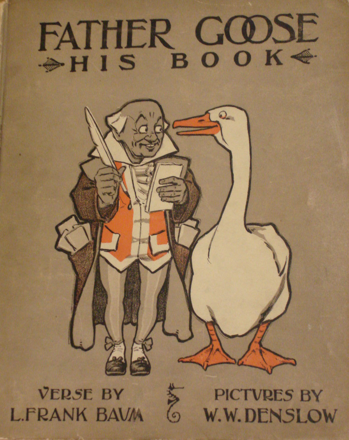
Here we see that the characters on the cover of Father Goose, His Book have evolved from Denslow’s original painting. The characters are much more elongated, and the book was published in “portrait” format. The copy shown is the second edition, published in 1899. (PS3503.A9228 F3 1899, Clifton Waller Barrett Library of American Literature. Photograph by Petrina Jackson)

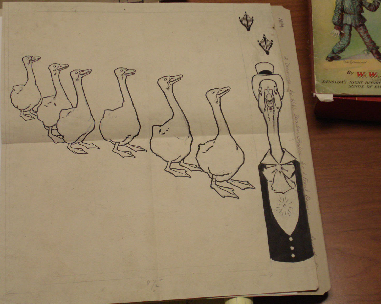
Also in Special Collections is the original pen and ink drawing of the back cover of Father Goose, His Book, accompanied by the marvelous Father Goose figure that appears on the endpaper. (MSS 10064, Clifton Waller Barrett Library of American Literature. Photograph by Petrina Jackson)

We end with the end of the book, its cover at least! (PS3503.A9228 F3 1899, Clifton Waller Barrett Library of American Literature. Photograph by Petrina Jackson)
In this age of sophisticated digital special effects, we hope you have enjoyed this trip back to the not-so-distant, but definitely magical, land of Baum and Denslow.

This Just In: An Artist’s Book from CODEX

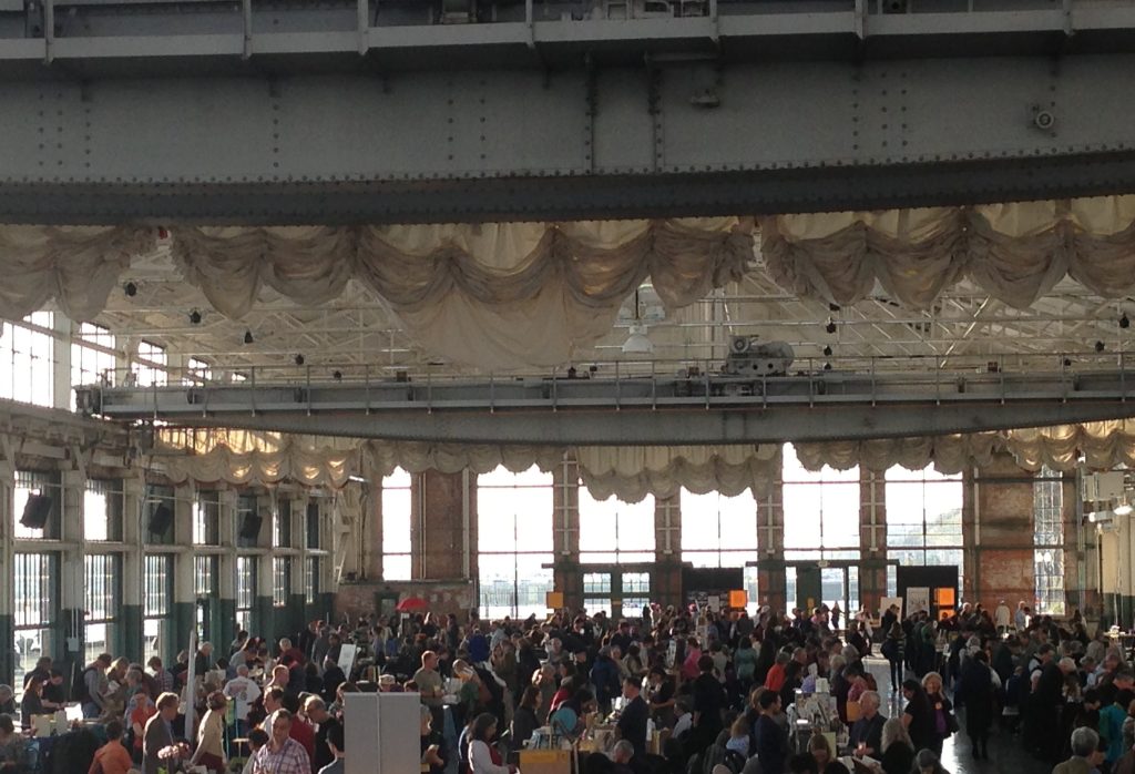
In mid-February, I took a trip out to the San Francisco Bay Area to attend the biennial Codex International Book Fair, which began in 2007 and has emerged as the premier venue for artists, printers, and dealers to display and sell artists’ books, fine press editions, and book art, with a particular emphasis on fine limited editions. Held this year at the beautiful Craneway Pavilion in Richmond, which overlooks the San Francisco Bay, the fair was a light-filled, dazzling display of creative production and craftsmanship. This new venue was necessitated by the growing number of visitors and exhibitors at the last fair. If, as they say, the book is a dying medium, “they” haven’t seen the diverse productions of book artists in recent decades, nor have they observed the increasing visibility of artists’ books beyond the small world of book artists and collectors.

Looking down on the Codex booths and buyers. (Photo by Molly Schwartzburg)

I went to the fair seeking items that would help us expand Special Collections’ already robust and diverse collection of artists’ books and fine press editions, which are used widely in teaching by academic and Rare Book School faculty alike. I left having met dozens of artists, printers, and publishers from around the world, and waited eagerly for the arrival of my various purchases for the collection.

A great artist’s book is like a great poem. When you read such a poem the first time, you see it whole, appreciate its beauty and formal sophistication, grasp it fully on some level. When you reread it, you suddenly find that you do not understand it at all, and you’re not even sure what questions you need to ask of the poem before you can begin to understand it again. The deep pleasure that poetry brings me begins when I start formulating these questions, and it does not end until I must put down the poem to go wash the dishes or answer my email. It is this type of engagement I seek when I am selecting artists’ books for the collection.

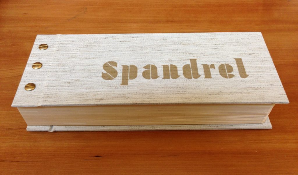
I had this kind of experience when I came across the elegant Spandrel, a collaboration between Frank Giampietro and Denise Bookwalter, published by Small Craft Advisory Press at Florida State University, which had a booth at the fair:

The front cover of Spandrel. The book is very thick and has the appearance of great heft, but is surprisingly light when you pick it up. This is due to the cut interior and the Hosho paper, which is thick and fluffy. (Photo by Molly Schwartzburg)

The title is an architectural term that refers to the empty space at the side of an arch (I can’t seem to explain this in words–I recommend that you Google it!). The press provides an excellent description of the book’s form: “Spandrel uses traditional and non-traditional processes to play with the reading of a poem.  One poem is on the first page and slowly transforms through the 150 pages into the second poem, which is on the last page.  In the middle of the book the text is unreadable but as the viewer nears the end the text comes back into focus.”

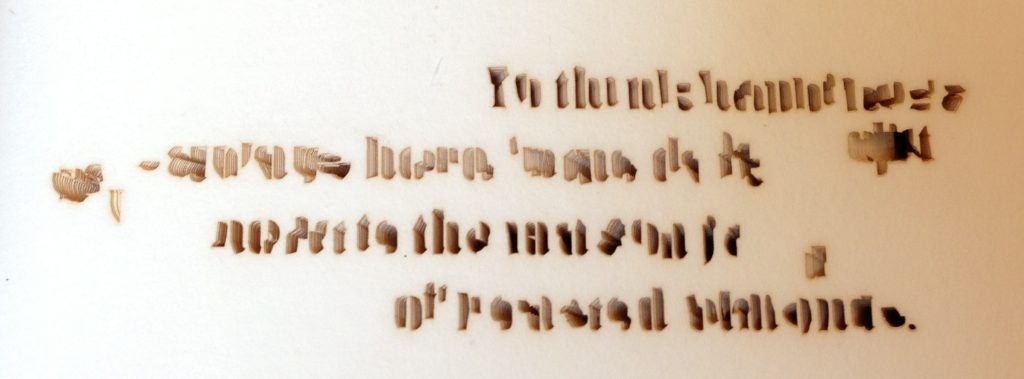
What this description doesn’t note is that none of this is printed: the text is an absence, cut out of the book with a laser, its font like a stencil. The shadows produced by the stacks of slowly shifting cuts on subsequent pages produces the visible text:

The first page of the text proper. (Photo by Molly Schwartzburg)

A detail view of two words on the first page of the book reveals the edges of cuts below. (Photo by Molly Schwartzburg)

The laser printing very slightly singes the page, producing a tinge of brown around each letter. Near parallels between the text of the poem and the form of the book begin to emerge as one considers the opening page: the singed pages and “roasted almonds” share the same color. The receding darkness behind each cut on the page seems somehow connected to the “dark cabinet.” There are disjunctions too: laser cutting is a relatively new technology associated with high-tech industry, while mason jars evoke homemade preserves. But this jar doesn’t hold preserves, just as this book doesn’t hold printing. Both hold something singed by heat. There is a sort of symmetry here.

But what happens next is more interesting. Looking at the first page, one might imagine that the entire text block (the “stack” of all of the book’s pages), was laser cut in one step. Page after page, the same poem appears again and again, but soon, it begins to shift slightly, and then more, until it moves towards illegibility and then back to legibility. Each page is cut separately from a series of digitally generated tempates:

Photo by Molly Schwartzburg

Photo by Molly Schwartzburg

Photo by Molly Schwartzburg

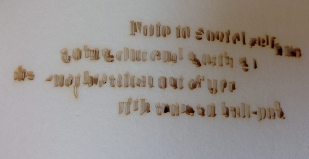
In the final pages, the text becomes clearer and clearer, and lighter and lighter, as there are fewer shadows to define the text. It finally resolves into this chilling poem, which takes more effort to read than the first one did:

Photo by Molly Schwartzburg

The image of domestic comfort in the opening poem is replaced by one of urban violence in the latter: ball-peen hammers are a dangerous weapon. The poem’s opening symbol of happiness–whole almonds protected in a clear jar inside a closed cupboard inside a home–is replaced by an image of the layers of someone’s skin, then skull, then brain being violently broken, shattered, and compressed respectively by a heavy blow. The lack of human actors in the first poem suddenly becomes apparent.

The second poem seeks actively to shock: mason jars are replaced by snot, and the strange elegance of the opening page is utterly lost.The reader begins shifting back and forth between the two poems, seeking to understand the differences between them, the justification for their juxtaposition, the physical location in which one word or phrase replaces another. I find my own mind running down multiple interpretive paths: which wins out in this book, happiness or the social self? What would happen if the two poems traded places, and it began with the social self and ended with happiness?  Once I come to the word “ball peen” this suddenly seems to be a book about a man, since I only associate this kind of violence with men. Is he the subject of both poems? Is there a woman in the domestic space of the kitchen? And why are there almonds in the jar instead of preserves? And while I’m at it, what does any of this have to do with spandrels? It has something to do with empty spaces, with round holes produced by a hammer, with jars, cupboards. With absence–an empty house with an empty space in a cupboard, and a “social self” who experiences only violence. What lesson am I to learn from all of this? What is the poet  telling me? What is the book telling me?

There are likely no clear answers to these questions; the two poems are not entirely symmetrical, do not have some kind of straightforward causal relationship. If they did, the book would fail because it would be clever, even smug. Instead, its mysterious, discomfitting texts and physical form together produce a fertile space for contemplating the poetry, heightening the reader’s capacity to observe the very specific elements of sentences, phrases, and lines. It is a dazzling example of the productive relationship that can exist between a book and its contents.

This is just one of the many wonderful items found at the fair. Too bad I have to wait two years for the next one!
If you get overwhelmed looking at books at Codex, step just outside and take in the view. The Bay Bridge may be seen on the left. (Photo by Molly Schwartzburg)


Exhibition Now Open: “Miniature Books and Money”

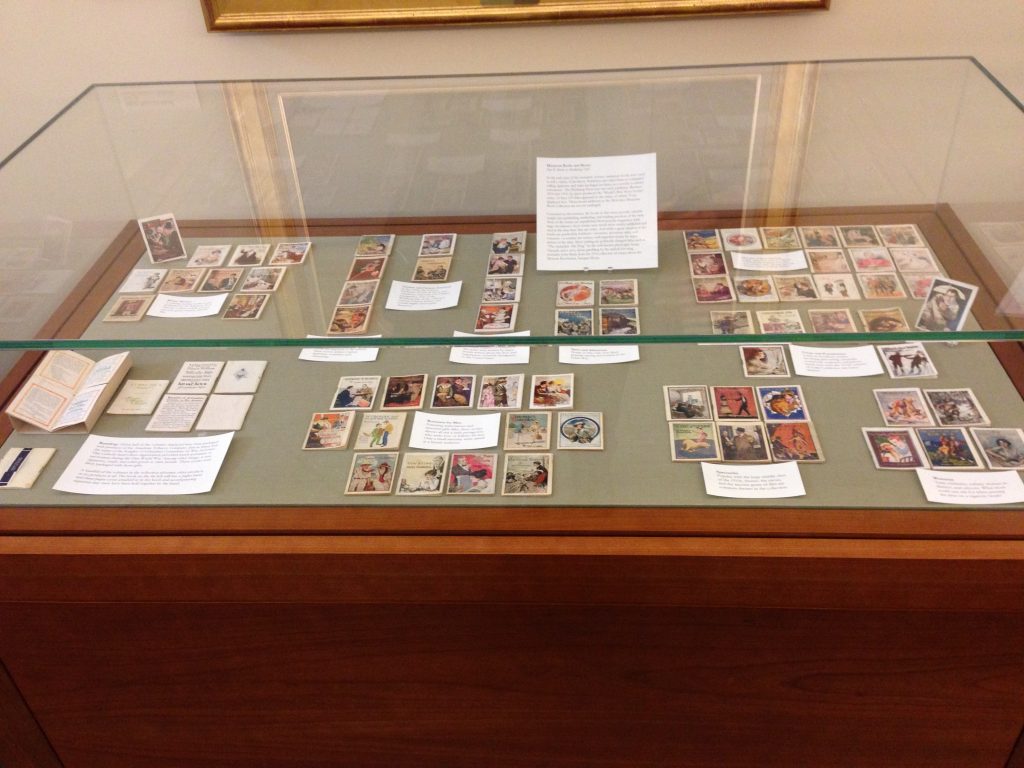
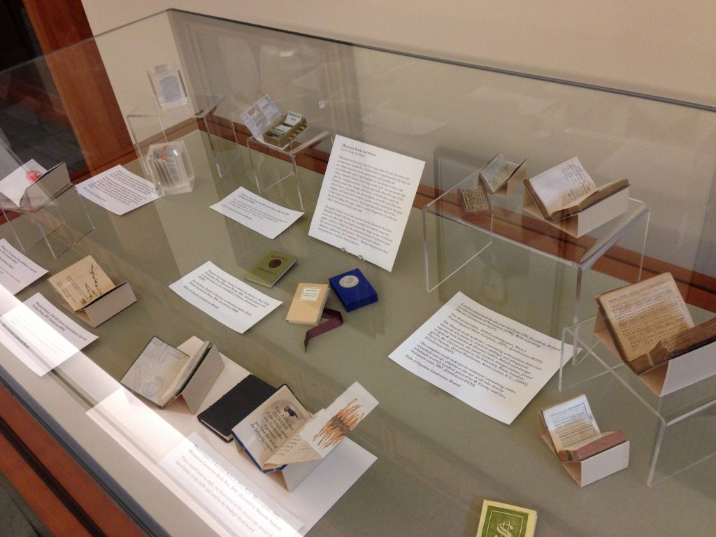
Come on by Special Collections to see our latest short-term exhibition, “Miniature Books and Money.” Drawing almost entirely from the McGehee Miniature Book Collection, the exhibition features almost 100 miniature books in just two exhibit cases, showcasing some of the ways that one topic–money–can be approached through this 12,000 item collection.

This exhibition is launched as a partner project to an exhibition currently on view at the Virginia Arts of the Book Center, Monumental Ideas in Miniature Books 2. Learn more about the VABC show here. You can visit the show at their space “Beneath the Art Box”  at 2125 Ivy Road, Charlottesville. Both exhibitions have been mounted in celebration of the 2013 Virginia Festival of the Book, which runs March 20-24.

Our theme was inspired by an artist’s book by Charlottesville book artist Amanda Nelsen, also featured at the VABC. Her book, entitled Fine Print, investigates the rhetoric of junk mail credit card offers with elegance, artistry, and humor.

“Miniature Books and Money” runs through April 18, and may be found on the First Floor Gallery of the Harrison Small building on the UVa Grounds during standard opening hours.

The exhibit features 79 volumes from the Winthrop Press, who provided tiny paperback editions of short stories to be packaged with cigarettes and other products in the 1910s. Come find out why so many of them are associated with the Catholic philanthropic organization, the Knights of Columbus.

If only we could make miniature labels for miniature books! But we worry about your eyes enough as it is…

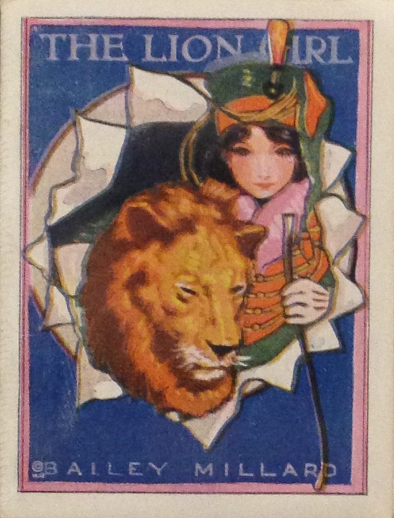
One of seventy-nine publications of the Winthrop Press in the exhibit, this book’s gorgeous cover image is cheaply printed.


How to make miniature book mounts with everyday library supplies: An Amateur’s Guide

When you apply for a job as a Special Collections curator, the required skills do not include “arts and crafts.” But an ability to work with your hands comes in handy, so to speak, especially when it comes to putting on small exhibitions on short notice. One of my favorite parts of the job is learning new and unexpected skills that help me to share our collections–especially when it means I get to play around with paper.

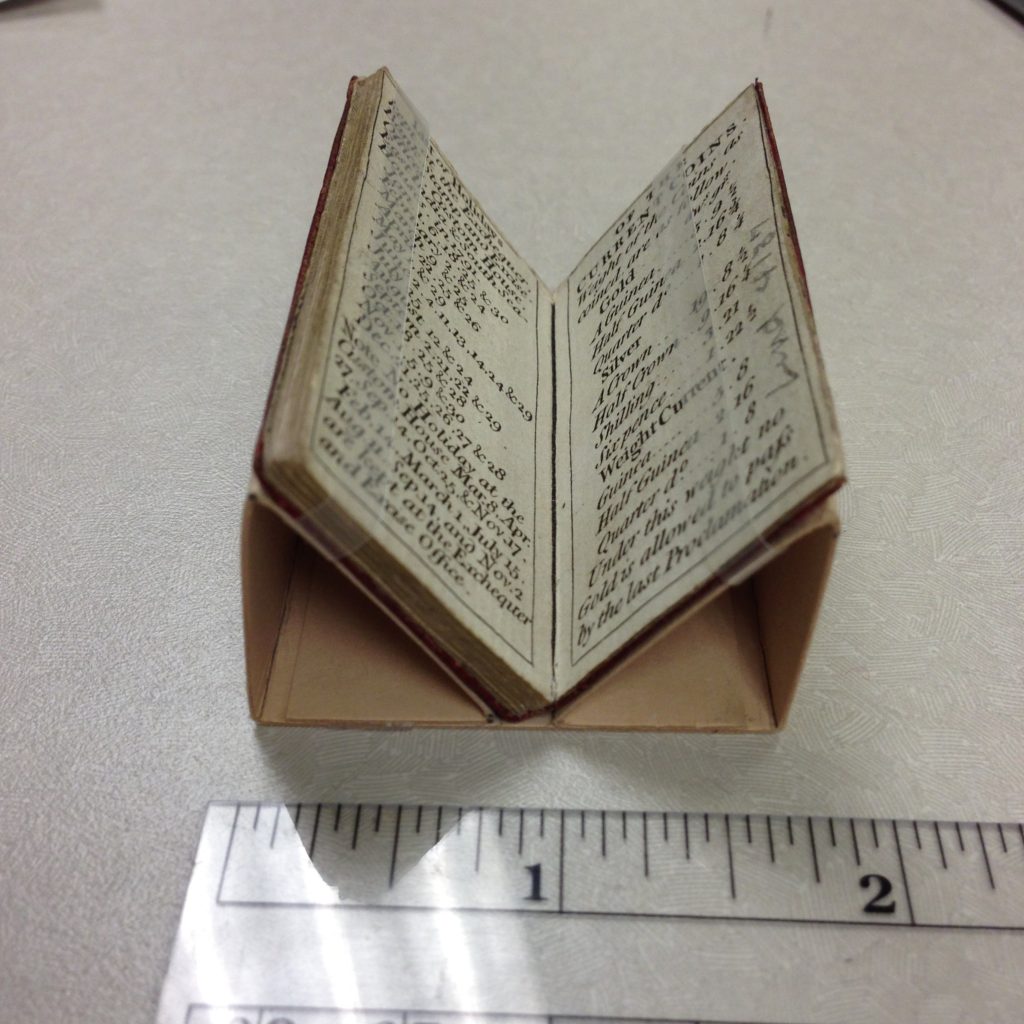
London Almanack for the Year of Christ 1791 ([London]: Printed for the Company of Stationers, [1790]. (Lindemann 04137, Photo by Molly Schwartzburg).

This week, I was thrilled to receive a quick and dirty lesson on how to make these simple but effective display cradles, courtesy of our book conservator, Eliza Gilligan. After some mumbled curses and false starts, I had soon produced half a dozen mounts that I believe would make her proud. If you’d like to display your own miniature books, take my lead and follow Eliza’s instructions, which are straightforward and allow you to leave your book safe on the shelf for almost the entire process.

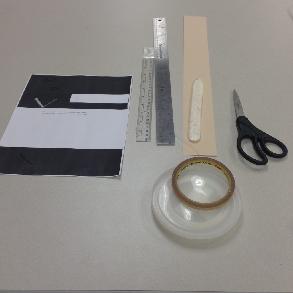
Step One: Gather Supplies

Photo by Molly Schwartzburg

Gather your supplies: rulers, bone folder, scissors, 20-point acid-free board (the weight used to make most collection housings), thin poly strap, narrow double-sided tape, and scissors. You’ll also need a photocopy machine. To get a nice clean cut when you slice your board, I recommend using a board shear, but scissors and a ruler will work in a pinch. Oh, you’ll also need a little book. Please note that these instructions apply only to miniature books, and may not succeed with larger books.

Step Two: Make your Template

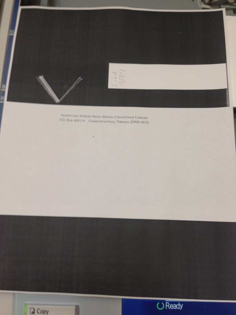
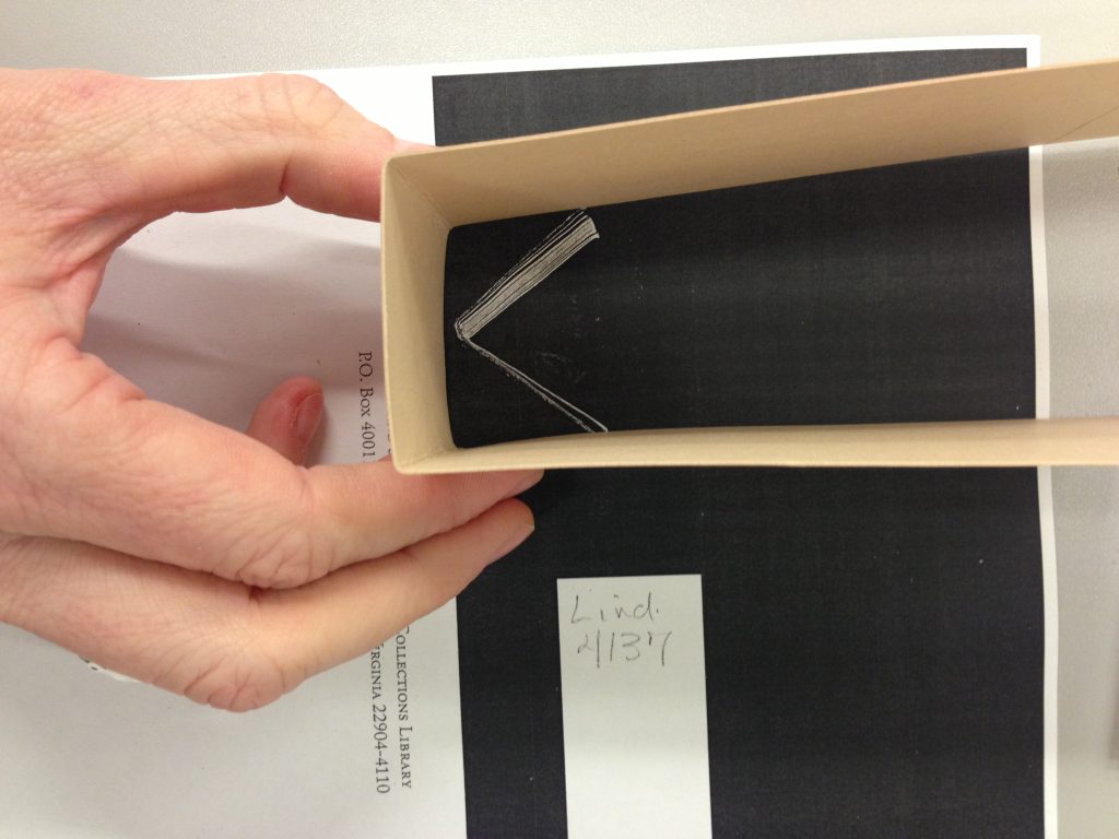
Consult with your conservator to determine a safe and healthy opening angle for your book. Hold the book open at this angle, standing upright in your photocopier, so the angle is visible to the camera. Place a straight-edge where the base of the item will be, and photocopy the book. I also included the call tag in my images, since I was photocopying several books at once and didn’t want to get them mixed up.

You’ll end up with an image that looks something like this:

Photo by Molly Schwartzburg

Step Three: Prep your board

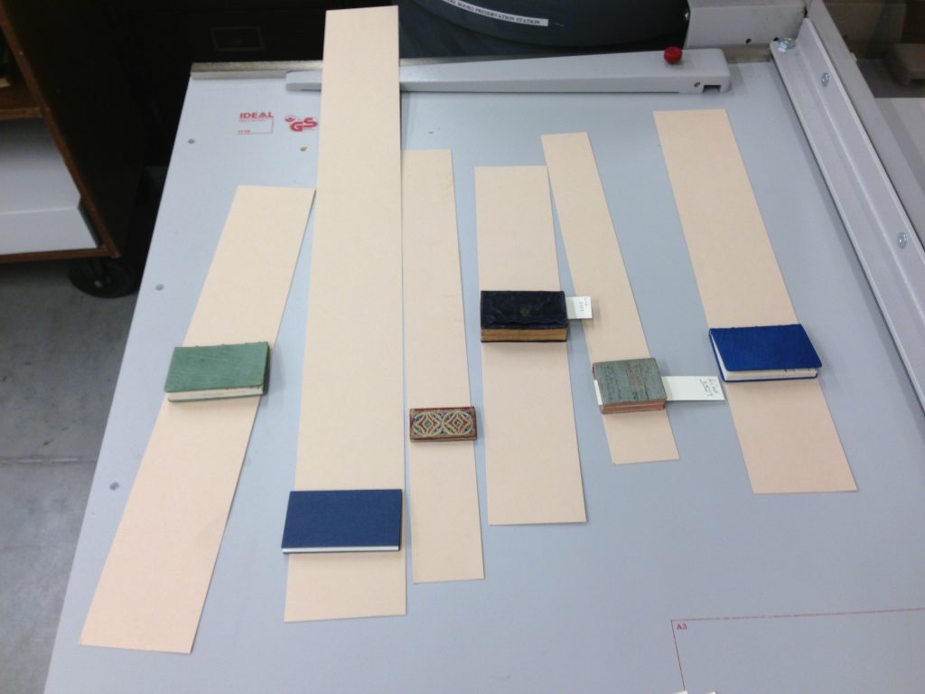
Cut a generous strip of board to the exact height of your miniature book. It must be the exact height so you do not place stress on the book’s edge when you strap it to the cradle later in the process. Don’t skimp on length until you know what you’re doing. The shortest of these pieces is plenty long.

Lots of minis, ready to go.  (Photo by Molly Schwartzburg)

Step Four: Make Your Six Folds

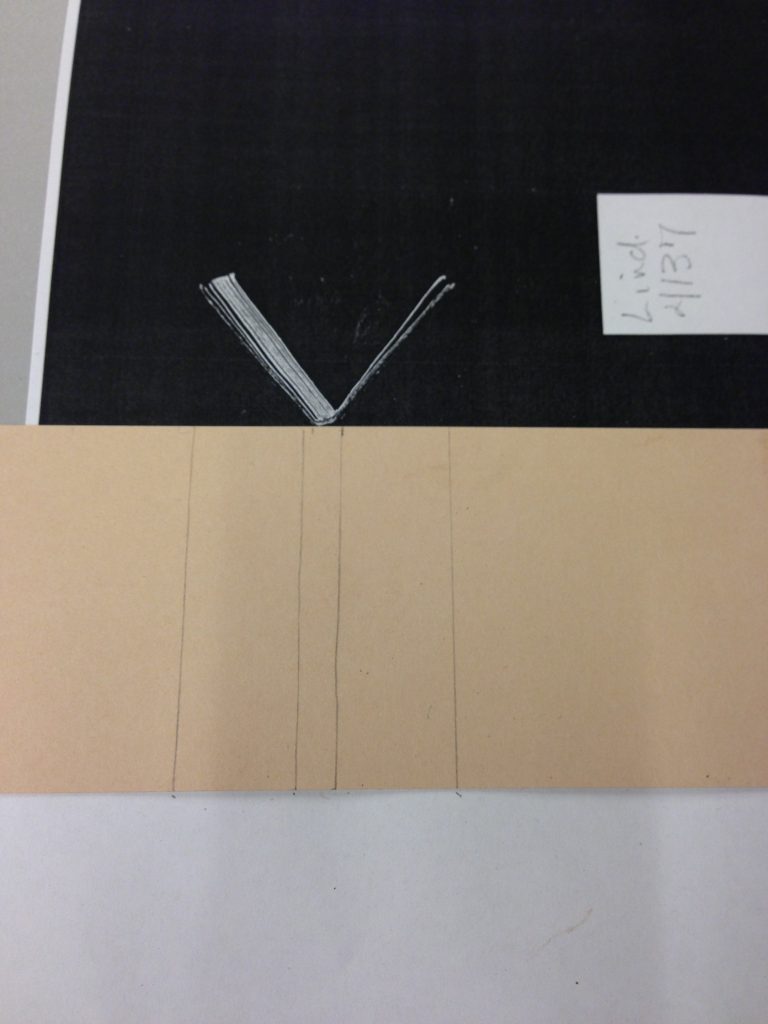
OK, now for the fun part. Put your miniature book somewhere safe (the little devils are easy to lose track of!) and clear your workspace. You will now use your photocopy as a template to determine the placement first for the binding to rest, and then for each of the six folds you will create.

Start by marking on either side of the spine–that is, whatever you do not want to rest on an angled surface. Then, use your ruler to mark a line that comes down at a 90-degree angle from just inside the edge of the book’s angled cover. If you line it up with the cover of the book exactly, your cradle will stick out and disrupt the view. Also be sure to keep your lines square with the top and bottom edge of the board. If you do not keep it square at all times, your cradle will be cocked.

Yes, those wavy lines were made with a ruler. I’m a bit embarrassed, but honesty is the best policy. (Photo by Molly Schwartzburg)

Fold up. I recommend using a heavy metal ruler for a nice solid edge. The board is stiff, so you’ll have to fudge with your lines to get the fold to rest exactly where you want it to (if this doesn’t make sense to you, try it and I think you’ll see what I mean). Folding is not an exact science. Did you remember to keep it squared up?

Don’t let that pesky cork get in the way of an accurate fold! Turn your ruler upside down for the best result. (Photo by Molly Schwartzburg)

Use your bone folder sharpen the edge of your fold.

I don’t know which paper tool I love more: the board shear or the bone folder. (Photo by Molly Schwartzburg)

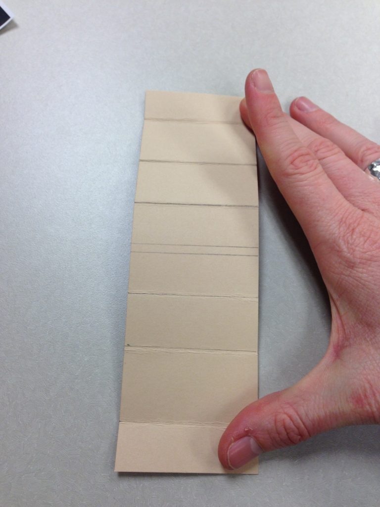
After you make your first fold, place it over the template to mark the next one, then flatten your paper and mark a fold line, and fold again. Be sure to mark on the inside of your board, since all your marks will fold inward. If this is too difficult, you can mark on the outside and then transfer the mark to the inside.

Be sure that this first fold is at a 90-degree angle when you make your mark for the next fold. (Photo by Molly Schwartzburg)

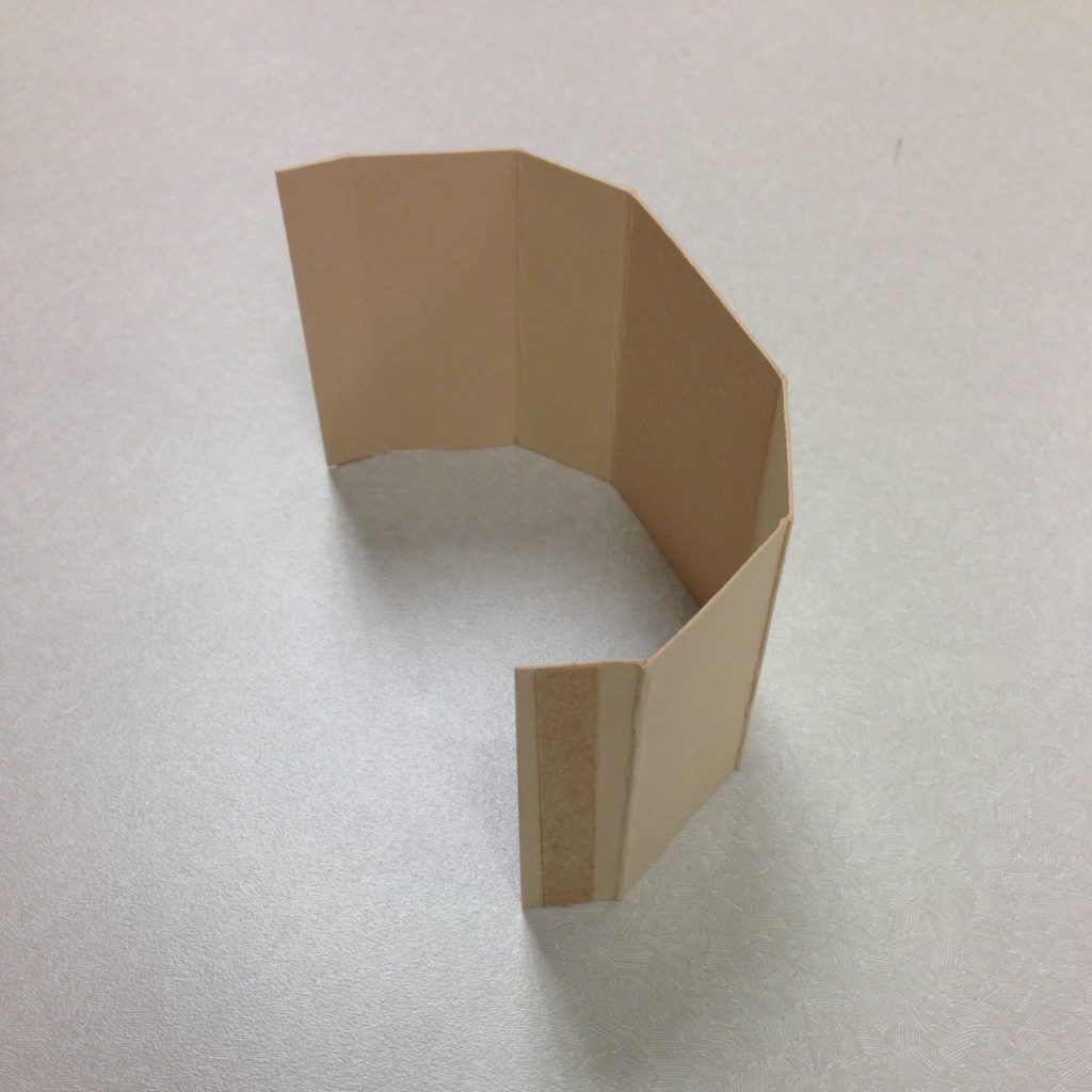
You will make three folds on each side. Return to the first image in the blog post if you need a reminder of your final goal. Don’t try to keep the first or second fold in place as you go–just turn the whole strip of paper around the template image as you work. You will need to trim excess paper off as you prepare to make your final fold. Be careful not to cut off too much–you’ll want a generous piece to tape to the base. Here’s what you’ll end up with.

Photo by Molly Schwartzburg

Step Five: Adhere Double-sided Tape

Place a line of tape on each of your final sections, on the outer side of your cradle. Fold in and adhere, being sure that your final fold lines up with your spine markers.

Double-sided tape before final placement. (Photo by Molly Schwartzburg)

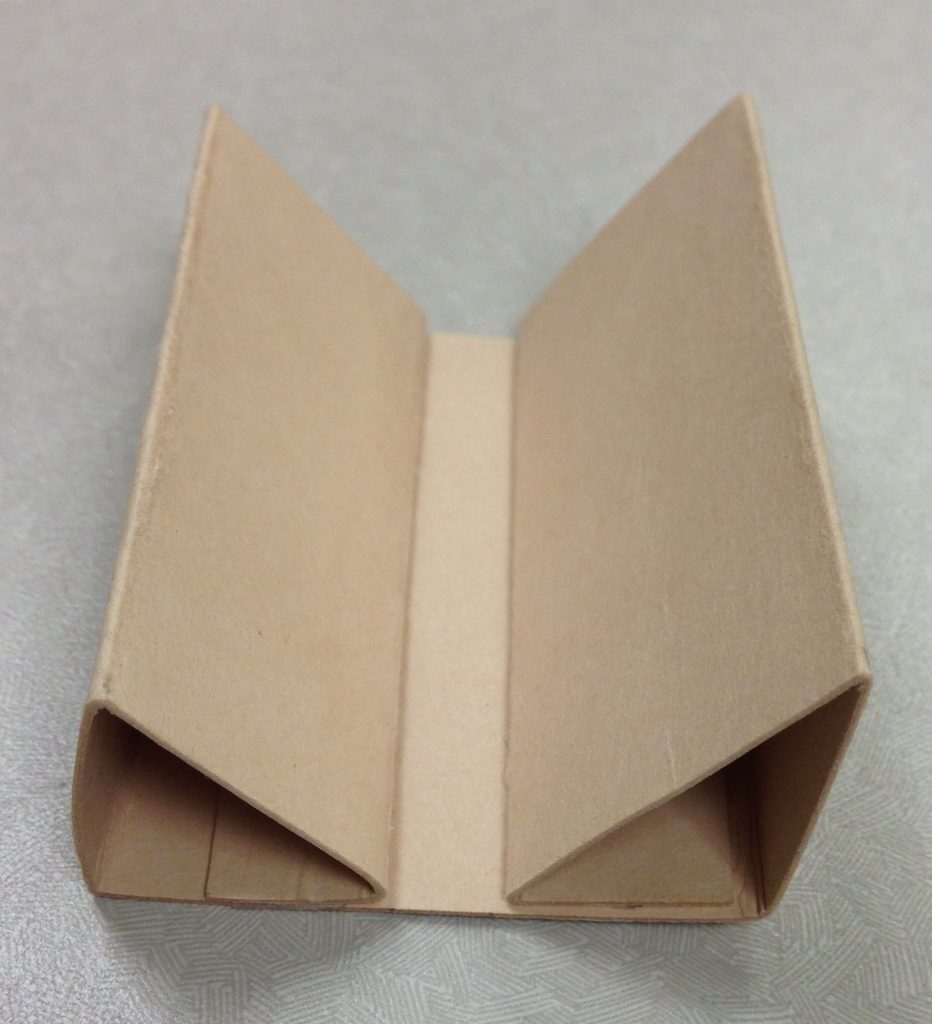
The next picture shows what your cradle will look like. Actually, it should look a lot better, as this was my first effort. Overall, this cradle is correctly assembled, but you can see the signs of my inexperience. On the right hand side, I did not achieve a right angle in my first fold, probably because I marked my folds inaccurately. The right side was not adhered squarely either; you can see that the folded section of board is not lined up with the edge of the base. As a result, the entire cradle is slightly cocked. I was less than consistent in my use of the bone folder, so the right-angle fold on the left is not solid. Finally, I made a marking error for my final fold on the left, resulting in an extra fold that had to be flattened out. You should expect to make all these errors and more your first time out!

So did I keep this first try for posterity? No way. Into the recycling bin it went. (Photo by Molly Schwartzburg)

Step Six: Strap Your Book

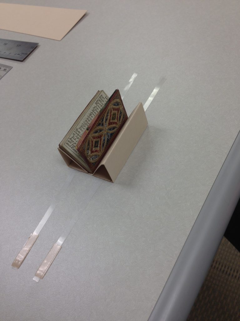
Place your miniature book in its cozy new cradle and strap it in, adhering the strap to the cradle. Most regular books require multiple straps to remain safely in a cradle without putting pressure on the text block, but many miniature books are very lightweight and only require one piece of thin strapping on each side. Use your judgment.

Double-sided tape adheres the strapping to your cradle. If you work in a shared space, be prepared to muffle your curses as you try to make this final step, as your fingers will seem too big and the spaces too small to ever get it all in place. Patience, grasshopper. (Photo by Molly Schwartzburg)

Step Seven: Admire Your Final Product!

This elegant little almanac is ready to go into the exhibition case, accompanied by its original matching carrying sleeve. Squee! (Photo by Molly Schwartzburg)

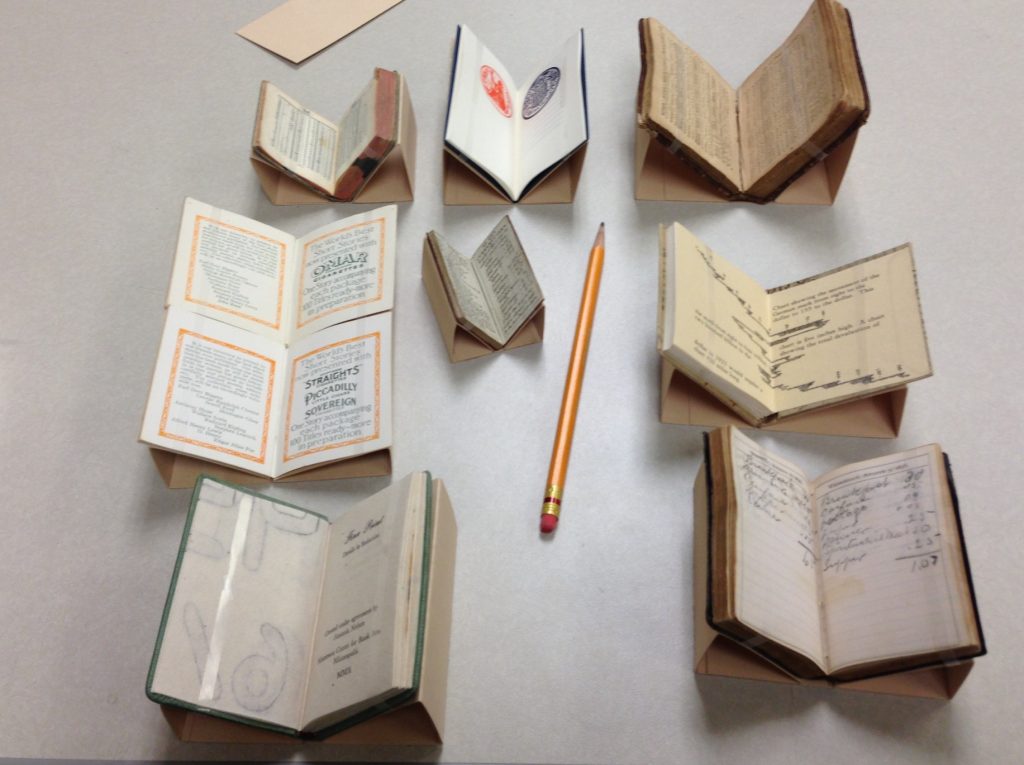
Warning: miniature cradle-making is addictive. (Photo by Molly Schwartzburg)

I hope this little tutorial is useful to you. Please let us know in the comments if you decide to use it for your own projects. Many thanks to Eliza Gilligan for her expert guidance. Now, go forth and fold!