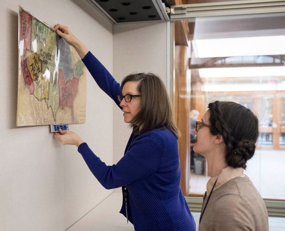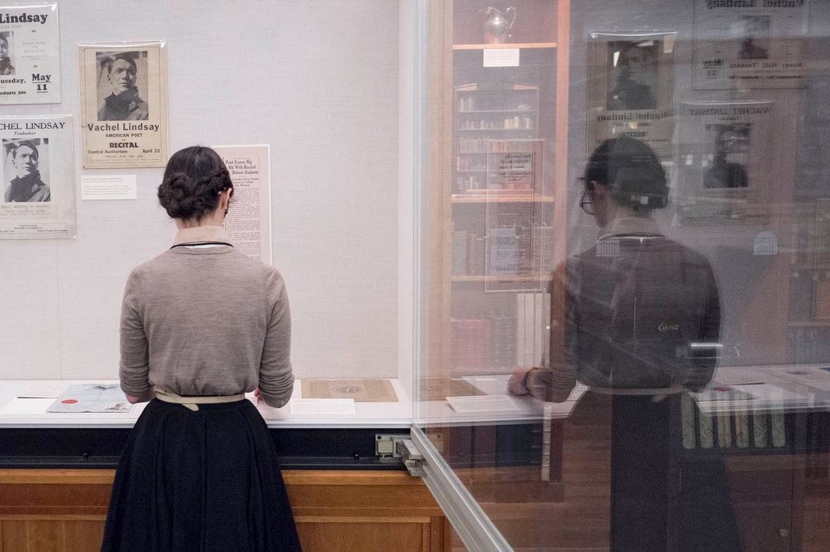

This week, we are pleased to feature a guest post by graduate curatorial assistant Elizabeth Ott, who has just finished preparing a small exhibition on a recently acquired magazine. The exhibition, The Gleaner: Documenting the Great War, opens Friday, August 8 and will remain on view through October.
While working on this serious exhibition, Elizabeth became increasingly distracted by the hilarious antics of the editorial team leading the magazine. In this blog post, she provides an overview of the magazine’s unusual editorial structure before sharing with you some of the tastiest tidbits.
In my work at Special Collections, I often come across items that are very easy to interpret when you hold them in your hands but become rather more complicated to describe to another person. Such an item is the recently acquired sixteen-issue run of The Gleaner (1910-1918). On its title page it declares itself an “amateur manuscript magazine,” an accurate yet vague description of an object that combines the methodology of a commonplace book or a picture album with the reflective qualities of a diary, the exchange of an epistolary correspondence, and the aspirations of literary quarterly. Its pages–a mix of handwritten and typed contributions alongside original works of art in pen, watercolor, charcoal, and pastels–tell the story of a fascinating community of men and women from across the United Kingdom in the years leading up to and during the Great War.
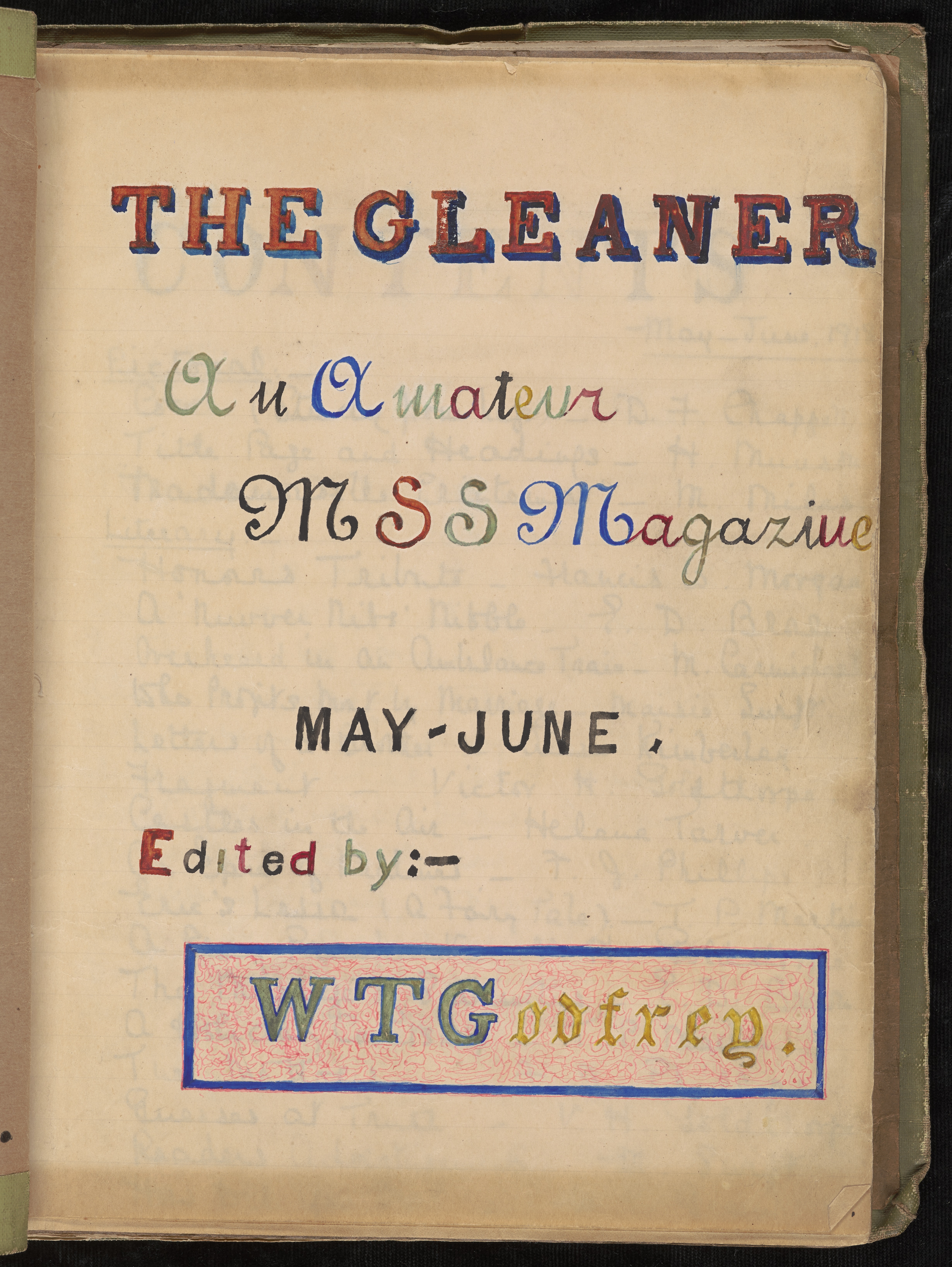
The title page for this issue from May/June 1918 features colorful calligraphy, contributed in lieu of an artistic submission. Members who failed to contribute at all to an issue were fined. (Not yet cataloged. Library Associates Endowment Fund.)
Each issue of The Gleaner is physically unique: only one copy was produced. Members submitted essays, stories, poems, drawings, etc. to editor Winifred T. Godfrey of Kew Gardens, Surrey. Godfrey collected and bound the entries inside an original cover (usually artwork submitted by a member), and added a table of contents, editorial preface, postal list, and section of criticism. Other features included a section where members voted for favorite submissions or left suggestions for future issues. Godfrey then mailed the completed magazine to the first member on the postal list. Each member was to keep the magazine for up to two days, then send it on to the next person on the list. When it had made its rounds, it was returned to Godfrey, with the critical remarks of each member to be added to the next issue.
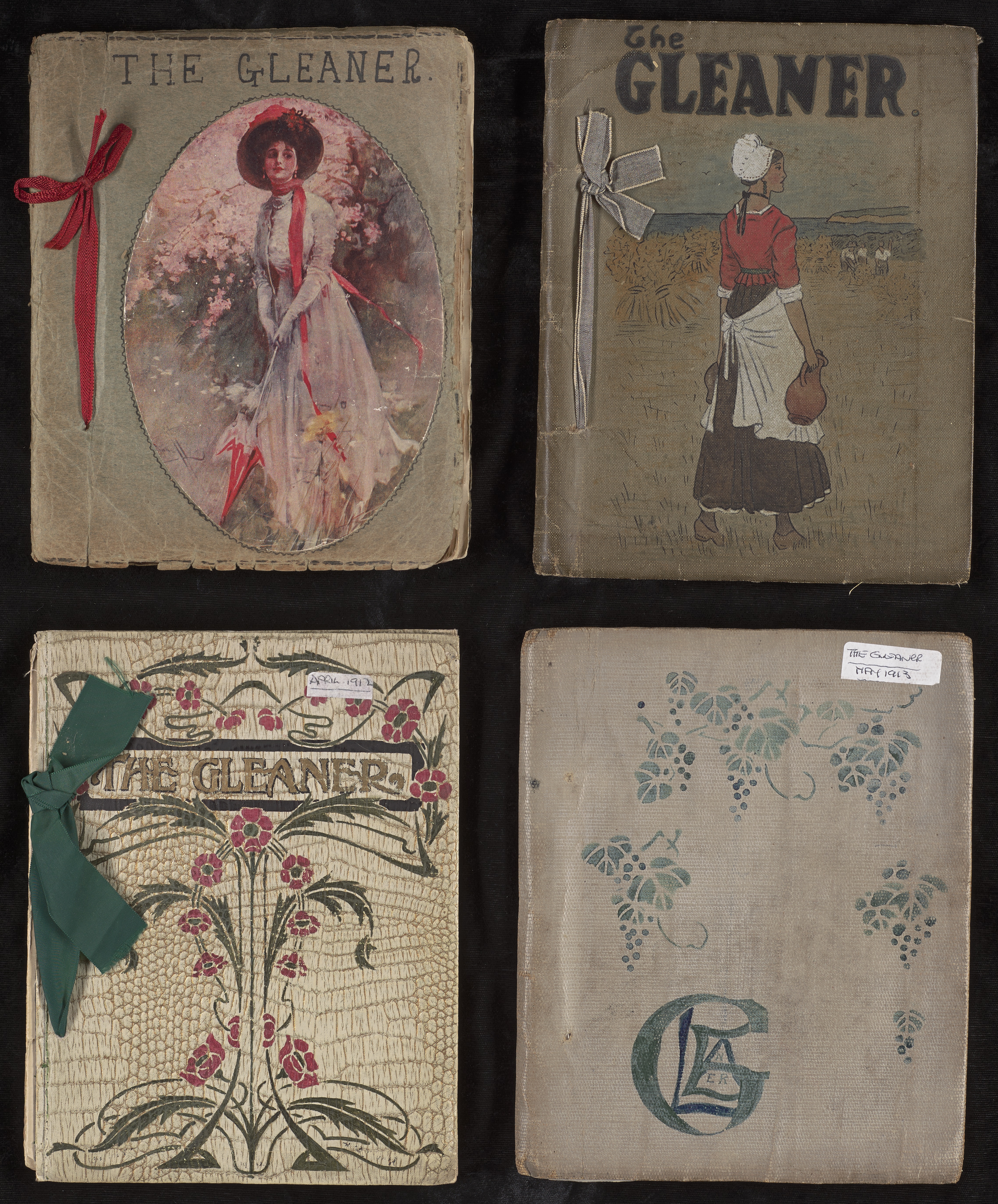
Cover designs for The Gleaner were contributed by members. These four early issues date from 1910-13.
It is not entirely clear how the magazine began, or how its members came together. They lived and worked in disparate parts of the country and came from a variety of political and social backgrounds: some were old and some young, some women and some men, married and unmarried alike. Some members appear to have known each other outside its pages, while others were clearly strangers—one member, Maisie Swift, notes her shock upon learning that long-time member Mr. Morrison was quite young. “Please don’t take offense,” she writes, before admitting that in her head she calls him “Old Sam.” In early issues members rarely used their first names, but in later issues frequently did, and sometimes submitted pictures of themselves to be included in the magazine’s pages.
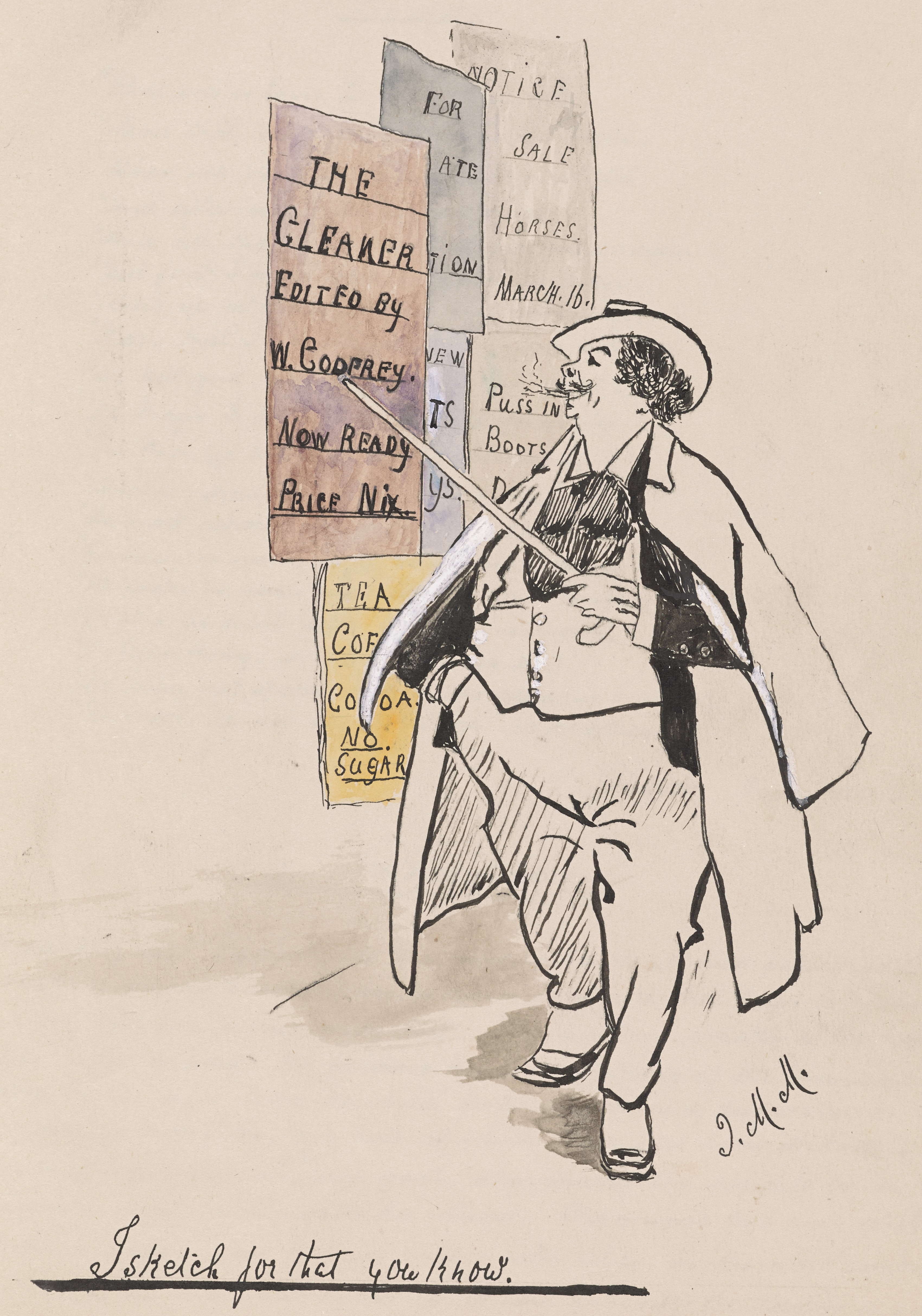
“I sketch for that” by J.M. Minty. Art contributions to The Gleaner are enclosed as originals, as in this ink and watercolor cartoon.
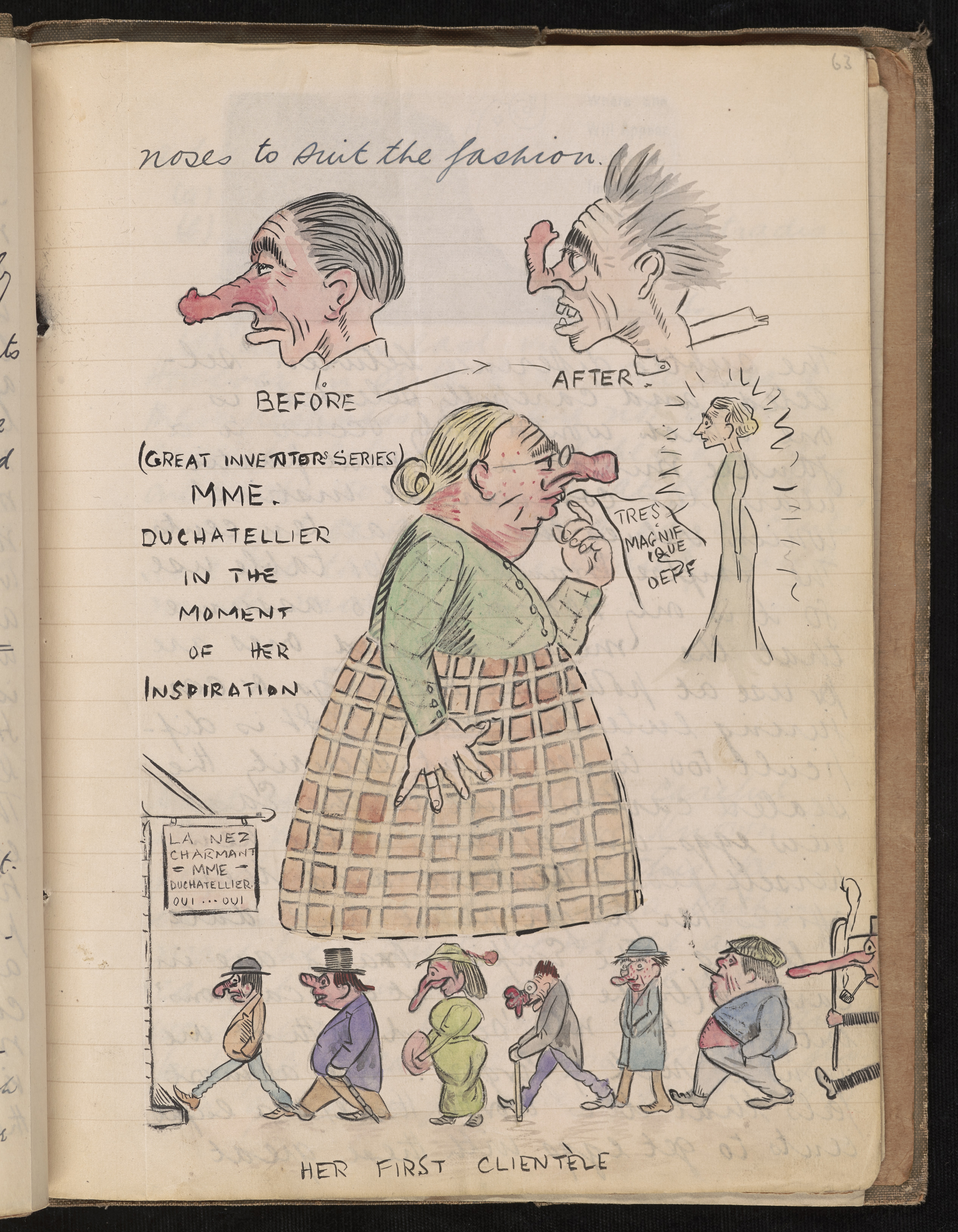
This humorous illustrated essay, poking fun at advertising rhetoric, is from the September/October 1918 issue, but unfortunately lacks an author attribution. The essay combines hand-written commentary, watercolor sketches, and clippings from newspapers.
Contributors paid a nominal fee for membership (the price of postage) and could be fined for failing to submit contributions on time. But the most onerous tasks involved in producing this a labor-intensive product (at times, issues of The Gleaner appear to have been produced once every two months) fell largely on the shoulders of editor Winifred Godfrey. In her editorial prefaces, she frequently chides members for late submissions, poor-quality artwork, or unintentional postal mishaps. They, in turn, fill the suggestions page with complaints about tardy receipts of the magazine or not having enough time to read it each month.
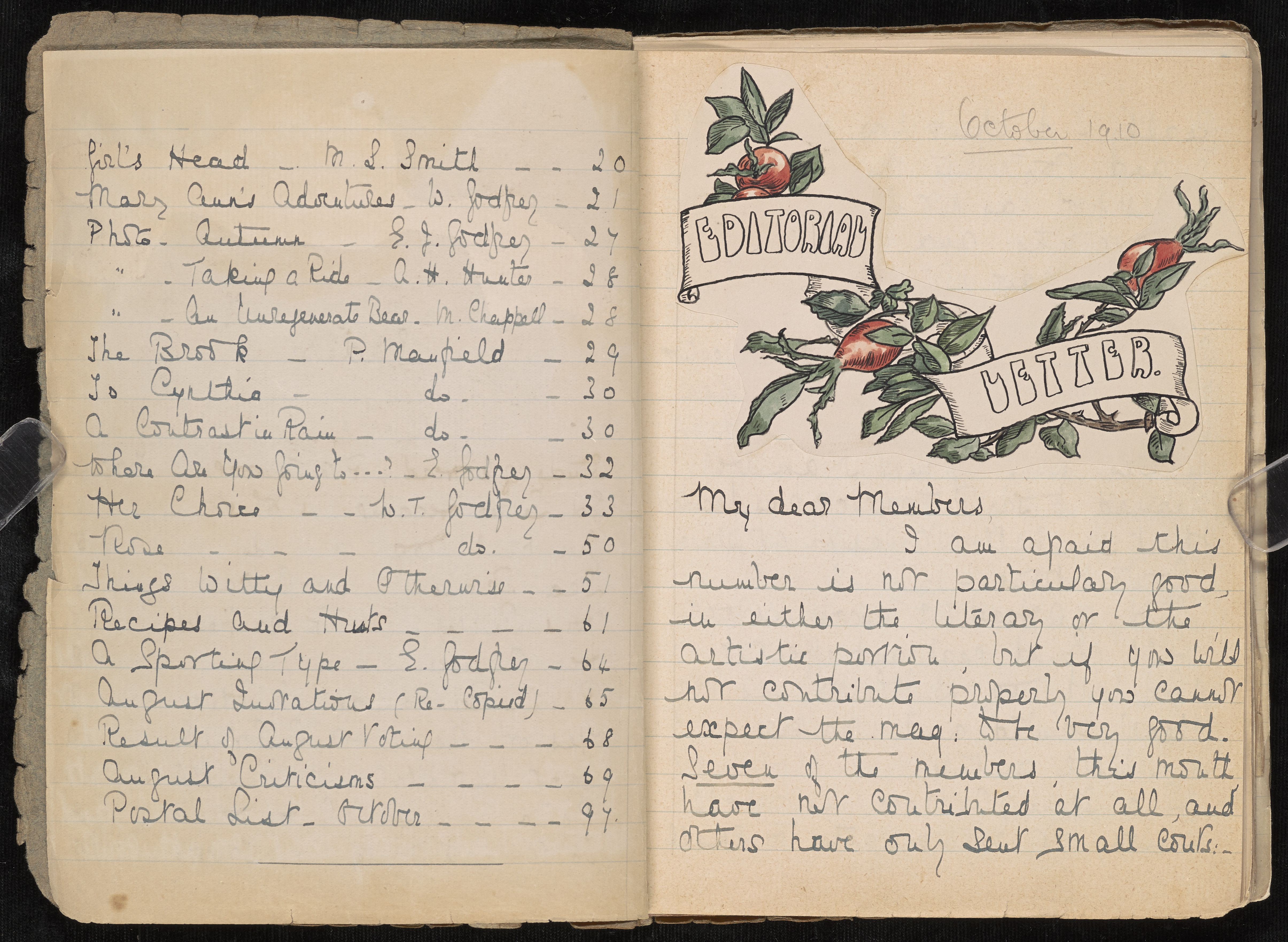
The editor here critiques the magazine’s submissions, stating, “I am afraid this number is not particularly good, in either the literary or the artistic portion, but if you will not contribute properly you cannot expect the mag. to be very good.” (Not yet cataloged, Library Associates Endowment Fund).
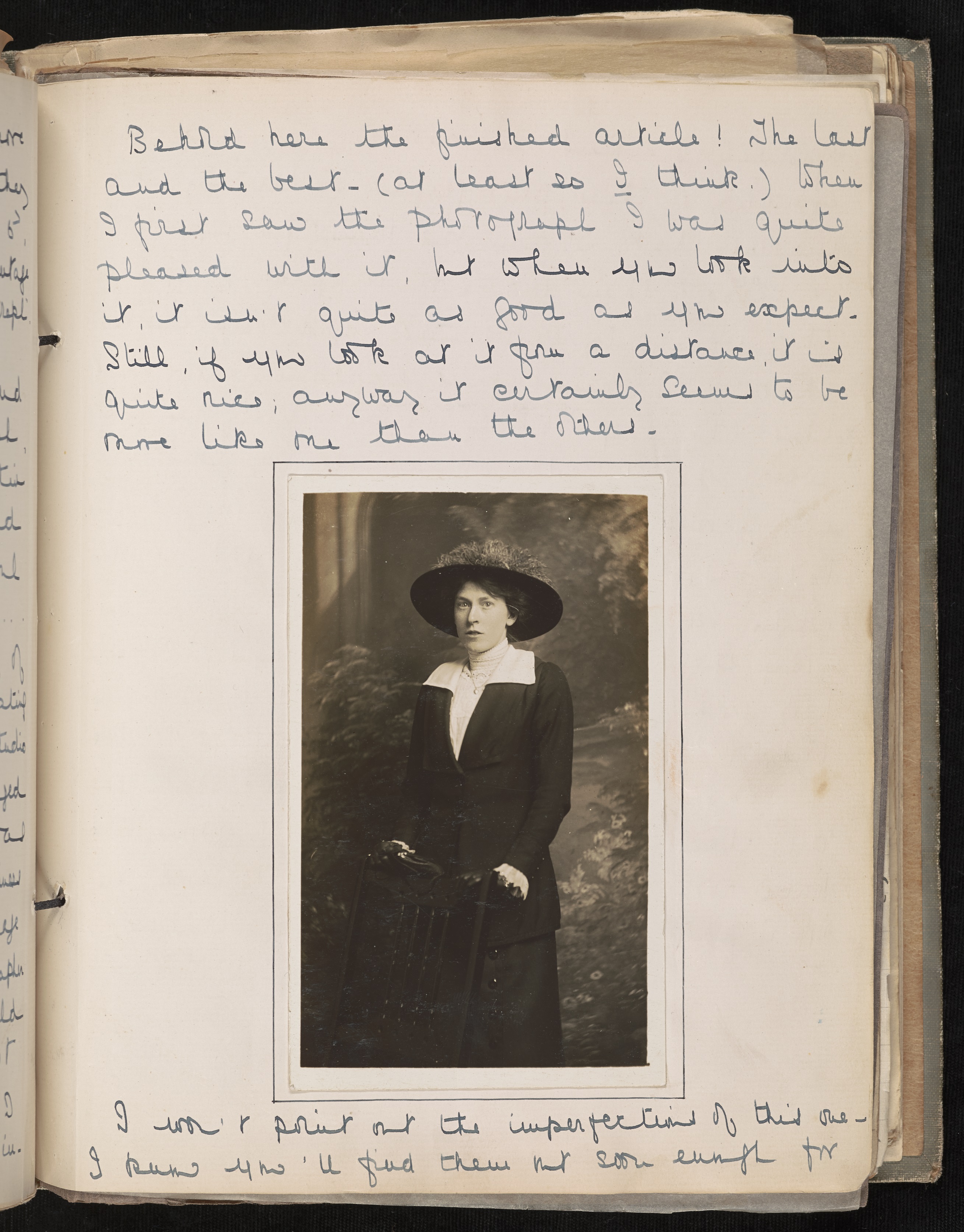
Photograph of Winifred T. Godfrey with a short essay describing her experiences having her picture taken. Godfrey’s essay is at once vain and deprecating: “When I first saw the photograph I was quite pleased with it, but when you look into it, it isn’t quite as good as you expect.”
It may have been for this reason that Godfrey invited one of the members, Leander Demetrius Potous, to join her as Sub-Editor. Potous’s original task seems to have been typing up the criticism and prefatory material. Potous, who styled himself a “Humoresque,” took things a step farther, using his new-found position as typist to insert sarcastic and caustic commentary into the magazine, particularly in the criticism section. Potous’s commentary was often scathing. He contradicted positive reviews by cheerful members and mocked those with literary aspirations. He inserted articles with titles like “How to Write a Poem for The Gleaner” that excoriated members–by name–for derivative entries.
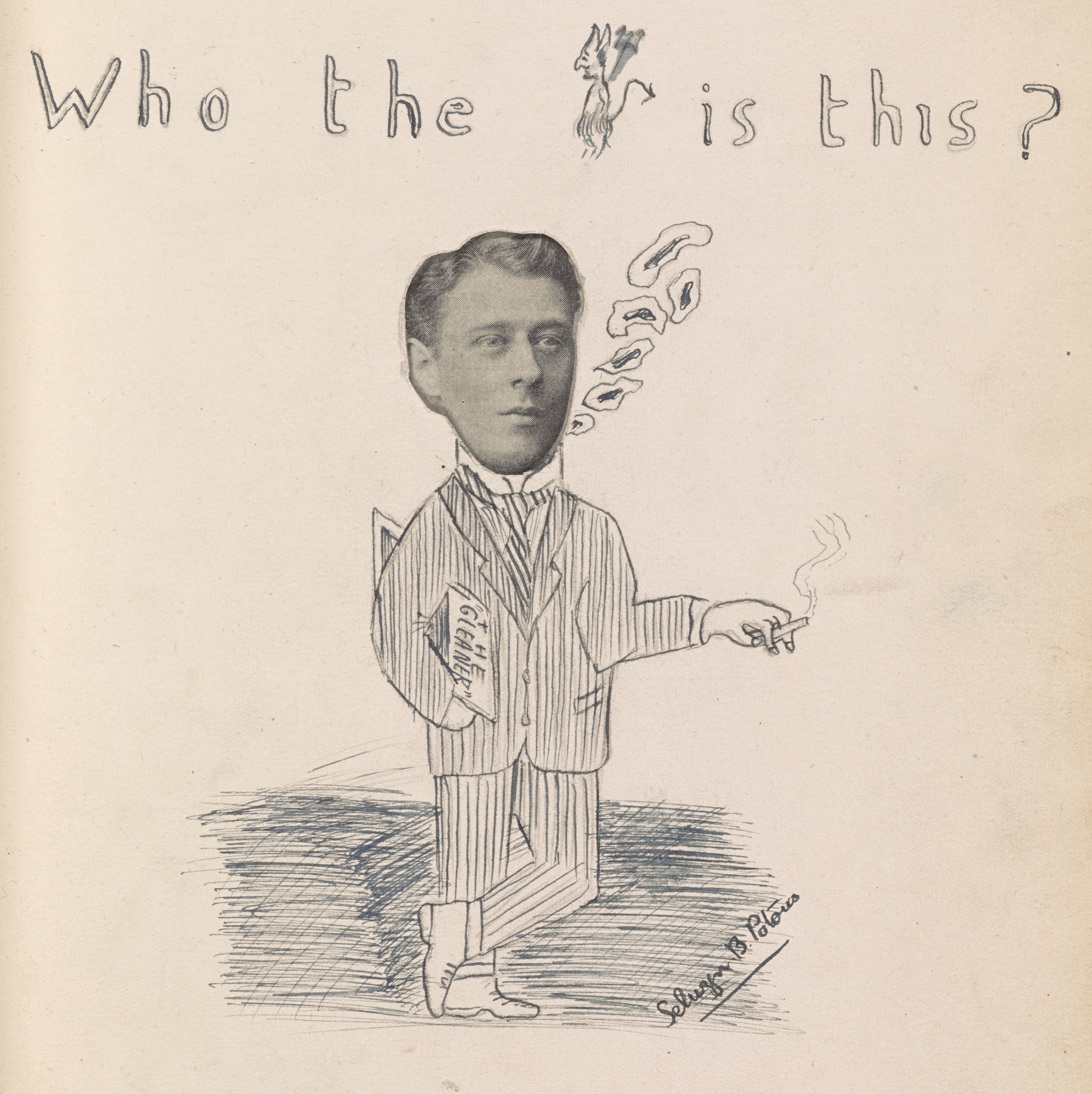
This pen sketch, decorating a photograph of the infamous Sub-Editor, is signed Selwyn B. Potous—perhaps a relative of Leander.
Perhaps unsurprisingly, Potous’s editorial influence was not well-appreciated, and members began to resign at an alarming rate, citing the toxic tone in the criticism section, spurred on by Potous, as their primary reason for departure. In the Nov/Dec 1917 issue, early in Potous’s tenure as Sub-Editor, Godfrey writes in her preface:
Yet another resignation: F.A. Griffin no longer finds the ‘Gleaner’ as interesting as it used to be. She thinks the influence of the Sub-Ed. completely spoils it, and that he stirs up strife among the members, and causes continual arguing and unpleasantness in the criticism. Poor S.E.! He seems to be blamed for a lot!
Godfrey’s sympathy for Potous waned, however, when his antics interfered with her editorial duties. In the Jan/Feb 1918 issue, Godfrey inserted a long note near the back of the book, noting with alarm that:
I don’t know what is the matter with you all this time! I have just returned today from spending a holiday at Eastbourne, and find this magazine awaiting me, while I see that six members have not had it at all yet. Why Mr. Johnston, after apparently keeping it five or six days instead of two, returned it to me instead of sending it on to Mr. Holt, I do not know. It has already had one lost journey by being sent on by Mr. Greenhorn to Mr. Potous instead of to Mr. Lewin, but this was really Mr. Phillips’ fault for putting Mr. Potous address on back when sending on.
The blame, she insists, lies with Mr. Potous:
I believe a lot of this trouble, however, may be caused by the Sub Editor’s having tampered with the Postal List, and sending it to one of the members out of her turn. And he has even had the audacity to cross my name off the end of the list, and put his own I notice! Please, no more altering or tampering with my Postal List, Mr. Sub Editor! It only makes the magazine look untidy, and is apt to muddle members who have not enough time to study things carefully or to read your detailed remarks.
Potous’s crime in altering her postal list is further compounded by the rather incendiary departure of another longtime member. Godfrey writes:
The following is an exact copy of a postcard I have just received from D.T. Wilcock—it will be remembered that the Sub Editor called him a “lunatic” in his last criticisms; I don’t know if he thought I was guilty of this and wished to be revenged, but here it is:–
‘Book sent away to Mr. Morrison from Wilcock Heptonstall today Sunday Sept 23rd 1917. To be fair with you it requires a lunatic to deal with you at present I saw that from your photo. You may be dealt with less mercifully some day. If the magazine was a thing that mattered much you would have known about it from your magazine. No wonder you are on the shelf. I am excused from responsibility of law court actions from the Gleaner in future.’
I have no idea what this all means—I am really rather inclined to think the Sub Ed. may be right for once, in his estimation of Mr. Wilcock. Anyway, I think you will all agree that I am justified in dismissing Wilcock from our midst henceforth; I cannot have postcards of this description being sent to our house; my father was very annoyed about it.”
Potous, for his part, appended his own defense, totalling four pages of type densely packed, biting back with characteristic zeal:
I do not remember calling our late member a ‘lunatic’ I am certain I did nothing of the sort. I may have asked him at what lunatic asylum he was residing, but this is quite another thing—he might have been there as a doctor or keeper or something of that sort. On the other hand, he might have been there as an inmate—one never knows.
Godfrey inserts another sheet, handwritten, at the close of this issue with a distressed call for members to send her a confidential postcard voting on whether or not Potous should be removed from his office, and, indeed, by the next issue Potous is conspicuously absent. Some departed members did return, but the criticism section remained contentious. One member groused that “in spite of our late Sub-editor’s retirement, scathing, unnecessary critiques still appear rife among the members.”
A detail from the page featuring a portrait of the Sub-Editor.
Though in-fighting often centered around the perceived literary or artistic merits of contributions, just as often members expressed divergent opinions about politics and current events, including the events of World War I, which was contemporary with the later years of the magazine’s run. Editorial antics aside, The Gleaner represents an important archive of a pivotal moment in Western history. Those interested in exploring this record of World War 1 are invited to view the exhibition The Gleaner: Documenting the Great War, in the First Floor Gallery at the Albert and Shirley Small Special Collections Library.

![The books are marvelous specimen collections in their own right. Incidentally, we believe the ancient author of the concept of humours, Galen, would put his stamp of approval on the layout of the recto of this page. From Pen and Brush Lettering and Practical Alphabets (London: Blandford Press, [1947].](https://smallnotes.internal.lib.virginia.edu/wp-content/uploads/2014/04/curtismasculine.jpg)