
This week we feature an acquisition made many years ago, but one whose true significance was discovered only this month. The Albert and Shirley Small Special Collections Library has long possessed a copy of Tableaux historiques & topographiques, ou Relations exactes et impartiales des trois événemens mémorables qui terminèrent la campagne de 1796 sur le Rhin (Basel: Chrétien de Mechel, 1798). Although lacking several plates, the U.Va. copy retains what turns out to be the key plate: a large folding map captioned “Retraite de Bavière en France … 26 Octobre 1796.”
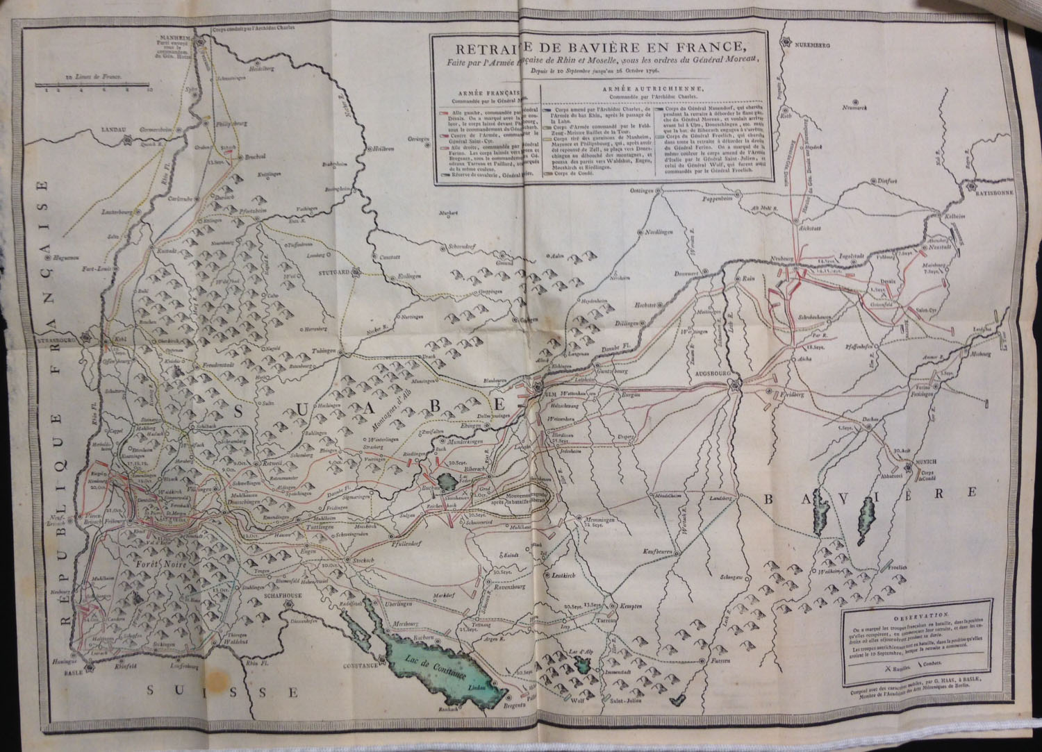
“Retraite de Bavière en France … 26 Octobre 1796,” from Tableaux historiques & topographiques, ou Relations exactes et impartiales des trois événemens mémorables qui terminèrent la campagne de 1796 sur le Rhin (Basel: Chrétien de Mechel, 1798). (DC220.8 .T3 1798)
This plate is one of the few known examples of a map set entirely from movable types. Everything—text, borders, and topographic features—has been set by hand using a variety of text fonts as well as a specially designed cartographic font (here heightened with red and greenish-blue hand-coloring).
![The map, "composed with movable types," bears the imprint of G[uillaume, i.e. Wilhelm] Haas, the Basel [Switzerland] typefounder who cut and cast the special cartographic font.](https://smallnotes.internal.lib.virginia.edu/wp-content/uploads/2015/02/Map2.jpg)
The map, “composed with movable types,” bears the imprint of G[uillaume, i.e. Wilhelm] Haas, the Basel [Switzerland] typefounder who cut and cast the special cartographic font.
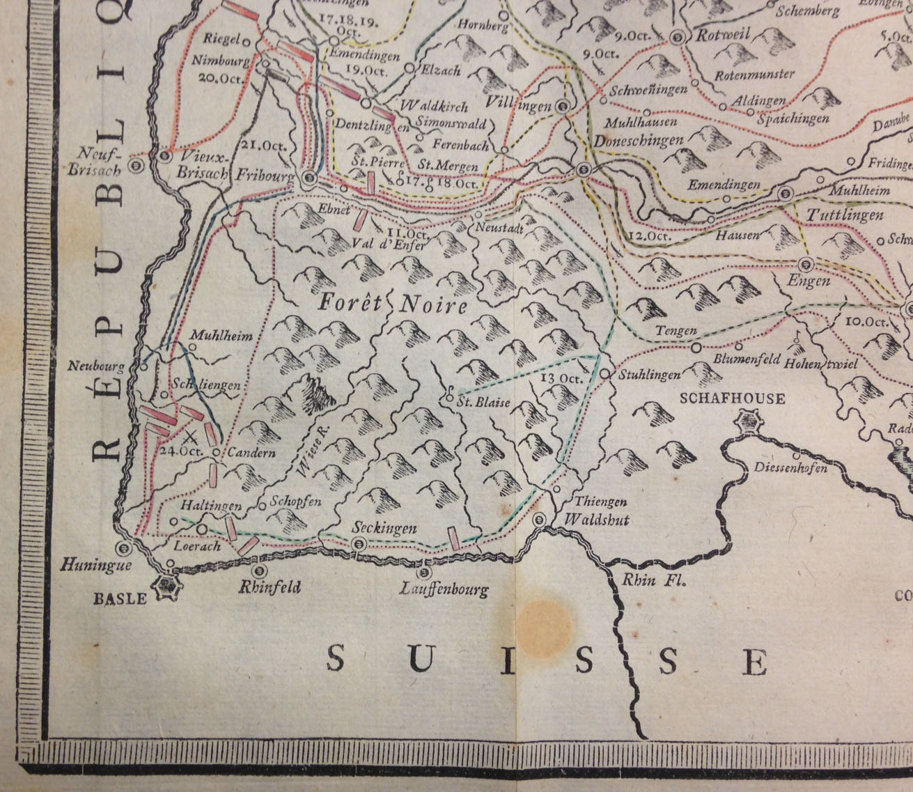
A detail showing the special symbols used to denote towns of various sizes, mountainous areas, rivers, roads &c. Note especially the tiny gaps (printing as white lines) between, e.g., the types used to set the meandering rivers.
In the early 1770s, August Gottlieb Preuschen of Karlsruhe, Germany, invented an alternative to the printing of maps from engraved copper plates: a 21-character cartographic type font. Preuschen’s idea was realized through the technical skill of Wilhelm Haas, a typefounder in Basel, Switzerland, who perfected and cast the cartographic font and, in 1776, published the first map composed entirely from movable types. Over the next two decades, Haas continued to refine and expand his cartographic font until it contained at least 139 different characters, or “sorts.” These were special symbols, not letters, including 24 designed for depicting streams and rivers, 17 for borders, 14 for roads, 31 for charting military movements, 15 for human habitations, 6 for mountains and forests, and 32 for coastlines. All told, Haas employed his proprietary font to publish approximately two dozen typographic maps, including the “Retraite de Bavière en France … 26 Octobre 1796.”
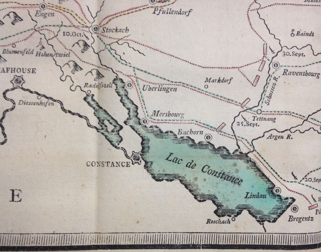
Note how the outline of Lake Constance is formed using separate pieces of type, each consisting of multiple horizontal lines; many of the pieces probably were individually filed down to create custom shapes. The bluish tint and red highlighting were hand-applied.
In setting these maps, Haas’s compositors worked from manuscript maps drawn on gridded paper. By breaking the complex cartographic image into small units, the compositors were better able to translate the image into small blocks of type metal. In doing so they faced two principal problems. First, the twists and turns of rivers and roads could be approximated but not rendered exactly, as could be done through engraving. Second, great care was needed to “lock up” these disparate assemblages of movable types so that they would not shift during printing. Type fonts are designed so that each sort has the same height, or “body size.” As long as each horizontal row of movable type contains sorts of the same height, a page consisting of several thousand small rectangles of metal type will “lock up” easily. Because Haas’s cartographic font contained sorts with a range of body sizes, which could not be arranged into uniform rows, it was necessary to painstakingly add filler material to the irregular gaps between types. In essence, the process was more like assembling a mosaic than setting type.
Haas’s cartographic font contained types in at least five different widths for setting rivers and streams–note how some rivers progressively narrow in width. Rivers follow a meandering course, though their paths look more representational than accurate–a major limitation of Haas’s font.
In principle, Haas’s cartographic font could claim several advantages over copperplate engraving: maps could be prepared more quickly, revision was easier, and unlimited impressions could be taken. But decided disadvantages remained for the prospective map publisher: only a limited level of accuracy could be achieved, and a large initial investment would be necessary to purchase the requisite types. Soon, however, the invention of lithography (and later, wax engraving) gave cartographers a far easier method for reproducing maps accurately, and Haas’s font was never adopted by other map publishers.
![Engraved reproduction of the famous Dove Mosaic discovered by Giuseppe Alessandro Furietti at Hadrian's Villa and now in Rome's Capitoline Museum. Furietti believed it to be the actual mosaic created by Sosus for the royal palace at Pergamon, as described by Pliny the Elder in his Natural History. Giuseppe Alessandro Furietti, De musivis (Rome, 1752), plate [1]. (NA3750 .F8 1752)](https://smallnotes.internal.lib.virginia.edu/wp-content/uploads/2014/05/X1.jpg)