This week, we are pleased to feature a guest post from curatorial assistant Elizabeth Ott, who is a doctoral candidate in the English Department. Liz recently produced preliminary catalog records for the collection she discusses in this post.
Special Collections is known for our fantastic collections in the history of type design; this strength just expanded dramatically with the generous gift of approximately 300 books on typography, letterforms, calligraphy, show cards, and graphic design given by the prolific American type designer Nicholas Curtis (b. 1948). Curtis, a resident of Charlottesville, has had a long a varied career as a graphic artist and type designer dating back the late 1960s when he got his start designing rock posters. He now operates his own independent type foundry, Nick’s Fonts, and his type designs can be found everywhere from Trader Joe’s labels to the titles for the recent film Oz the Great and Powerful (2013)—in fact, Curtis is also responsible for many of those super-condensed fonts you see at the foot of film posters, which help cram in the names of a film’s key cast and crew.
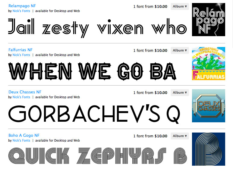
Some of Nick Curtis’s type designs. The influence of lettering and type design from across the decades may be seen in his faces.
The range of books in the Curtis gift reflects Curtis’s eclectic style and nostalgic designs. It includes items such as specimen catalogs from nineteenth-century type foundries, how-to guides for producing calligraphy alphabets, books of clip art for early computers, and many manuals for creating show cards. Most of the items in the gift relate to commercial art and offer a glimpse behind the curtain of nineteenth and twentieth-century graphic design. The show card manuals, in particular, offer an example of a now-obscure commercial art profession that had a profound impact on the visual and print culture of nineteenth and twentieth century America.
Show cards (sometimes show-cards, sho-cards, or sho’ cards) were hand-lettered signs used for local advertising and incidental labeling, popular to the point of near ubiquity between about 1880 and 1920, though the practice of show card writing survived well into the sixties. Show cards filled a niche role in early twentieth-century advertising distinct from printed posters or painted signs, allowing shops, restaurants, and other local businesses to produce inexpensive displays for goods and services. Typical show cards were small in scale, at most 11 by 14 inches, and produced on a stiff cardboard or poster board. Examples may be seen in this series of photographs of Charlottesville in the early twentieth century from the Rufus Holsinger Studio Collection:
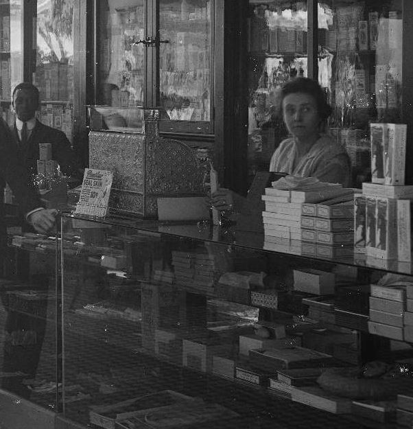
A show card rests in front of the cash register in this detail from a 1917 photograph of the Timberlake Drugstore on Main Street. (MSS 9862. Image by UVA Digitization Services)
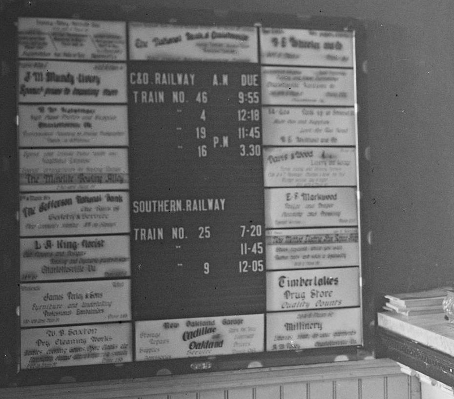
Hand-lettered advertisements for local businesses surround the Charlottesville train timetable in the Gleason Hotel in 1915, detail from a larger photograph. (MSS 9862. Image by UVA Digitization Services)
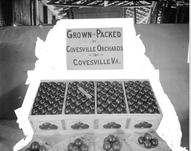
A very simple 1914 show card for tomatoes. Sections of the photograph’s background have been whited out, perhaps in preparation for use of the image in an article or advertisement. (MSS 9862. Image by UVA Digitization Services)
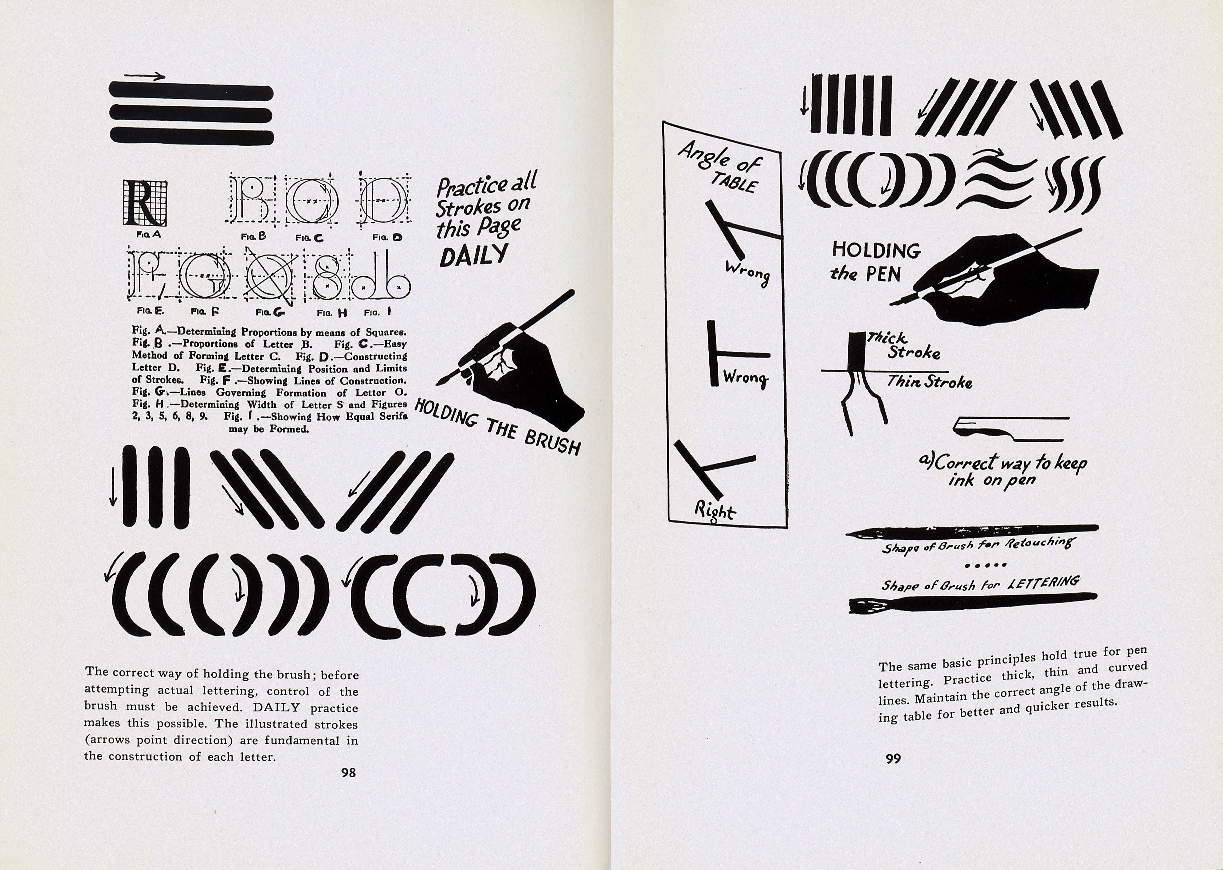
Show card writers used water based paints or inks in conjunction with a “rigger” brush—a long-handled sable brush—or nibbed pen to create designs. Show cards could be made and remade swiftly, so they were ideal for displays where signs needed to be rotated frequently.
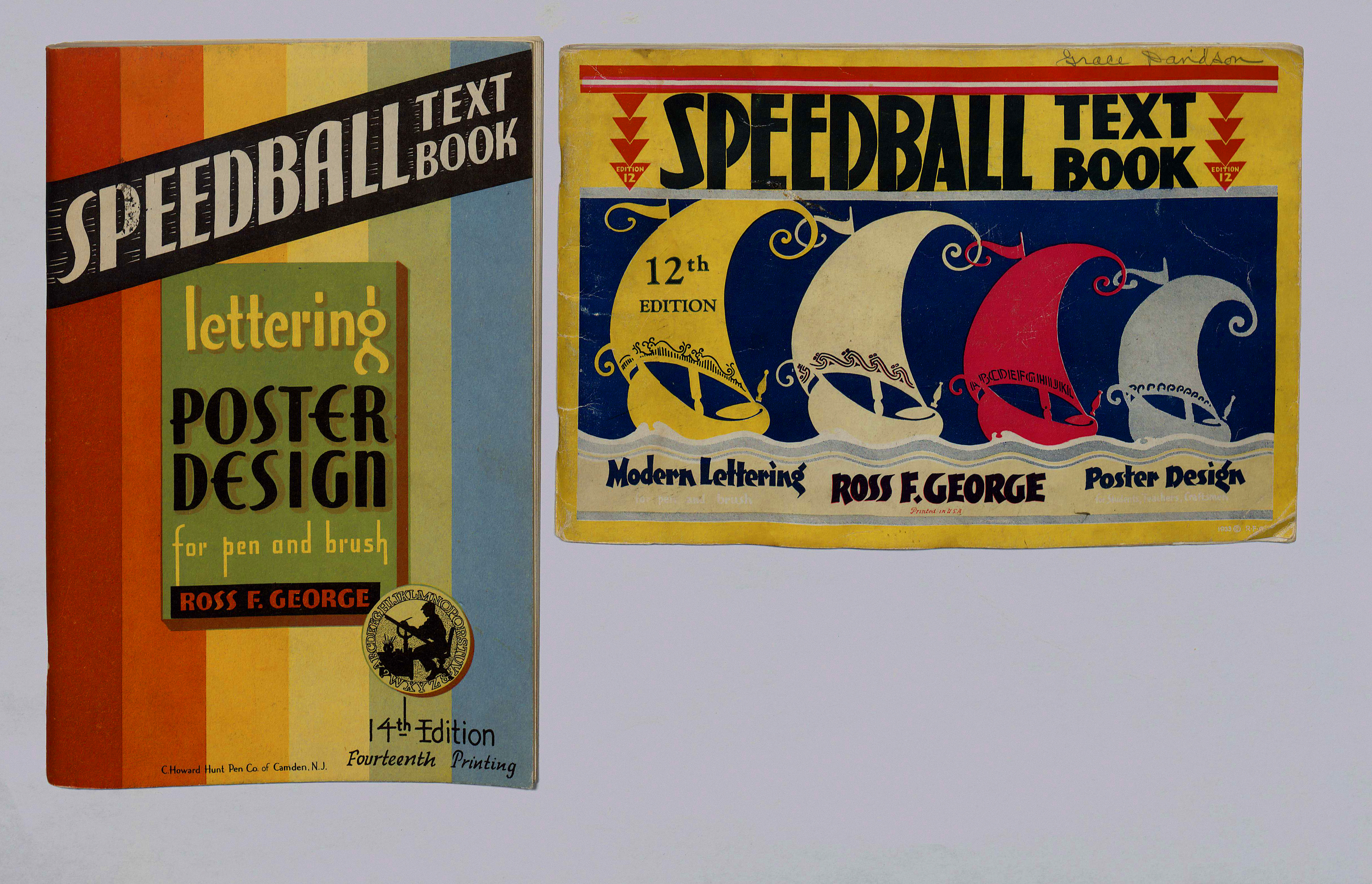
Two scarce instruction books for Speedball pens produced by the C. Howard Hunt Pen Company, which operates today as Speedball. Speedballs were nibbed pens produced specifically for the quick work of show card lettering. Left: Ross F. George, Lettering, Poster Design for Pen and Brush (Camden: C. Howard Hunt Pen Co., n.d.); Right: Ross F. George, Modern Lettering/Poster Design (Camden: C. Howard Hunt pen Co. , n.d.). (Image by Elizabeth Ott)
Because show cards were meant to be produced quickly, show card writers did not want to spend time creating unique designs and layouts for every new card. Show card manuals offered design templates and best practices for producing attractive, readable show cards that could be easily copied. Manuals instructed writers on how to scale alphabets up and down, how to balance negative and positive space, and how to choose complementary color schemes. More than just a compendium of display alphabets, show card manuals condense the aesthetics of early twentieth-century graphic design into readable, concrete lessons.
A page spread from E. C. Matthews, How to Paint Signs and Show Cards (New York: Illustrated Editions, 1940). (Image by Elizabeth Ott)
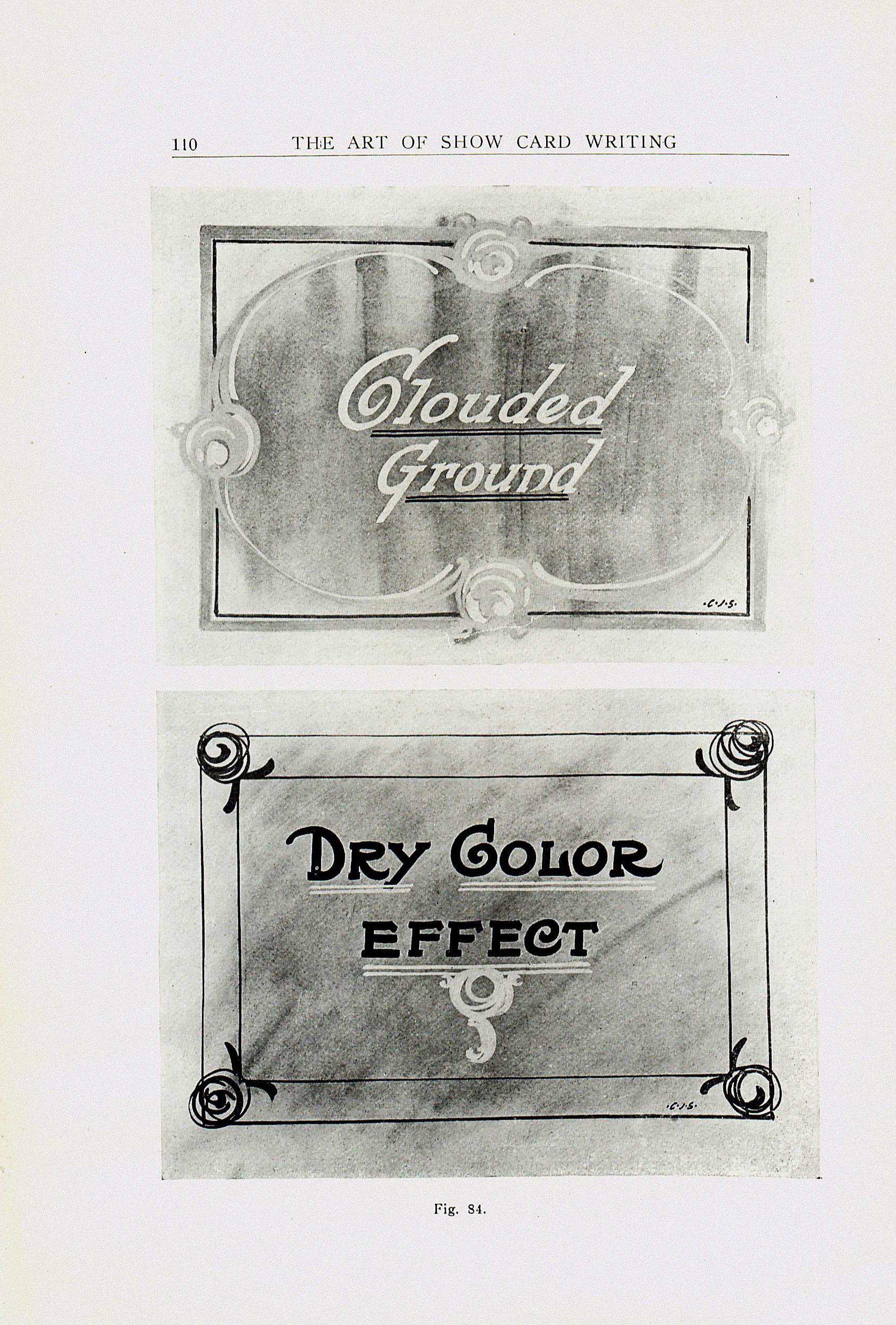
A page from Charles Strong’s The Art of Show Card Writing, showing an airbrushing technique used to add depth and texture quickly to a flat design. (Detroit: The Detroit School of Lettering, 1907).
These show card manuals are an important, but often overlooked, aspect of the history of typography, graphic design, and American advertising. The script alphabets of show cards influenced type design, especially for display types, but also diverged from many trends in typography. Similarly, the non-pictorial nature of most show cards and their freedom from the constraints of printing meant they were both like and unlike printed advertisements produced during the same time. Ephemeral and rarely preserved, show cards are largely absent from the cultural record, except in photographs that attest to their prevalence. Show card manuals are thus an invaluable resource for understanding the practice of show card writing. Many of the manuals in the Nicholas Curtis gift are extremely rare, available in only a handful of libraries world-wide—indeed, we were unable to find existing holdings for more than two dozen. We are particularly pleased to add these books to our collections, adding their richness and texture to our extensive collections on the history of typography and type design.
![The books are marvelous specimen collections in their own right. Incidentally, we believe the ancient author of the concept of humours, Galen, would put his stamp of approval on the layout of the recto of this page. From Pen and Brush Lettering and Practical Alphabets (London: Blandford Press, [1947].](https://smallnotes.internal.lib.virginia.edu/wp-content/uploads/2014/04/curtismasculine.jpg)
The books are themselves often exuberant celebrations of the myriad ways to design the Roman alphabet. Pen and Brush Lettering and Practical Alphabets (London: Blandford Press, [1947]).