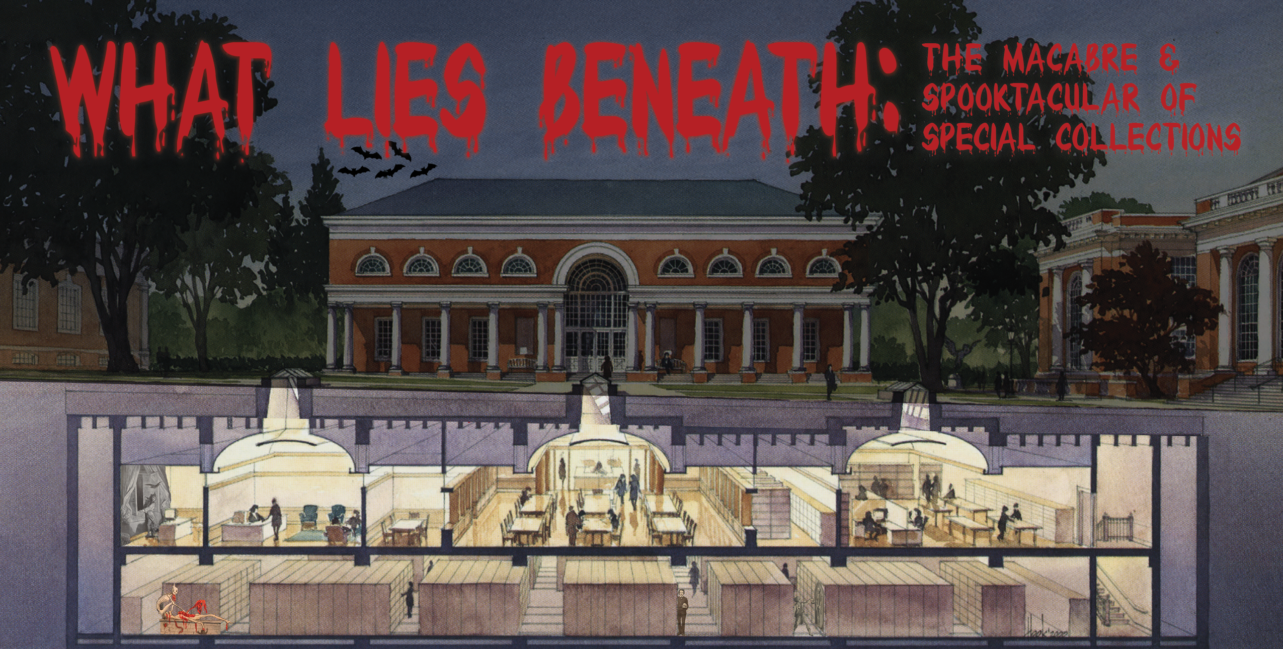
For your alphabetical pleasure, we present the letter:
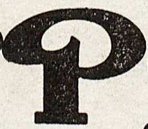
P is for Poster Block #2 which is one of 75 alphabets represented in Frank H. Atkinson’s Atkinson Sign Painting up to Now: A Complete Manual of Sign Painting. Chicago: Frederick J. Drake & Co., 1915 (not yet cataloged. Gift of Nicholas Curtis. Image by Petrina Jackson)
P is for Ron Padgett
As a high school student in Tulsa, Oklahoma, Ron Pagett co-founded the low budget journal, The White Dove Review, boldly soliciting poems from many of the avant-garde poets of his day. The first issue came out in 1959, featuring Jack Kerouac’s poem, “The Thrashing Doves.” Other contributors included LeRoi Jones, Allen Ginsberg, Ted Berrigan, and e.e. cummings. After graduating high school, Padgett went to New York where he became an influential member of the New York School of poets. An author search of our online catalog shows 27 hits related to Ron Padgett.
Contributed by George Riser, Collections and Instruction Assistant
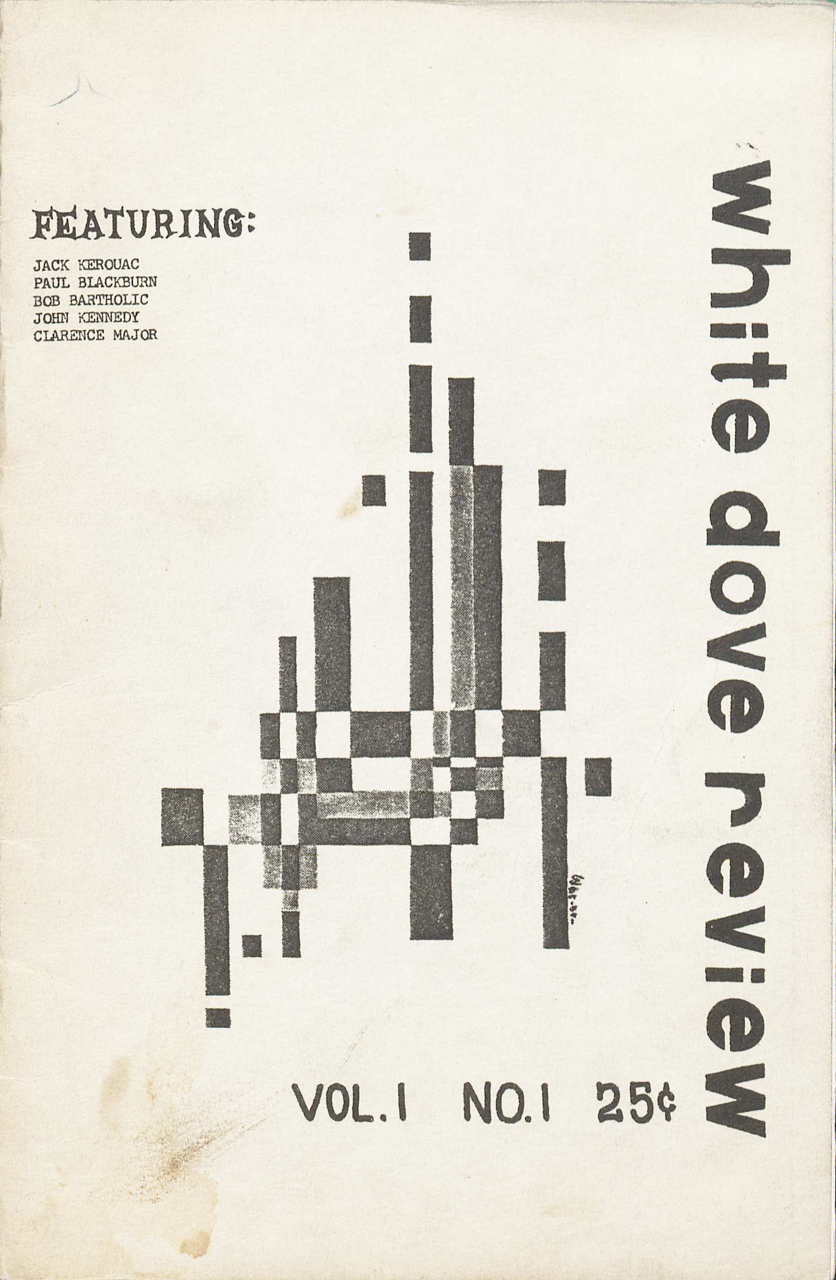
Shown here is the first issue of The White Dove Review. (PS501 .W47 no.1 1959. Marvin Tatum Collection of Contemporary Literature. Image by Petrina Jackson)
P is for Peede’s Poe Postage
We can’t cover the letter P without mentioning U.Va.’s favorite dropout, Edgar Allan Poe. Along with significant early editions, manuscripts, and other Poe rarities, we sometimes receive wonderful, unexpected gifts that extend our strengths in new directions. John Peede, publisher of the Virginia Quarterly Review, recently donated this group of postal ephemera marking the first day of issue for a 42-cent Edgar Allan Poe postage stamp on the poet’s 200th birthday, January 16, 2009.
Contributed by Molly Schwartzburg, Curator
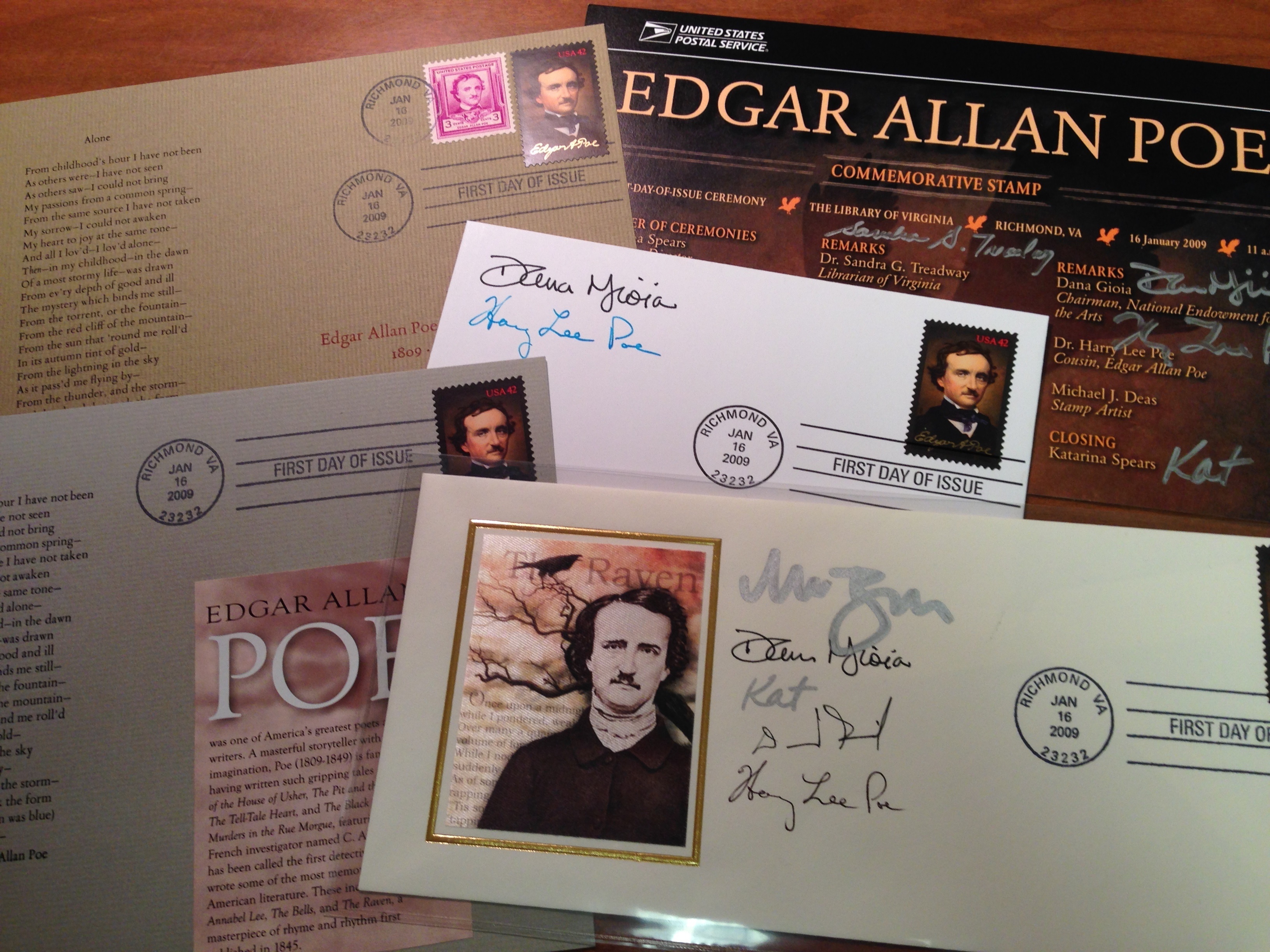
Edgar Allan Poe postal ephemera (Gift of John Peede. Photograph by Molly Schwartzburg)
P is for Pen-and-Ink Drawings
Ellen Graham Anderson (1885-1970), a native of Lexington, Virginia, studied art in Richmond, New York, and Paris. She was known as a painter, caricaturist, and illustrator. Her “modern” pen-and-ink drawings illustrated many early twentieth-century periodicals including the Post Magazine, The International, The New York Tribune, and The New York Times Book Review and Magazine. Her drawings treat the viewer’s eye to a sense of fluidity and motion in her subjects. Ms. Anderson gave her papers, primarily pen-and-ink drawings, to the University of Virginia Library in 1963.
Contributed by Margaret Hrabe, Reference Coordinator
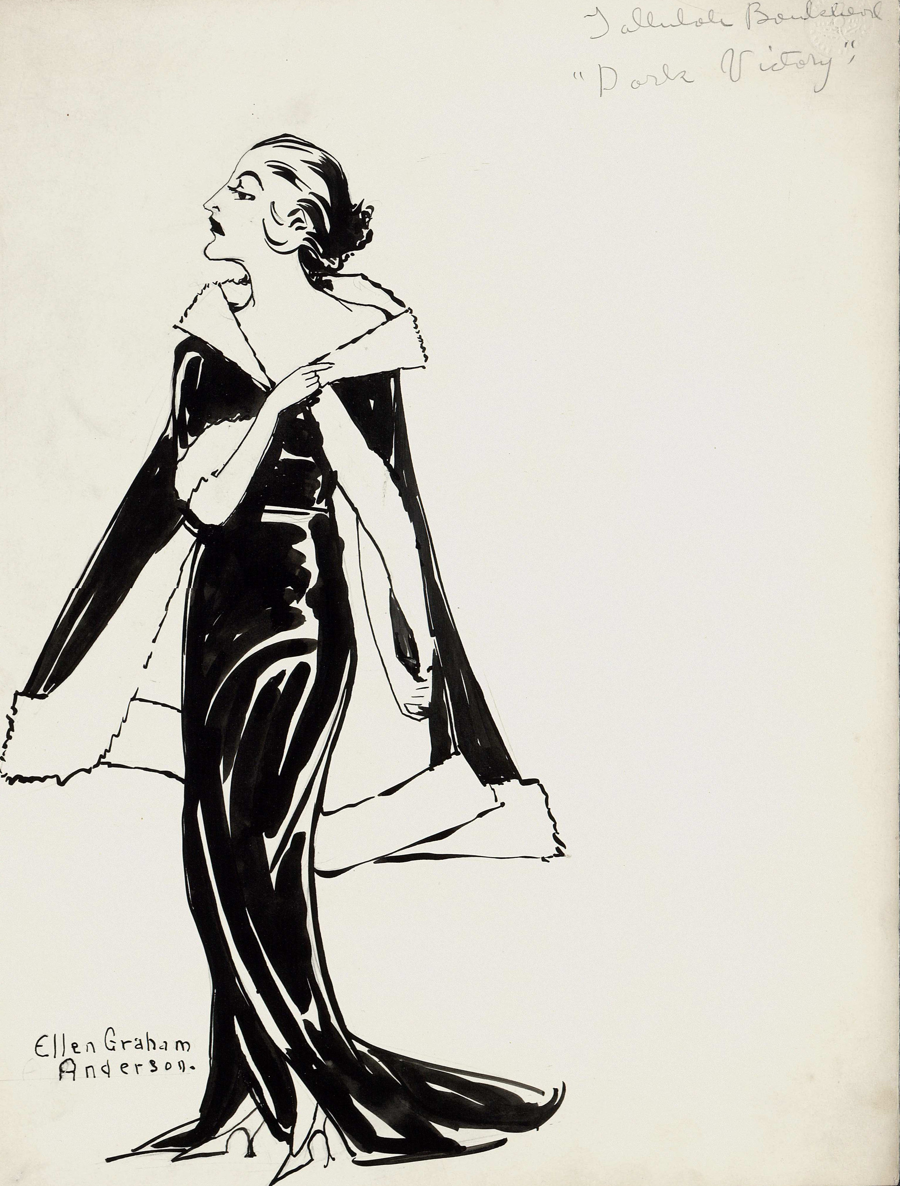
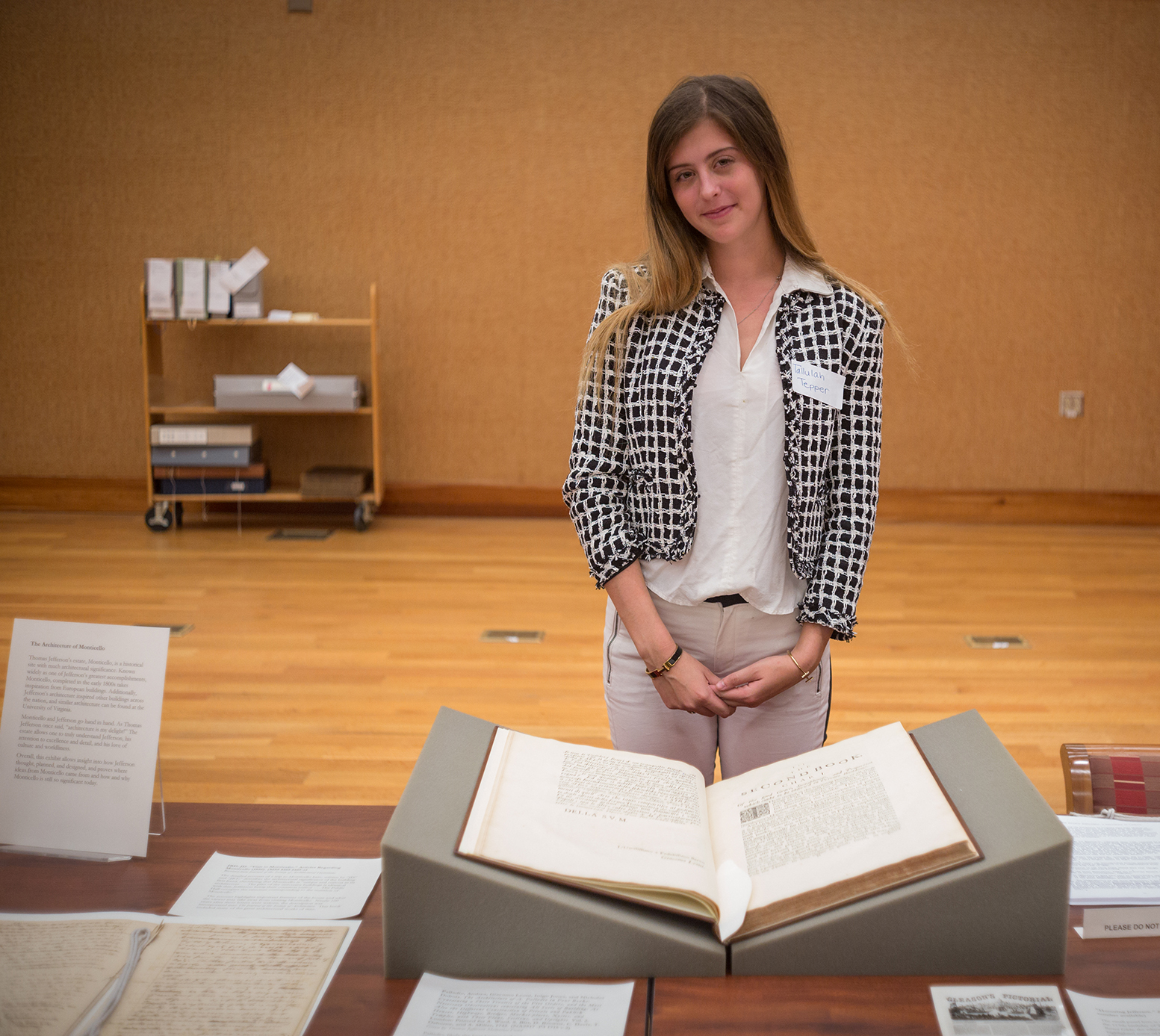
Pen-and-Ink drawing of Tallulah Bankhead in “Dark Victor,” n.d. (MSS 38-96-f. Gift of Ellen Graham Anderson. Image by Petrina Jackson)

Pen-and-Ink drawing of Ira and Edward Millette, Circus. New York, n.d. (Image by Petrina Jackson)
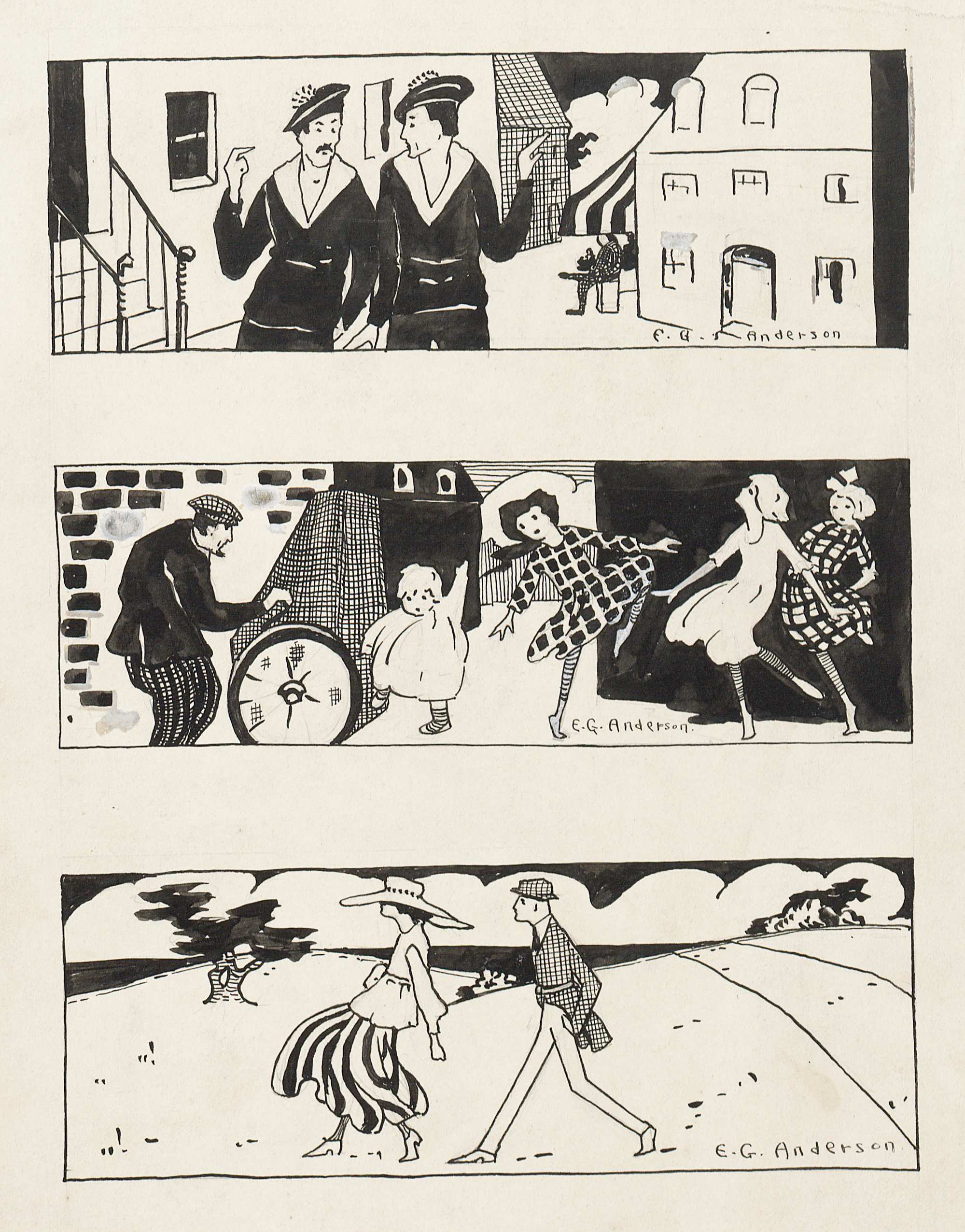
Three Pen-and-Ink Scenes, n.d. (MSS 38-96-g. Gift of Ellen Graham Anderson. Image by Petrina Jackson)
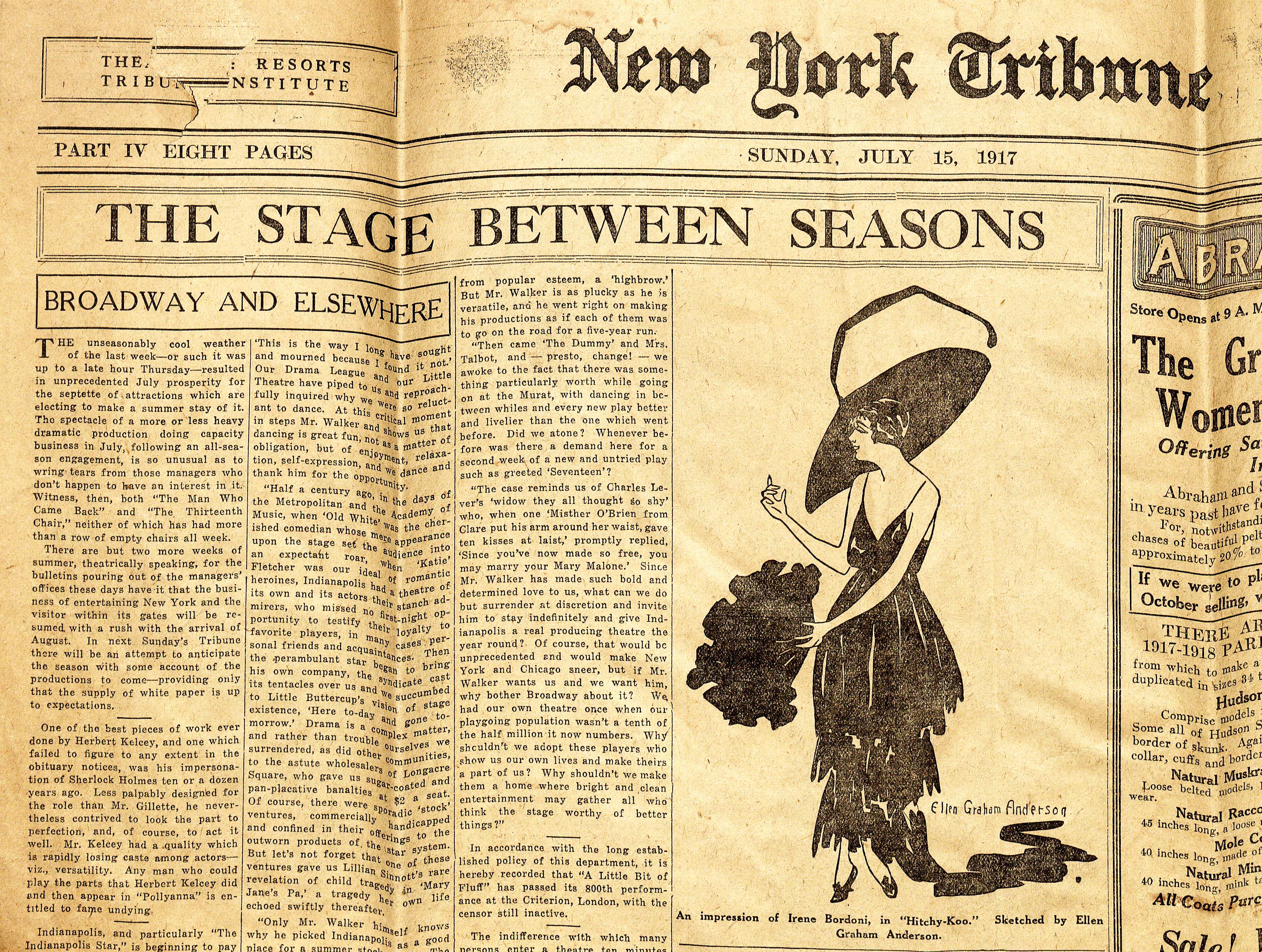
Newspaper clipping, New York Tribune, July 15, 1917, “An impression of Irene Bordoni, in ‘Hitchy-Koo.” (MSS 38-96-g. Gift of Ellen Graham Anderson. Image by Petrina Jackson)
P is for Picture Album
This is no ordinary scrapbook album; this is an album of vibrant illustrations, hues as if they were applied yesterday! It is The Fairy Book Picture Album, page after page of chromolithographs (a picture printed in a wide range of colors from a series of lithographic stones or plates). These were stories so loved and well-known the author didn’t add the written word. All that was required from even the littlest child was their imagination.
Contributed by Donna Stapley, Assistant to the Director
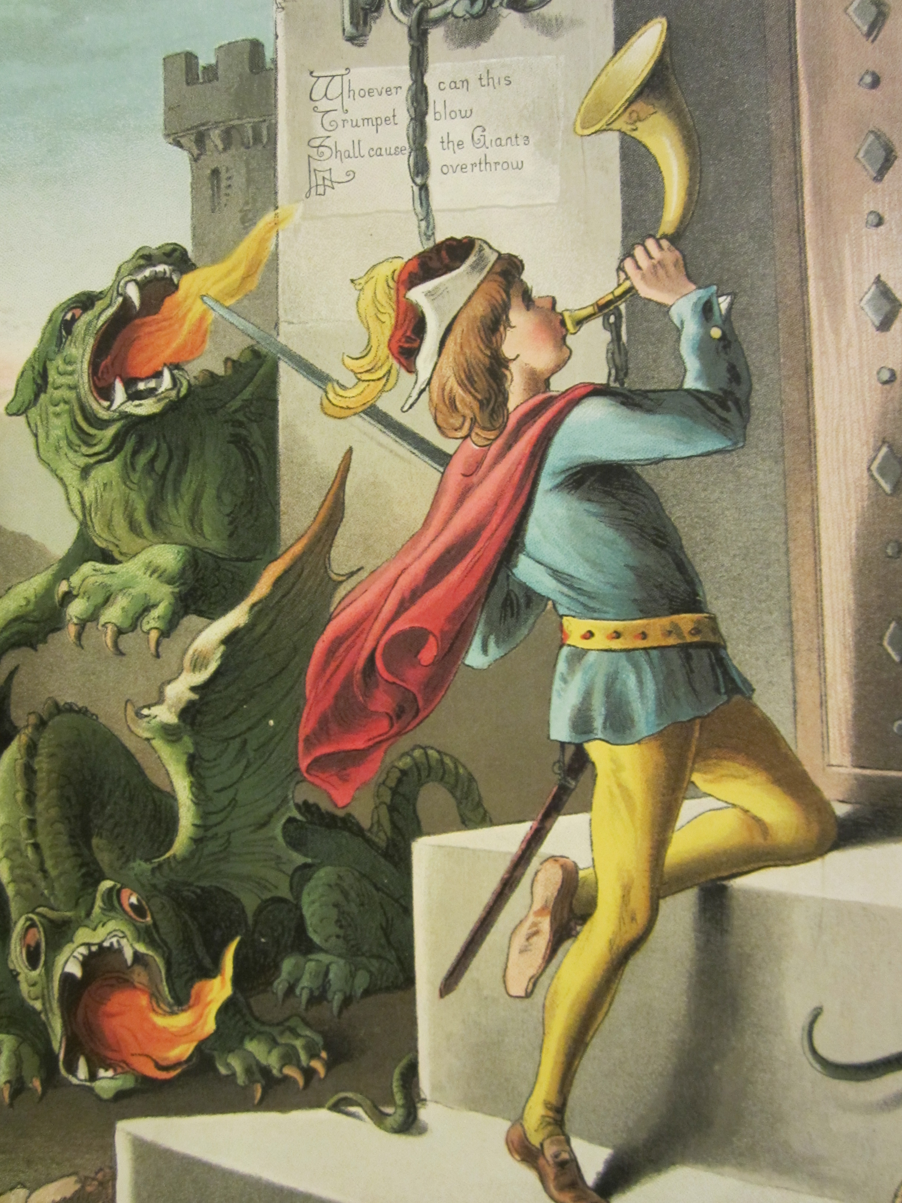
Page from the Fairy Picture Album, published by T. Nelson and Sons, ca. 1850s. (Not yet cataloged. Gift of Martha Orr Davenport. Photograph by Donna Stapley)
Page from the Fairy Picture Album, published by T. Nelson and Sons, ca. 1850s. (Not yet cataloged. Gift of Martha Orr Davenport. Photograph by Donna Stapley)
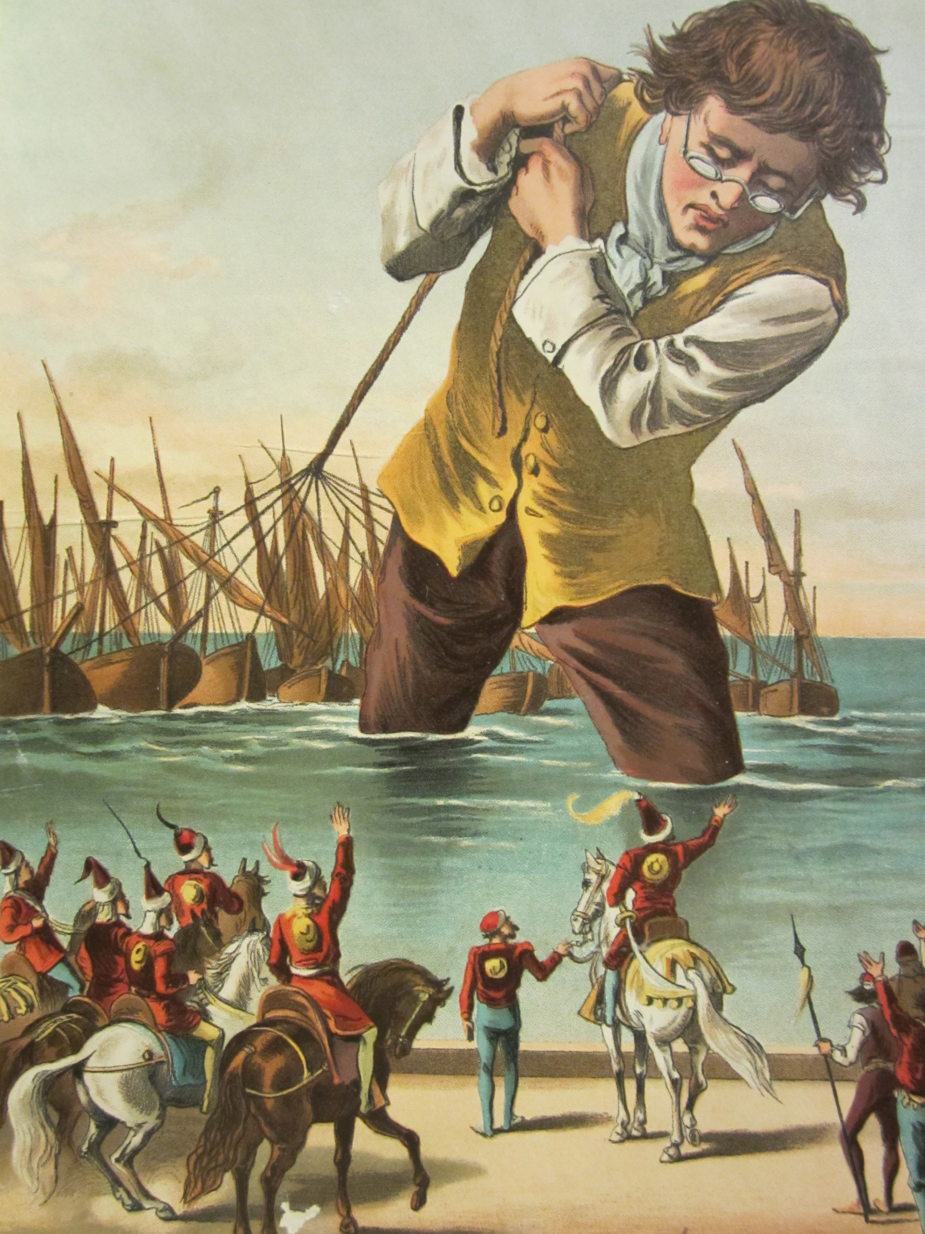
P is for Pop-Up Books
The art of folding paper to create a book with “movable,” “springing,” and “mechanical” pages has been popular with adults and little ones for over 700 years. Harold Lentz was the first publisher in the United States who coined the term “pop-up.” Leading the resurgence of interest in pop-up books today are paper engineers Robert Sabuda and Michael Reinhart. Many Pop-up books have evolved into intricate, complicated designs and have become favorite advertising tools of architects, engineers, and artists.
Contributed by Donna Stapley, Assistant to the Director
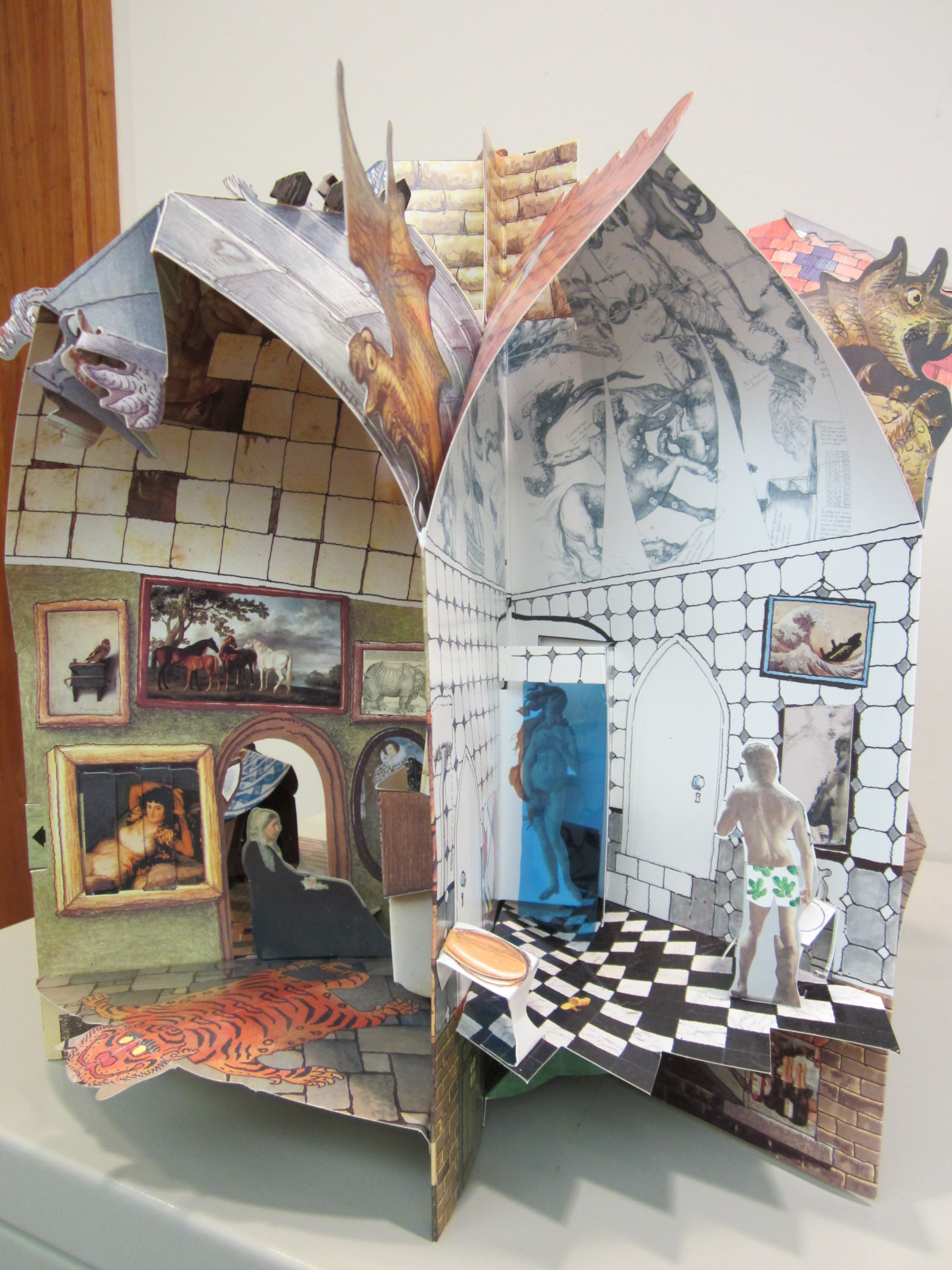
Botticelli’s Bed and Breakfast by Jan Pienkowski, 1996. (PZ92. F6S65 1996. Brenda Forman Collection of Pop-up and Movable Books. Photograph by Donna Stapley)
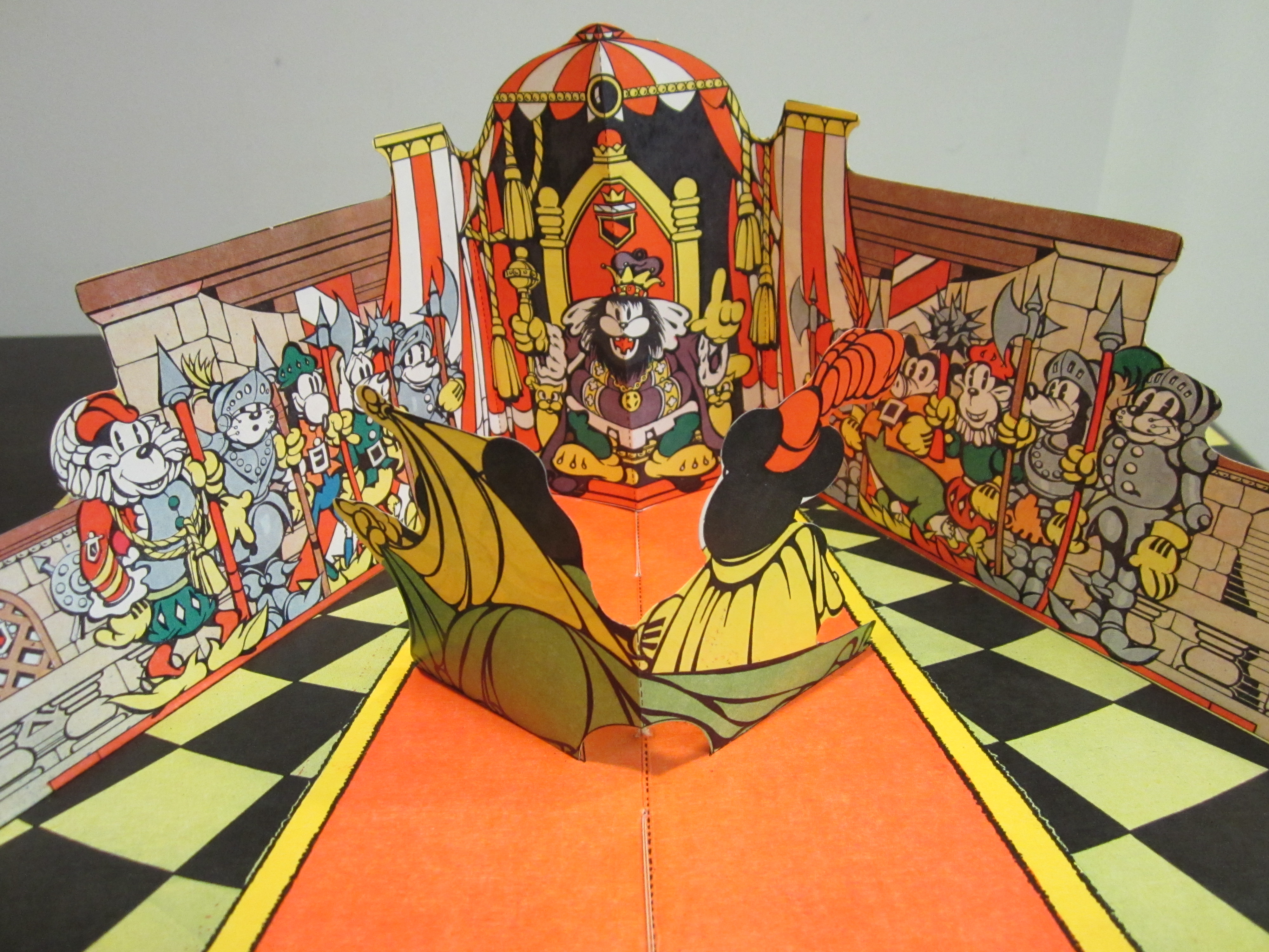
Mickey Mouse in King Arthur’s Court with “Pop-Up” Illustrations. (PZ92. F6 M526 1933. Brenda Forman Collection of Pop-up and Movable Books. Photograph by Donna Stapley)
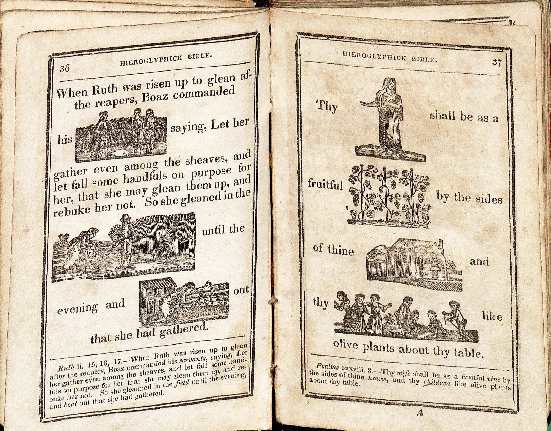
P is for Psalter or Psalterium
A psalter (Psalterium in Latin) is the biblical Book of Psalms and was created especially for liturgical use. Psalters developed in the early 8th century and became widespread in the 11th century. Psalms were recited by the clergy in the liturgy, so Psalters were important in the church.
Various schemes existed for the arrangement of the Psalms. Besides the 150 Psalms, medieval psalters often included a calendar, a litany of saints, canticles from the Old and New Testaments, and other devotional texts. The selection of saints in the calendar and litany varied and can provide clues about original ownership.
There are several Psalters in Special Collections – some handwritten from the Medieval Manuscripts era and other later printed texts.
Contributed by Anne Causey, Public Services Assistant
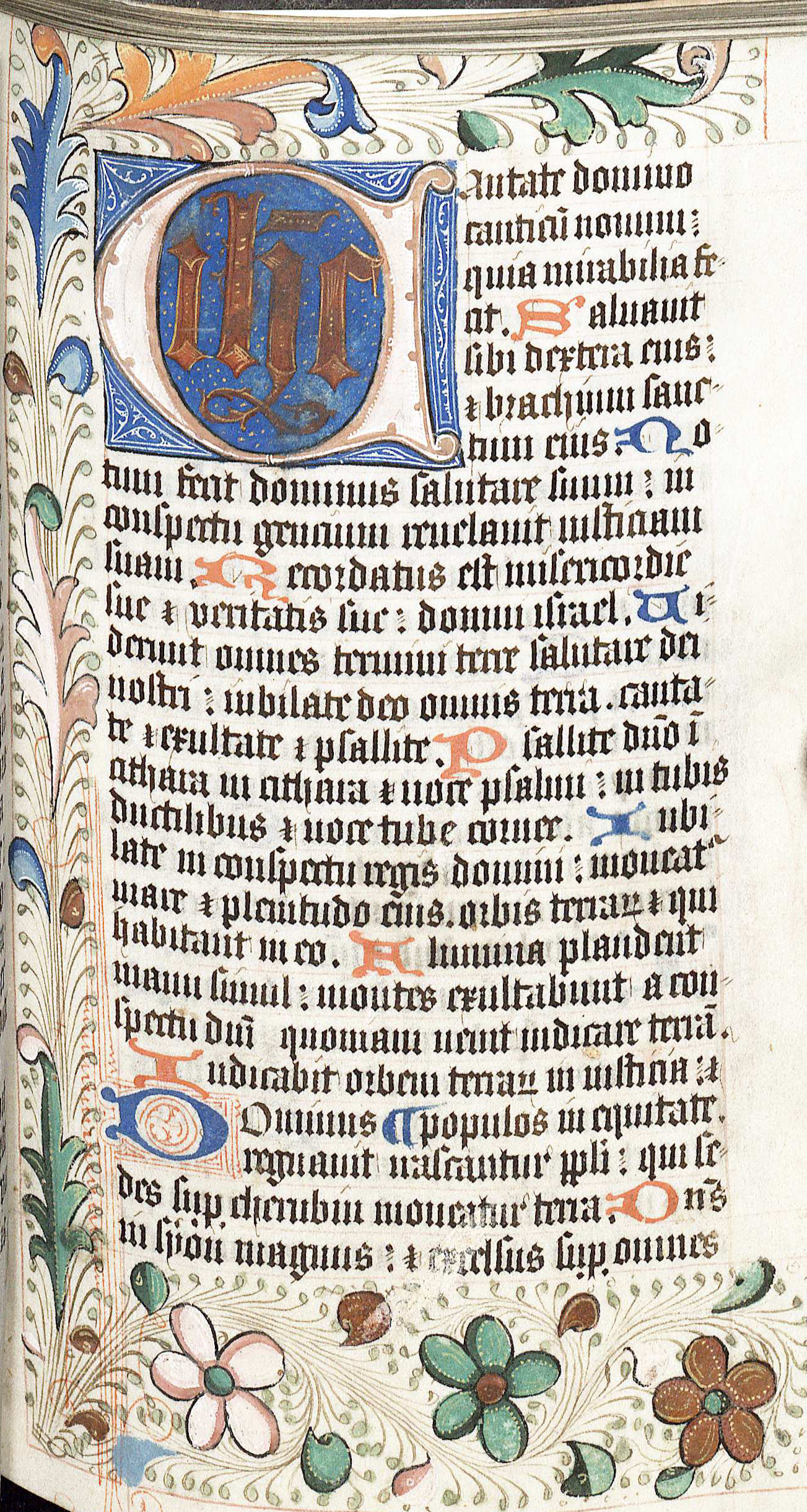
Psalterium. Written in England, 15th Century. Psalters were popular books in the Medieval Ages, primarily written in Latin, often lavishly decorated. (MSS 382 [M.Ms. I]. Gift of Edward L. Stone. Image by Anne Causey)
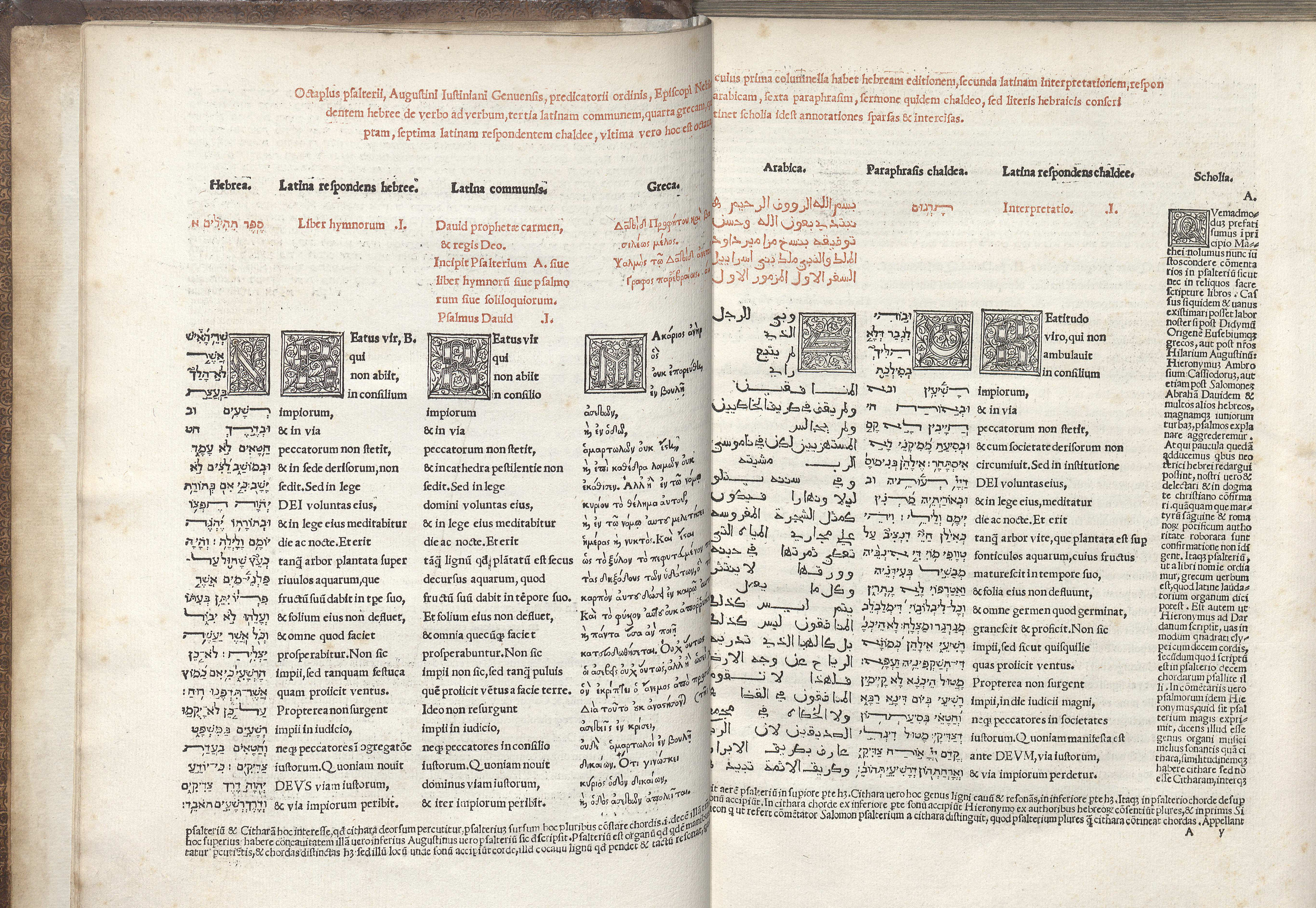
Psalterium, Hebreum, Grecum, Arabicum, & Chaldeum: cum tribus Latinus
The text of this Psalter is in five languages – Hebrew, Latin, Greek, Arabic, and Aramaic. (Image by Anne Causey)
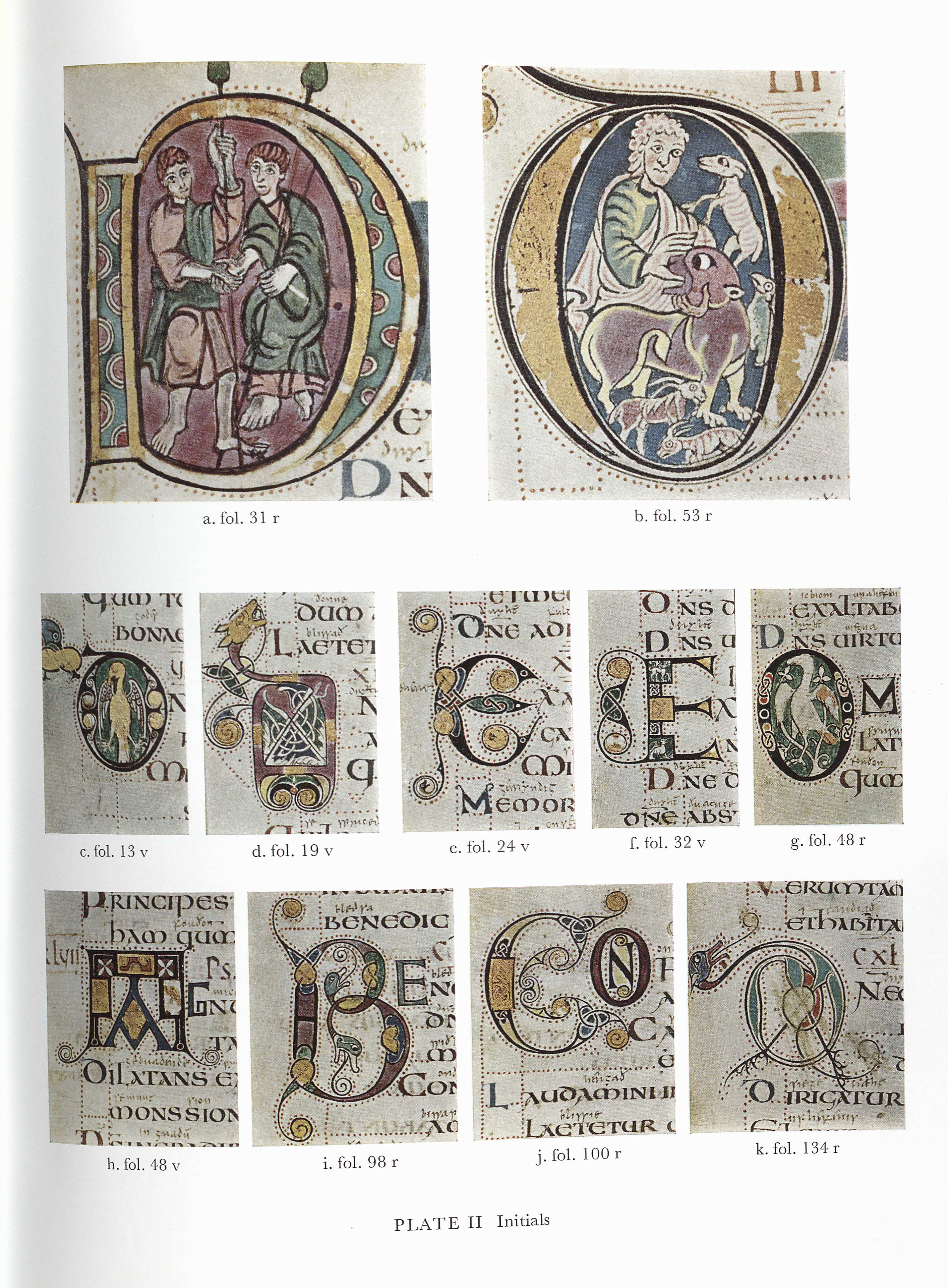
This is a selection of initials from a facsimile of the Vespasian Psalter which is housed in the British Museum. The Vespasian Psalter was produced in England in the 8th century and is the oldest surviving book in the world with historiated initials. Written in Latin, an English gloss was added to it in the 9th Century. (Z115 .E5 E2 1967 v. 14. Image by Anne Causey)
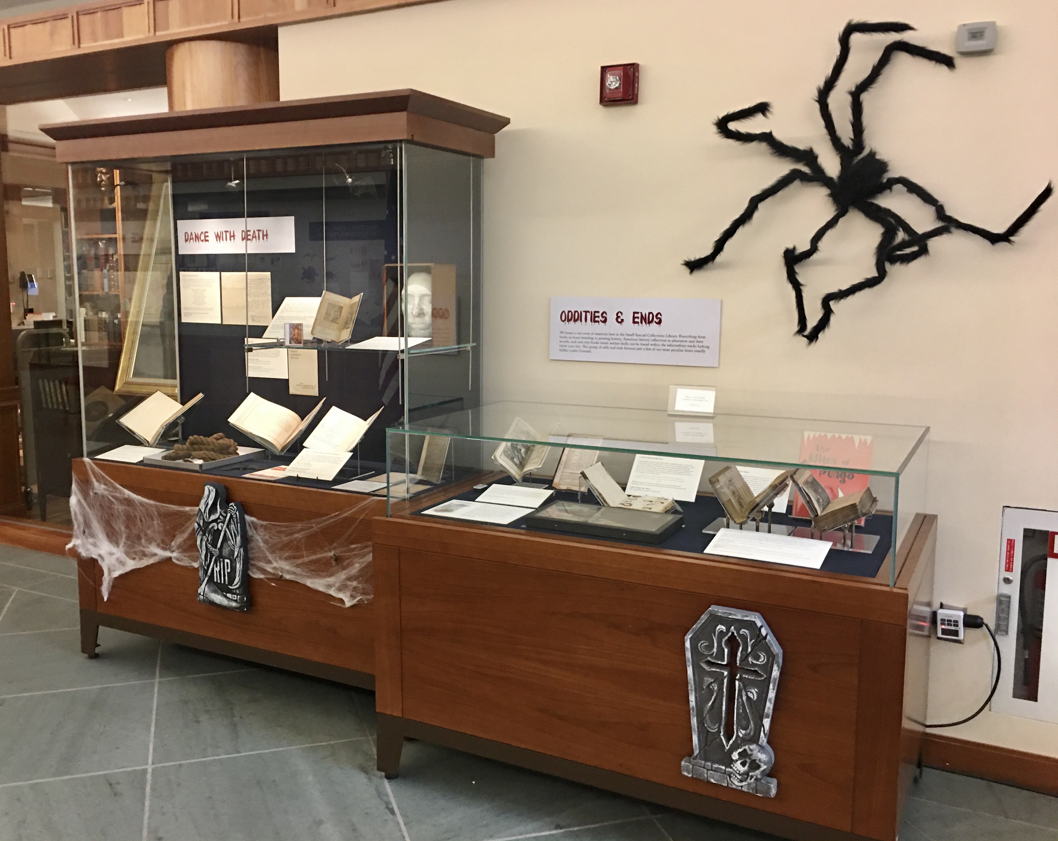
P is for Punishment
The American system of slavery relied heavily on instilling fear in an attempt to cow the enslaved and render them docile. Slave owners disciplined their slaves for reasons such as theft and attempts at flight. The varieties of punishment meted out short of death included whipping, branding, and dismemberment, as shown in a letter dated October 10, 1727, from Robert “King” Carter to his overseer, Mr. Robert Jones:
Ballazore is an incorrigeable rogue nothing less than dismembring will reclaim him. I would have you outlaw him and get an order of the court for taking off his toes I have cured many a negro of running away by this means ….
On occasion, corporal punishment had horrific and unexpected consequences. Thomas Mann Randolph, writing from Monticello on November 22, 1818, describes such an event at a nearby Albemarle County plantation when a trusted slave
… received a few lashes on his bare back for some trifling misdemeanour; leaving his tools in the field, it is said. He hung himself, 30 feet from the ground, in a tree near his Masters door, the same night ….
Contributed by Edward Gaynor, Head of Description and Specialist for Virginiana and University Archives
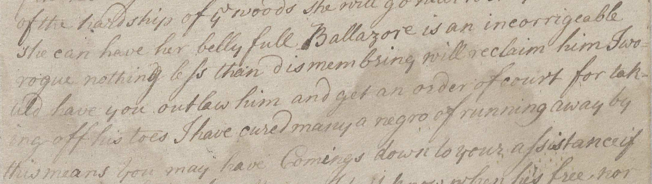
Detail from Robert “King” Carter’s Letterbook, regarding the escaped slave Ballazore, 1727. (MSS 3807. Image by Petrina Jackson)
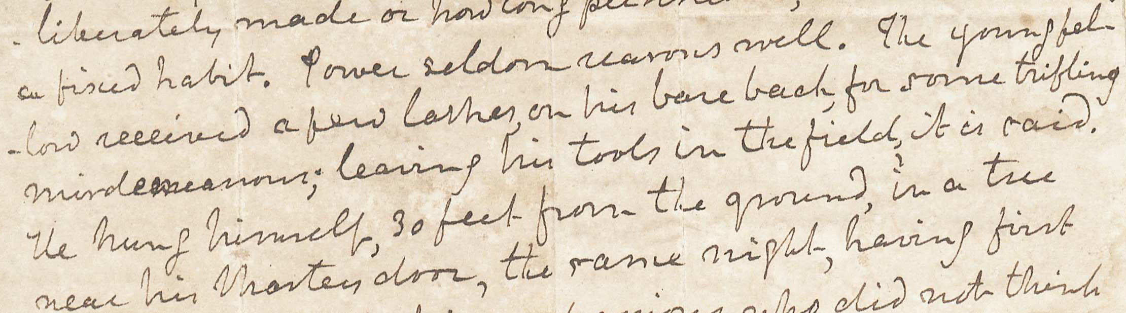
Detail of a Thomas Mann Randolph letter, regarding the beating and consequent suicide of an enslaved man, 1818. (MSS 10487. Jefferson Trust 1982/1983. Image by Petrina Jackson)
See you in a couple of weeks, when we feature the “Q’s!”