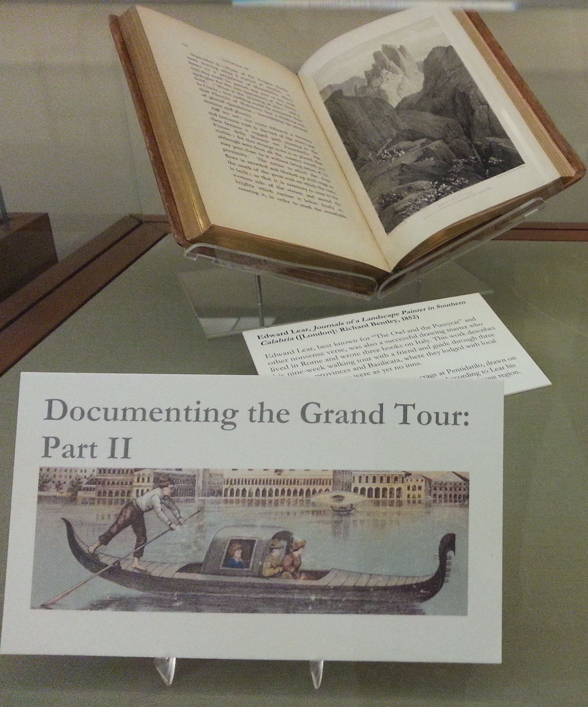
This week we are pleased to share a guest post by Rodger Steele Williamson, who is a professor at the University of Kitakyushu, Japan. Professor Williamson spent several months over the last year working in the Lafcadio Hearn collection in the Barrett Library of American Literature. Professor Williamson was a cheerful and vibrant addition to our community during his time here and we miss him (and his pastry-chef wife’s delectable and elegant treats, delivered at impressive intervals to the staff break room!).
In Japan the names Lafcadio Hearn (1850-1904) or Koizumi Yakumo, his name after adoption into his Japanese wife’s family register, are synonymous with ghost stories or nostalgic and exotic tales of Japanese cultural heritage. Today Hearn is renowned by the Japanese public for his advocacy, respect, and praise for what he viewed as refined and even superior cultural traits of Japanese culture and society that disappeared with the rapid modernization that characterized the Meiji Era (1868-1912). If one mentions him to locals in the two major American cities (Cincinnati and New Orleans) that he called home for a total of almost twenty years, you most likely get a blank stare.
Outside of most academic circles Hearn is relatively unknown in a country he called home for nearly twice as long as Japan. His many publications on Japan (all of which may be found at the University of Virginia) had been the cornerstone of any American studies on Japan until he was essentially blacklisted due to Japanese use of his writings as propaganda during World War II; also damaging was the fact that he took Japanese citizenship to protect his family at a time when marrying a non-citizen would have meant his wife’s loss of rights as a Japanese.
In contrast to the United States, Hearn studies thrive in Japan, where numerous books, mostly in Japanese, continue to be written about his life and works. Interestingly, there are many Japanese who do not even realize that all of Hearn’s works are available in English and are widely available online for free, making them great resources for English-language classroom readings.
A longtime resident of Japan, I was, in fact, introduced to Hearn in Virginia, by my history professor at the University of Richmond: around that time there were several new publications related to the centennial of Hearn’s arrival in Japan (1890). That led to research in the Hearn holdings in the Clifton Waller Barrett Library of American Liteature at U.Va. and then graduate studies in Japan. I had the great privilege of writing my dissertation at Kumamoto University, where Hearn taught at the Higher Middle School from 1891 to 1894. I am fortunate to have come full circle with an investigation of Hearn’s Irish and American roots (even though he was never an American citizen).
Clifton Waller Barrett (1901-1991), 1920 alumnus of the University of Virginia, wrote in 1983 that, “In 1939 I made a decision that brought about a radical change in my life. I decided to amass a comprehensive collection of American Literature.” Writing on the occasion of a U.Va. Library exhibition of his Hearn collection, he stated, “One writer who stood out in this group was Lafcadio Hearn. His amazing originality, combined with the unusual beauty and quality of his writing had won praise from discriminating critics; however, in the years of World War II and the decade following he was neglected.” During his lifetime Lafcadio Hearn never mentioned any personal connections with Virginia or the University of Virginia but scholars of Hearn owe much gratitude to the pursuits of Clifton Waller Barrett in building “a representative collection of Hearn’s printed works and manuscripts most particularly.” One might say it is now the greatest depository of Hearn related materials and original manuscripts in the world.
I was glad to return recently for an in-depth study of the Hearn collection, and have reflected during that time on its strengths and its history as a collection. It is important to realize the dedication of family and scholars responsible for some of the Barrett collection’s core Hearn materials. Hearn’s eldest son, Kazuo Hearn Koizumi, writes about his attempt to save his father’s papers in his essay “On War’s Futility,” published in the collection Re-Echo in 1957:
During World War II I was afraid that Father’s treasured manuscripts would be burned in an incendiary bomb attack. I divided his mementos into three packages, two of which I left with friends. I kept one packet. One package my friend stored in a warehouse which was burned; the other package was stolen.
Once the war was over he dug out his package and while airing out the papers “in the sunbeams, under the bright, blue, peaceful, autumn sky in which there were no more air raids, the memories of the dear old days of my childhood returned to heart.” It was his hope that the papers could be published in some form; his book and the works of numerous others greatly benefited from this labor of love. Most of the papers and notebooks from the bundle are now easily accessed in the Barrett Reading Room in the Albert and Shirley Small Special Collections Library. The original manuscripts of Re-Echo are perfectly preserved there along with all the artwork that Hearn’s son painstakingly took out as clippings from the notebooks for the publication.
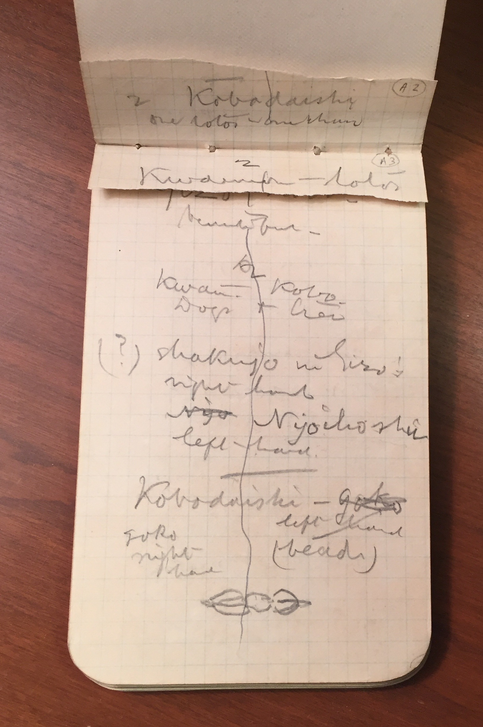
Hearn’s early notebook draft material for “Re-Echo.” (MSS 6101)
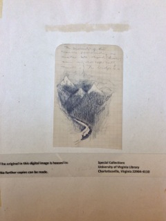
Draft illustration for “Re-Echo.”
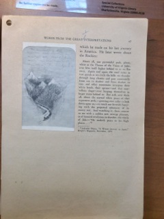
Page proof for “Re-Echo.”
Another contributor to whom much is owed is P.D. Perkins, who compiled and published a comprehensive bibliography of Hearn in 1934 during the commemorations of the thirtieth anniversary of Hearn’s passing. Perkins also saved some of Hearn’s rarest–and most politically forceful–work from destruction. In a letter to Barrett, he describes how, at his own personal risk, he traveled to Japan and “spent two weeks in September 1941 three months before the start of World War II going over the files of the [Japan Chronicle] newspaper for 1894-95,” when Hearn wrote for hte paper. If not for his actions all would have been lost: “the file of the Chronicle from which I obtained these articles was destroyed during the bombing of Kobe during the war. To the best of my knowledge there is now no file of the Chronicle in existence.” Perkins was unable to publish these pieces and they remain in the Hearn collection at Virginia as a a set of typescripts.
In these typescripts, Hearn uses his unusual position to critique foreign views of both Japanese and Western culture. Writing in 1895 to Atlantic Monthly editor Horace Scudder, Hearn states, “The difference between myself and other writers on Japan is simply that I have become practically a Japanese – in all but knowledge of language; while other writers remain foreigners, looking from outside at riddles which cannot be read except from the inside.” From this vantage point, Hearn condemned what he thought to be predominating social and racial biases among foreign residents in Japan. In a notable unpublished Chronicle article from August 1895, Hearn advocates for the rights of religious minorities:
The majority have no more right to say that the minority shall be voiceless than the minority have the right to compel the majority to accept their view. It is indeed a proof of how very little the civilization of the nineteenth century has advanced in certain respects beyond that of the Middle Age.
In an editorial of October 1885, he writes on racism that “Race hatred itself [is] based on a sort of perverted emotionalism….Certainly it is clear that it is the growth of intellectuality that we must look for [in] the elimination of race hatreds and the spread of a sane cosmopolitanism.”
Hearn believed that his opinions did not sit well with some expat readers in Japan. After leaving Kobe for Tokyo he would write in a letter, “I have long been a subject of persecution in Japan . . . The matter appears to have been managed by a humble clique of English officials, with the aid of the religious bodies.” With this in mind, we can only speculate why these particular articles were not originally chosen for publications. Some of them might have been viewed as too controversial for their anti-western sentiments. In any case a great debt is owed to P.D. Perkins for saving them and then Mr. Barrett for adding them to his collection.
A key strength of the Hearn collection is in its breadth, as may be seen in the library’s own description of the collection: “three hundred letters, some of them to Ernest Fenollosa and to Japanese friends, twenty-five groups of manuscripts, including those of Kwaidan and the description of feudal customs, Glimpses of Unfamiliar Japan, over thirty notebooks, and innumerable periodical appearances and translations.” The essayist Guy Davenport, writing for a U.Va. exhibition on Hearn, noted the voluminous presence of “variant bindings, later editions, periodical printings, translations, [and] inscribed association copies.” It holds a true wealth of resources for a visiting Hearn scholar.
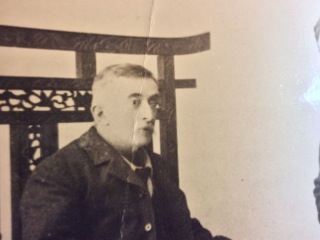
Lafcadio Hearn was virtually always photographed in profile, with his right side visible. This was due to a disfiguring scar caused by an accident in his youth. The injury was not attended to quickly enough, causing him to lose the sight of the left eye: his cornea was completely transformed into a white scar. His right, uninjured eye was so myopic that, even with lenses, he could scarcely see clearly beyond six inches from his nose. This 1898 image shows Hearn facing the camera much more directly than other photographs. (MSS 6101)
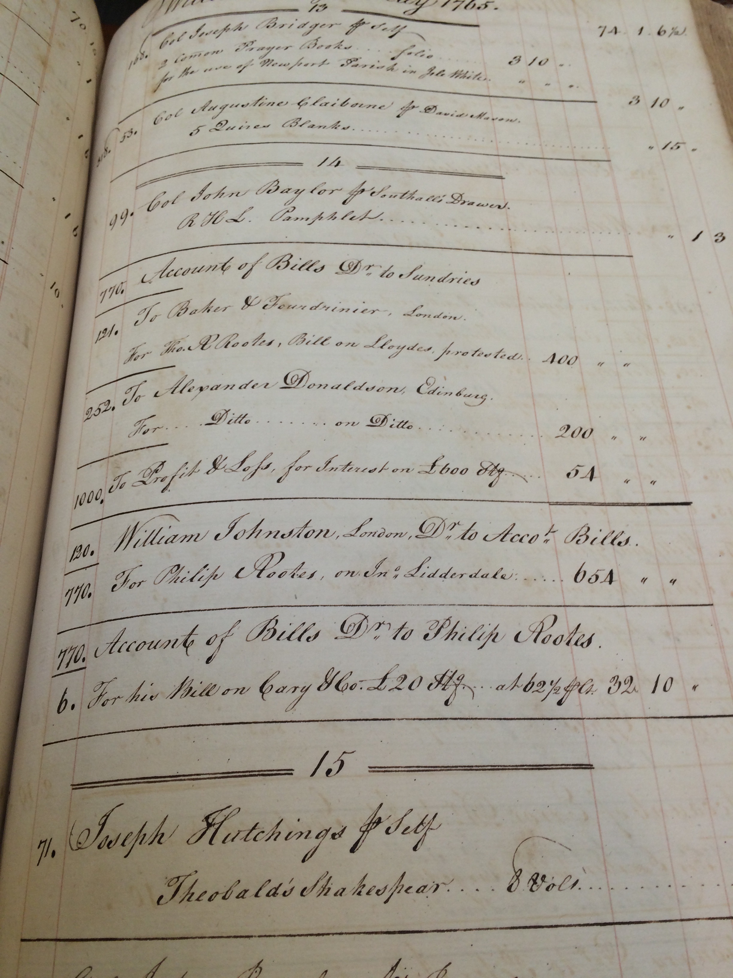
![Joseph Hutchings purchased 8 volumes of of Shakespeare "for [his] self" (MSS 467).](https://smallnotes.internal.lib.virginia.edu/wp-content/uploads/2015/10/theobalds_shakespeare.jpg)