This is the first in a series of four posts, spotlighting the mini-exhibitions of students from USEM 1570: Researching History, Fall 2014.
Last semester, I taught USEM 1570: Researching History for the second time. The course gives first-year students the opportunity to learn about and immerse themselves in primary source research. For most undergraduates, archival research is scary stuff. However, my students bravely navigated through the rich array of research materials held in the Albert and Shirley Small Special Collections Library, sharing what they learned with friends, family, and the general public. Sharing what they learned was most evident in their final assignment, curating a mini-exhibition. The mini-exhibition had to illustrate a particular story with only five items of varying formats. After creating the exhibitions, these budding researchers presented them at their outreach program, Tales from Under Grounds II.
For those who could not make it, I present to you the second best thing: Tales from Under Grounds II in its abridged version as captured in each student’s own words.
Note: only two selections per student are shown.
***
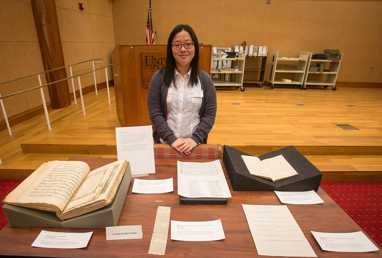
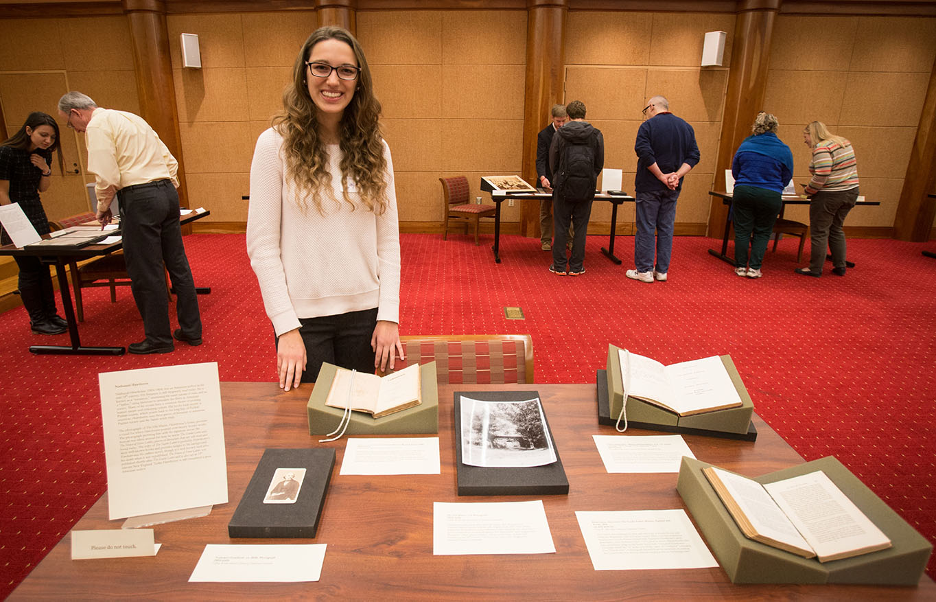
Maryknoll Hemingway, First-Year Student
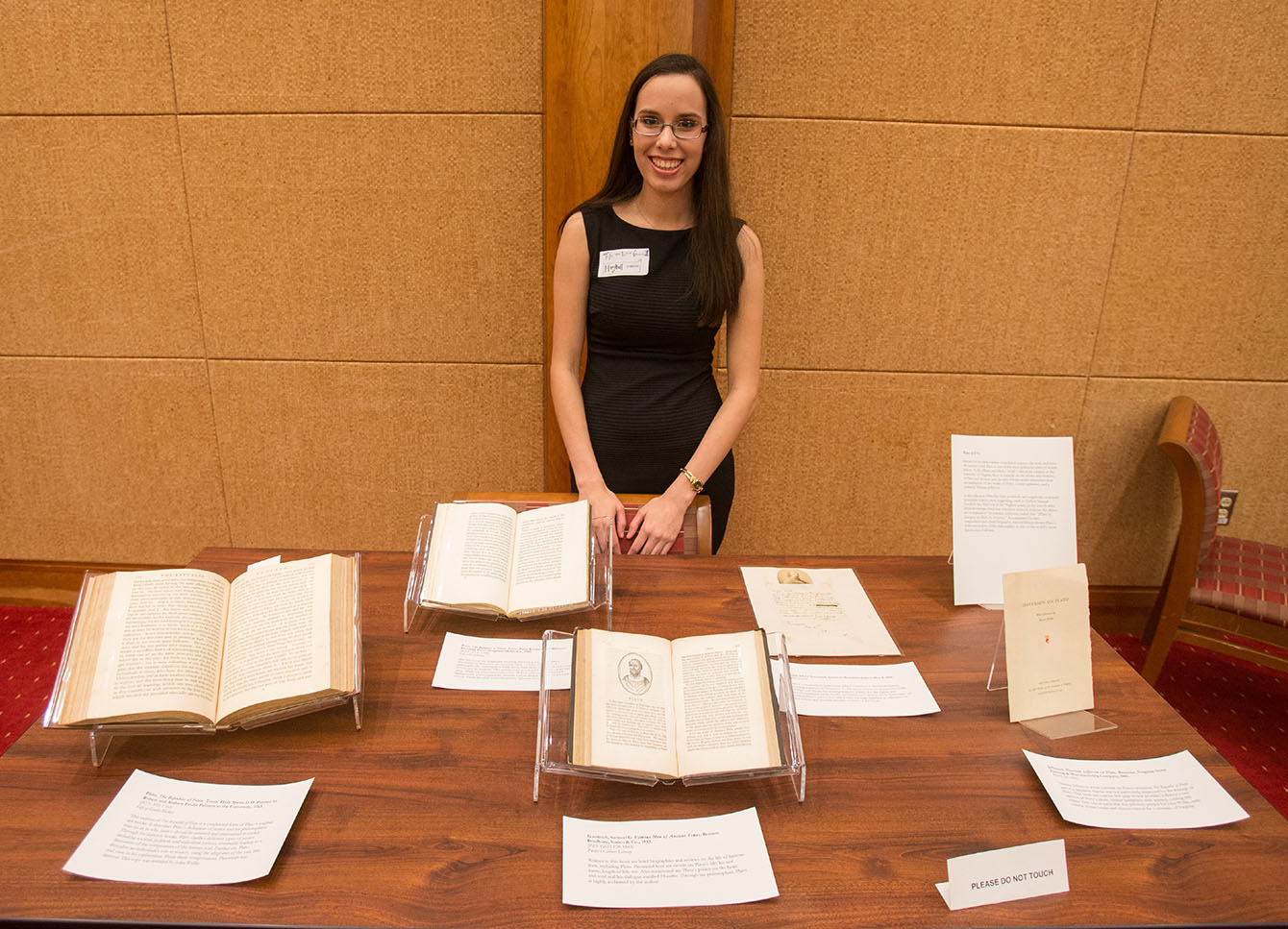
Photograph of Maryknoll Hemingway by Sanjay Suchak, November 18, 2014.
Plato at U.Va.
Known for his philosophies on political science, the soul, and love, the ancient Greek Plato is one of the most infamous men of world history. At the Albert and Shirley Small Collections Library at the University of Virginia, there is material on the works and reviews of Plato and his ideas and theories. Of the works presented here are translations of two works of Plato, a letter appraisal, and a review by Thomas Jefferson.
In this collection, reviewers negatively and positively respond to Plato’s philosophies, most suggesting, such as Author Samuel Goodrich, that Plato was at the “highest point, in the search after divine knowledge which has ever been attained, without the direct aid of inspiration.” In contrast, Jefferson, stated that “[Plato’s] dialogues are libels on Socrates.” Accompanied by two compositions and a brief biography, this exhibition shows Plato’s works and reviews of his philosophies as one of the world’s most famous men of all time.
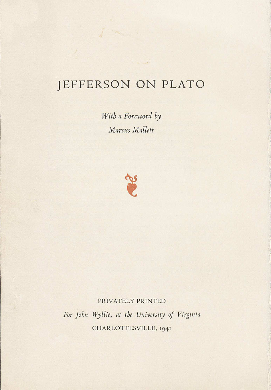
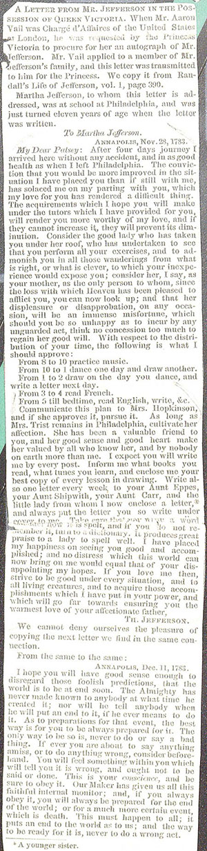
Jefferson, Thomas. Jefferson on Plato. Roanoke, Virginia: Stone Printing & Manufacturing Company, 1941. Thomas Jefferson wrote a review on Plato’s “The Republic of Plato,” and it is apparent that he was not particularly impressed by the writings of Plato. This brief and concise five page review provides Jefferson’s raw opinion of Plato’s ideals. Similar pamphlets were printed, totaling 600 copies. This one in particular was privately printed for John Wyllie, early curator of rare books and manuscripts at the University of Virginia. (B393 .J4 1941)
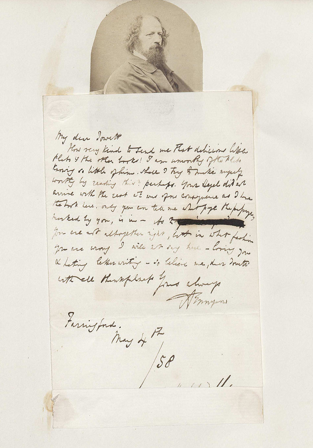
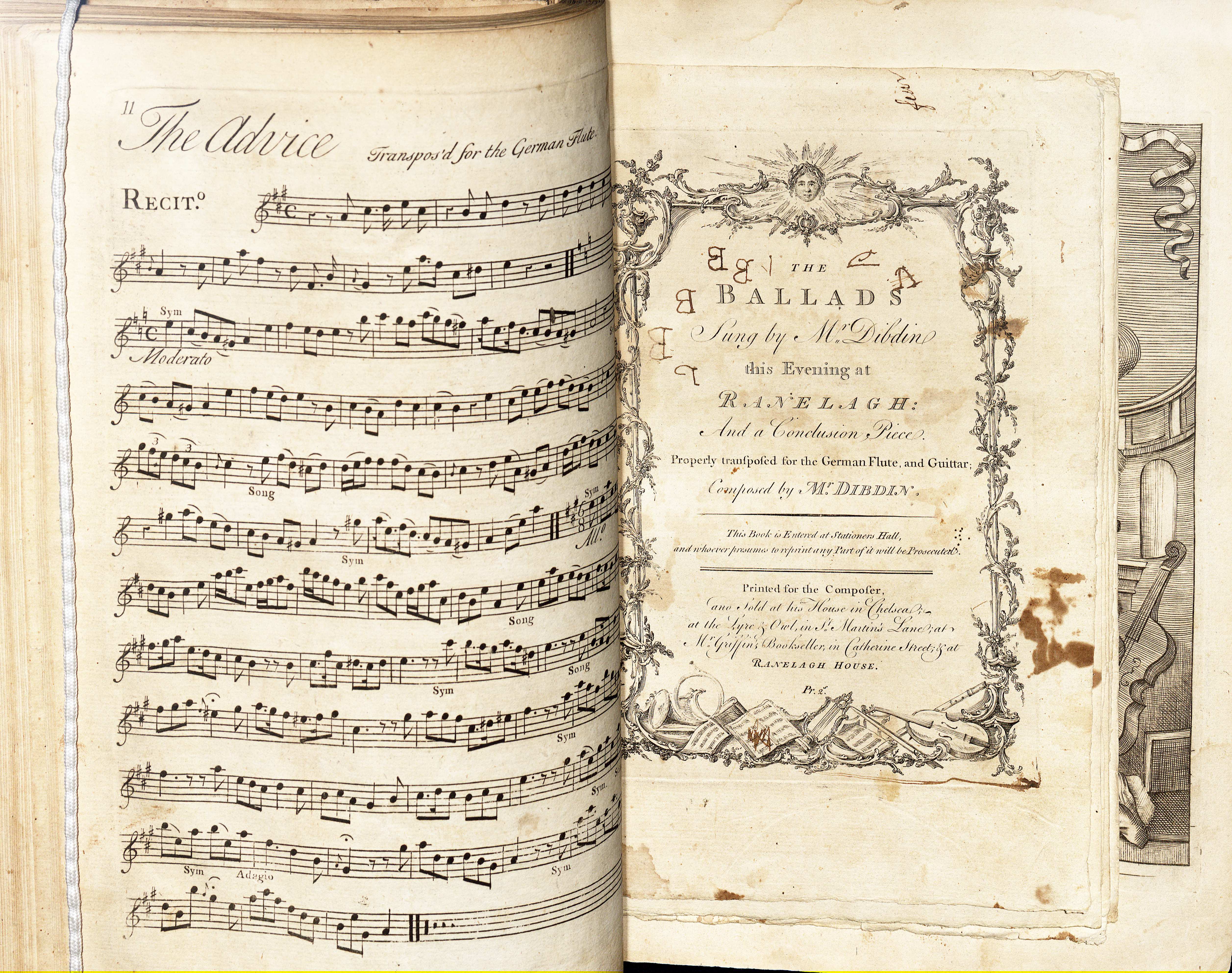
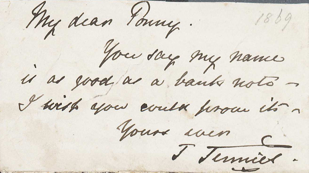
Baron Alfred Tennyson, Letter to Benjamin Jowett, May 4, 1858.
This is a handwritten letter from Alfred Tennyson to Benjamin Jowett, featuring a picture of Tennyson. In this letter, Tennyson praises the works of Plato and thanks Jowett for copies and recommendation of books. In Tennyson’s opinion, he [Tennyson] is “unworthy” of reading Plato’s pieces, but asks Jowett for page numbers as references to key points, and possible favorite sections of the books. (MSS 10499)
***
Josh Huttler, First-Year Student
Photograph of Josh Huttler by Sanjay Suchak, November 18, 2014.
Monkey-Man or Genius: The Development of Charles Darwin’s Evolutionist Theories and Public Response
Throughout the nineteenth century, Charles Darwin was one of the principle contributors to the theory of evolution. Following his expeditions on the H.M.S Beagle, Darwin produced one of the most influential and controversial texts of the era: On the Origin of Species by Means of Natural Selection.
In this collection of artifacts, a Conrad Martens watercolor of the H.M.S Beagle and a first edition copy of Darwin’s On the Origin of Species reflect the development of Darwinian evolutionist thought. Further, several cartoons from British periodicals, a magazine describing religious responses, and an obituary released after Darwin’s death illustrate the mixed public reactions to Darwin’s work. Several of these items refer to one of Darwin’s most contentious and publicized ideas— the concept that man and monkey share a common ancestor.
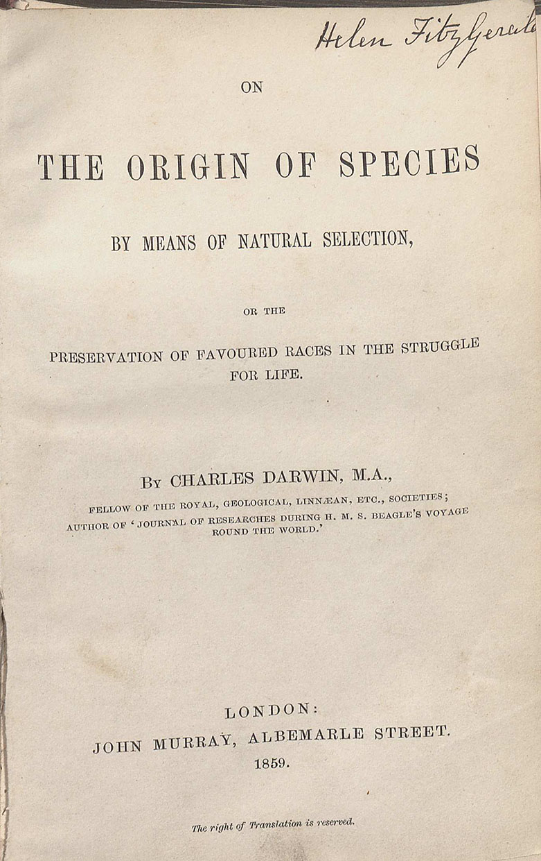
Darwin, Charles. “On the Origin of Species by Means of Natural Selection, or the Preservation of Favoured Races in the Struggle for Life.” London: John Murray, 1859.
Published almost twenty years after The Voyage of the Beagle, this first edition copy of Charles Darwin’s “On the Origin of Species” set the foundation for new evolutionist theory. Amongst other important topics, this text outlines the theories of natural selection and species variation while building on the ideas of his evolutionist predecessors. (QH365 .O2 1859. Gift of Colonel J. R. Fox)
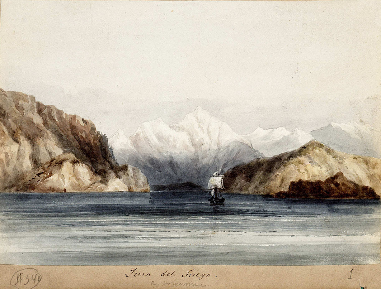
Martens, Conrad. Terra Del Fuego: H.M.S. Beagle Under the Land, ca. 1834.
This watercolor of the H.M.S. Beagle reflects the ship landing in Tierra Del Fuego, a South American archipelago. Darwin developed many of his early evolutionist theories during his almost five-year expedition on this ship. Darwin discusses some of his findings from the expedition in his book The Voyage of the Beagle. (MSS 3314. Paul Victorius Evolution Collection)
***
Sierra Teate, First-Year Student
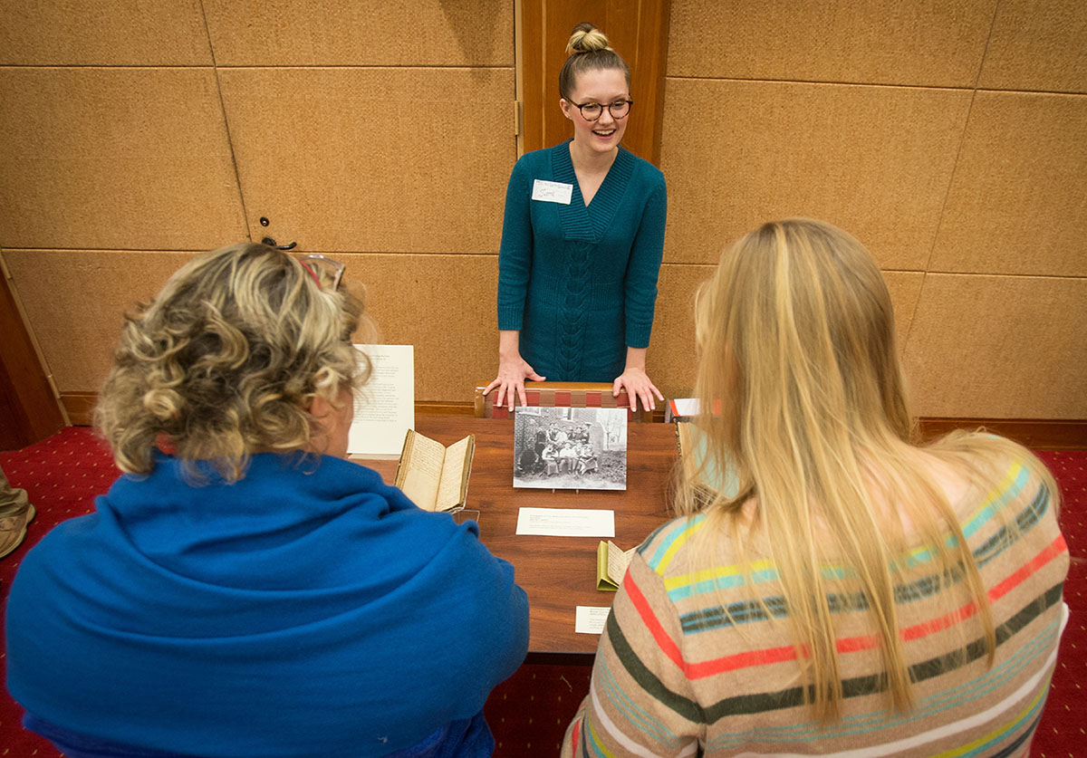
Photograph of Sierra Teate discussing her mini-exhibition with library staff, November 18, 2014. (Photograph by Sanjay Suchak)
What Was Medicine Really Like During the Late Nineteenth and Early Twentieth Century in Charlottesville, Virginia?
Everyone knows medicine has come a long way since the late nineteenth and early twentieth century, but just how different were practices and philosophies then? Despite substantial discoveries that had been made hundreds of years before, much more progress needed to be made.
The sources displayed here give a first hand look at how doctors and upcoming doctors in Charlottesville, Virginia viewed their profession as well as how they diagnosed and treated their patients. It is obvious that many of their practices are foreign to us today. For example, now at the University of Virginia, students do not pose for a picture with cadavers. Hospital receipts are printed on very different paper. Some remedies doctors used are definitely frowned upon now. Yet, we still of course have many similarities with this generation of medical professionals. They record their patients’ symptoms, speak at medical events, and vaccinate children. A great deal can be learned about the evolution of medicine from this collection. Beyond being simply fascinating, the history of medicine is important to keep in mind for the future.
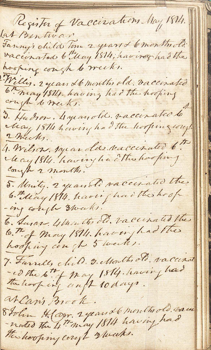
Frank Carr’s Journal and Commonplace Book, 1810-1838.
This is the personal journal of Frank Carr, which includes a register of vaccinations during May, 1814 and an extensive description of a man’s case of hydrophobia. (MSS 15444. C. Venable Minor Endowment Fund, 2012/2013)
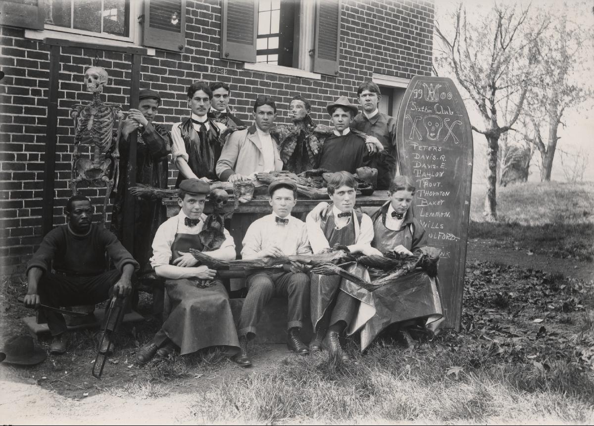
Photograph of U.Va. Medical Students, The Sixth Club, 1899.
This picture shows University of Virginia medical students posing with cadavers they have been studying. (RG-30/1/10.011. University of Virginia Visual History Collection. Image by University of Virginia Digitization Services)
***
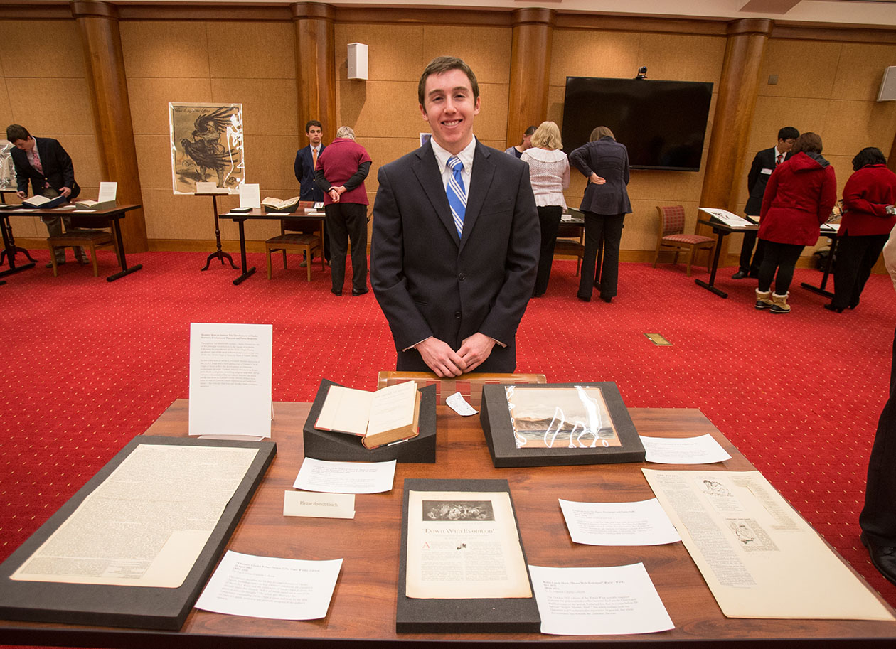
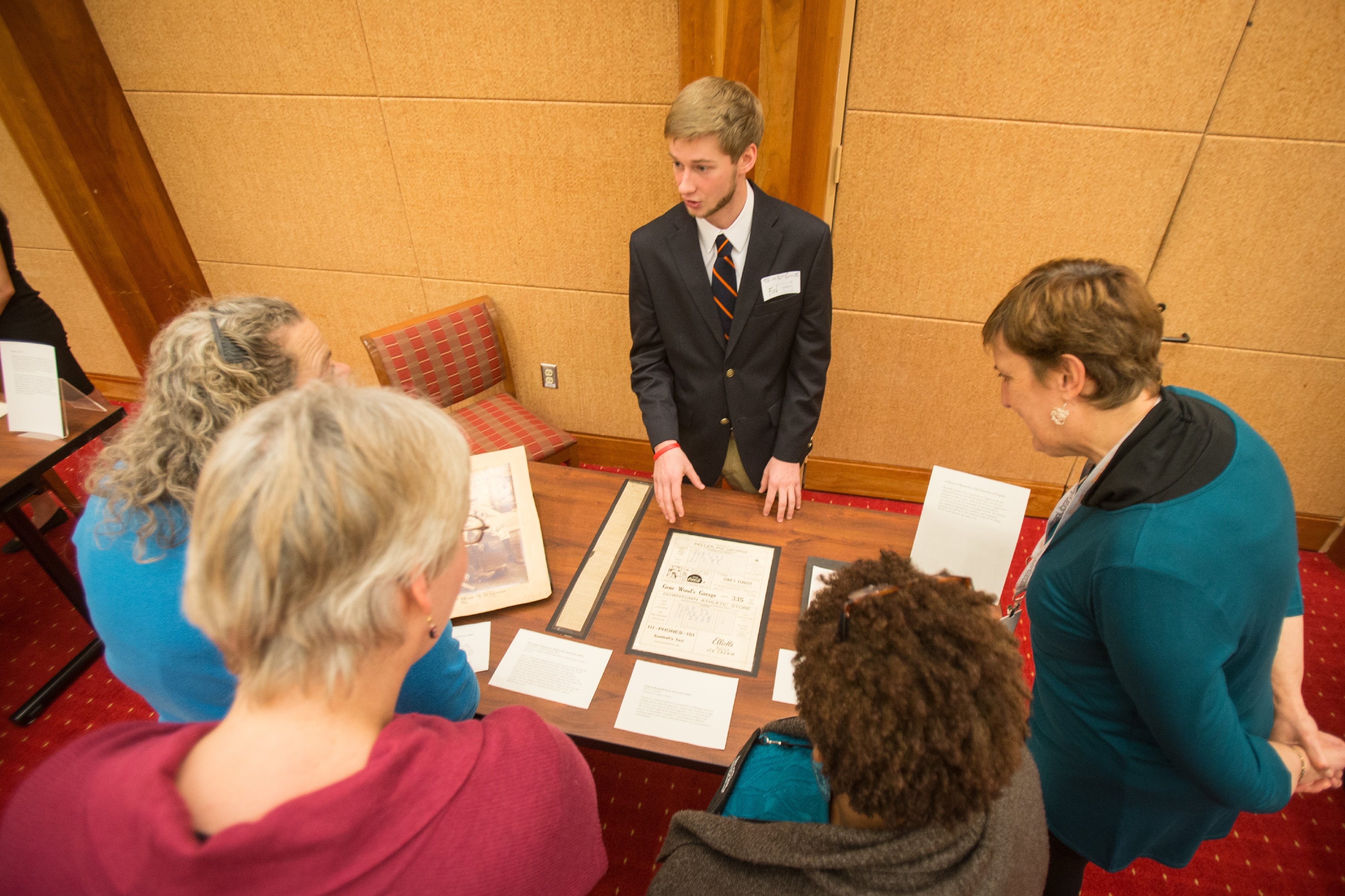
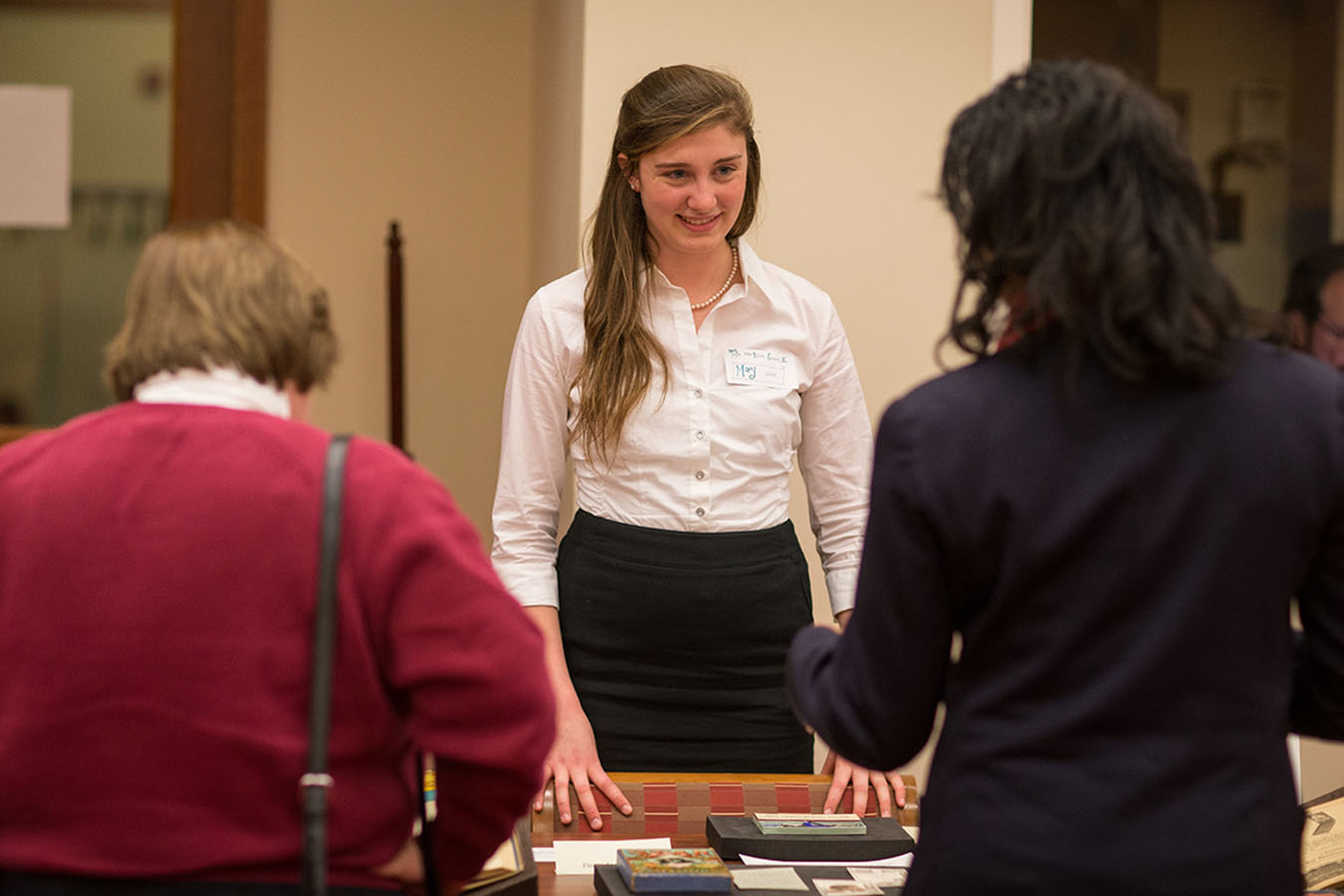
Nick Kumleben, First-Year Student

Nick Kumleben discusses his mini-exhibition with visitors, November 18, 2014. (Photograph by Sanjay Suchak)
Peaceful Protest in the 20th Century: from Cape Town to Charlottesville
This exhibition tracks the development of ideas and forms of peaceful protest in the 20th century, beginning with Mohandas Gandhi’s campaigns in South Africa and India, moving on to document the civil rights campaigns in 1950s and 1960s America, to the more recent South African and international protests against apartheid. It aims to give the viewer a sense of the development of peaceful protest as a political and social tool, the demographics that took part and its eventual success, or lack of, in changing the course of 20th-century history. It is particularly interesting to observe the difference and the evolution in terms of how the movements were commemorated, both by those who attended and those who chronicled it in print.
The focus on South Africa also allows us to consider the changing political landscape of that country, especially the dynamic of internal protest first gaining external coverage, then a previously local protest movement expanding to become an international phenomenon in an increasingly globalized world.
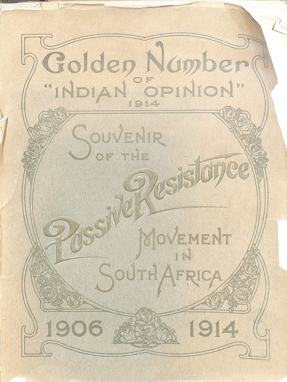
The Indian Opinion, Souvenir of the Passive Resistance Movement in South Africa, 1906-1914. Phoenix, Natal, South Africa, 1914. Featured is a commemorative edition of the “Indian Opinion” magazine, celebrating the passive resistance campaign spearheaded by Mohandas Gandhi in South Africa from 1906-1914, resulting in the eventual repeal of pass laws for the Indian population. This campaign was where Gandhi developed his idea of satyagraha, or devotion to the truth through the form of nonviolent protest. (DT763 .S88 1914. Gift of R. Smith Simpson)
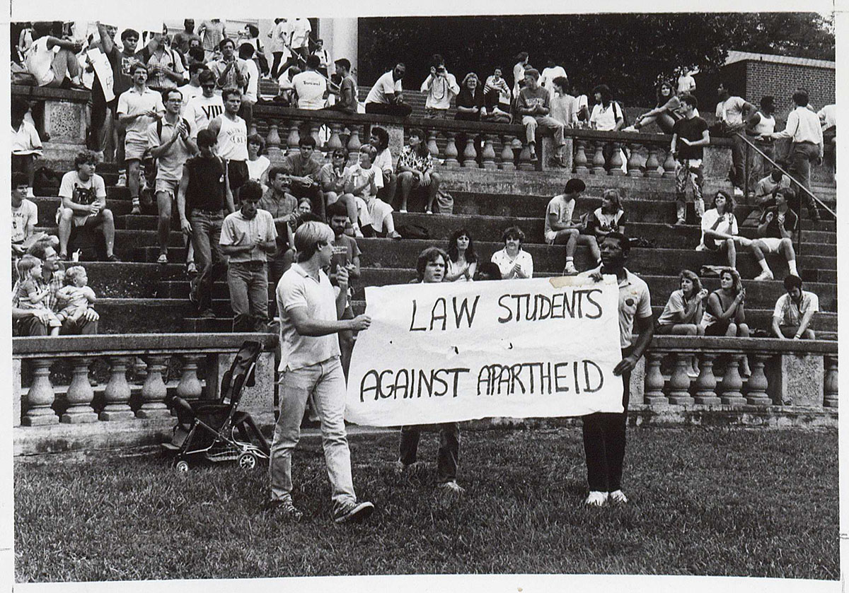
Paula Windridge. Photograph of Anti-Apartheid Rally, 1987.
This photograph depicts University of Virginia law students in the McIntire Amphitheatre, peacefully protesting the racially divisive apartheid system in South Africa. The apartheid government would begin the process of handover to a democratic system three years later in 1990. (RG-30/1/10.011. University of Virginia Visual History Collection. Image by University of Virginia Digitization Services)


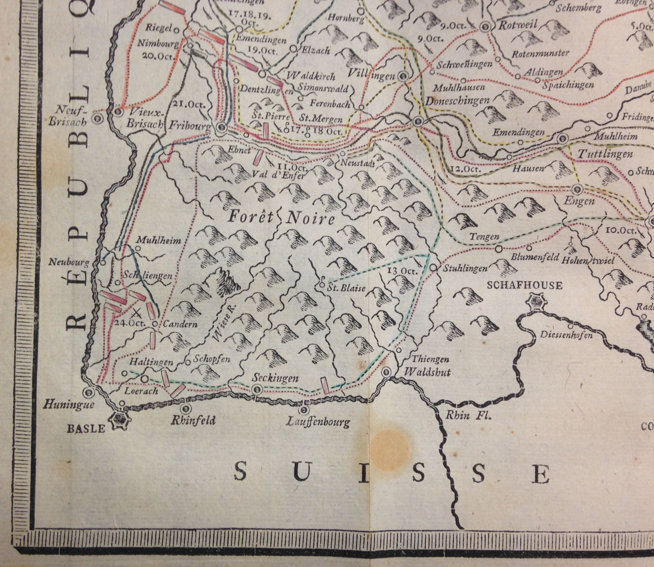
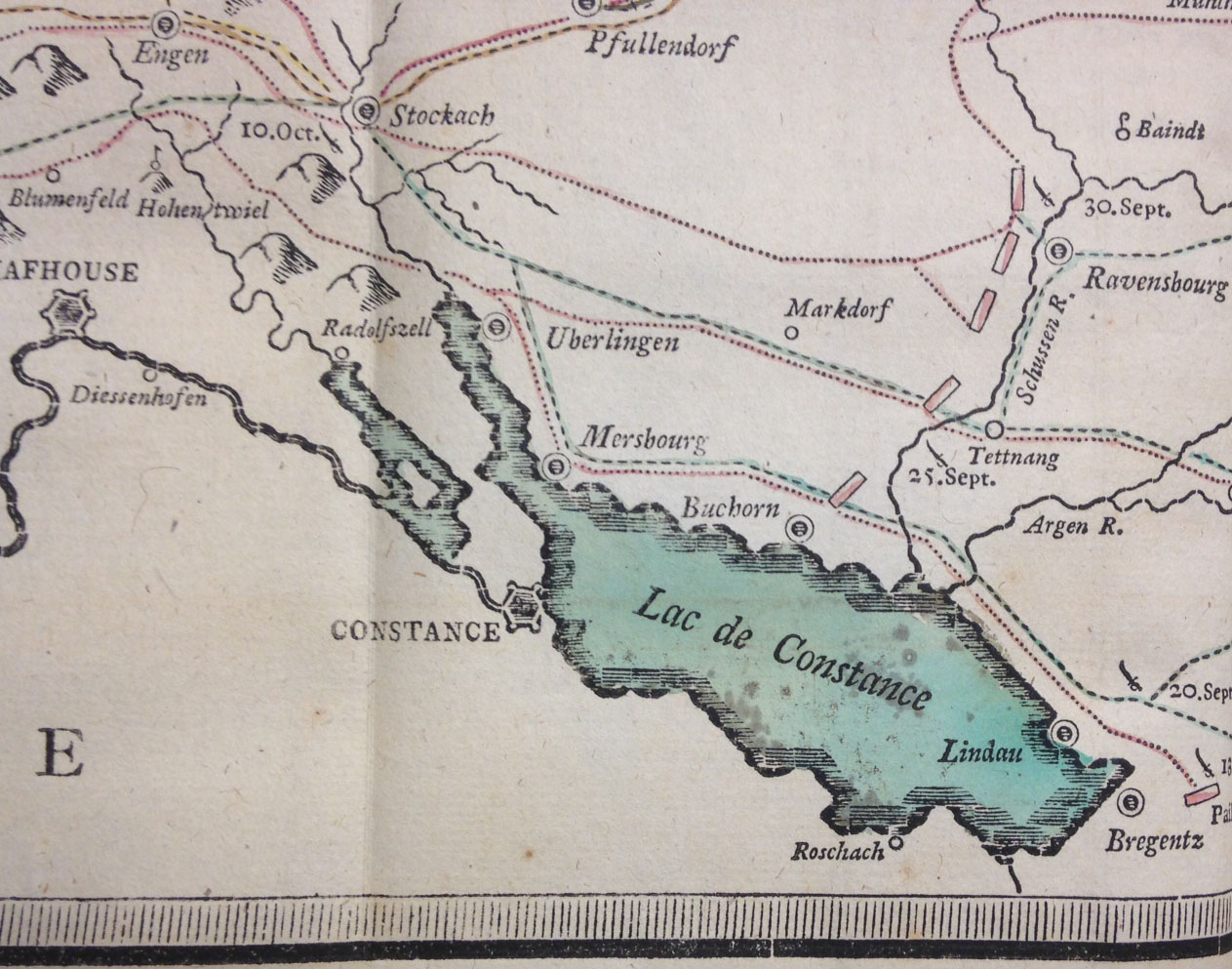
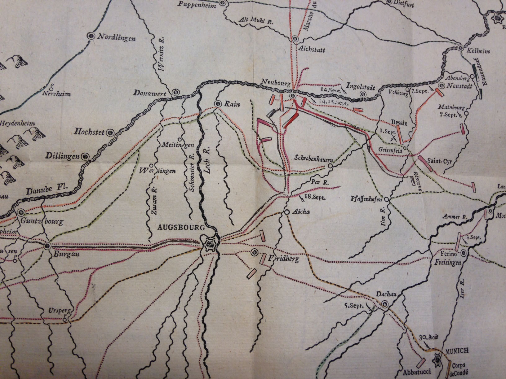
![The map, "composed with movable types," bears the imprint of G[uillaume, i.e. Wilhelm] Haas, the Basel [Switzerland] typefounder who cut and cast the special cartographic font.](https://smallnotes.internal.lib.virginia.edu/wp-content/uploads/2015/02/Map2.jpg)