
Please note: This post has been updated by a follow-up post.
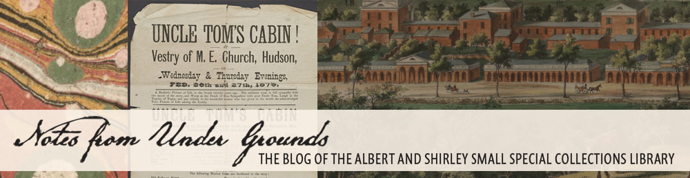
The Albert and Shirley Small Special Collections Library’s collections span over 4 millennia, from Babylonian clay tablets dating to ca. 2000 BCE, to poetry published only this spring via 3-D printer. Impressive as this may sound, it actually conceals a glaring gap, for until last week we possessed no original manuscript written in the nearly three-millennium period between our two clay tablets and our earliest parchment manuscript fragments, which date to the 9th century CE. We have now begun to address that gap with the acquisition of the U.Va. Library’s first original manuscript from Classical antiquity: a papyrus document from Egypt tentatively dated to the 3rd century CE.
P. Virginia 1, U.Va.’s first papyrus document, measures 16.5 x 8 cm. It was written in Greek, probably in Egypt during the 3rd century CE. Purchased on the Associates Endowment Fund.
Papyrus was already employed as a writing surface in Egypt by 2500 BCE, and it was used widely throughout the Mediterranean and Near East from ca. 500 BCE up to ca. 1000 CE before being superseded by parchment and paper. Papyrus sheets were formed by taking the stem of the papyrus plant, cutting the inner pith into long, thin strips, laying the strips side by side to form a sheet, laying another layer of strips crosswise over the first, then hammering the two layers together. The sticky pith strips would naturally adhere to one another. After polishing, the papyrus sheets could either be pasted together to form a scroll, or used individually. Taking up a reed pen, scribes would typically write on the “recto” side—that is, the side on which the strips ran horizontally—though both sides could be used.
Few of the many millions of papyrus documents written over the millennia have survived to the present day. Because papyrus is an organic material and easily damaged by water, the vast majority of the extant documents have been obtained from two sources. Most come from desert areas in Egypt, where documents were quickly buried by sand and protected from moisture until excavated from the late 19th century onward. These mostly fall within the period 300 BCE – 500 CE and are written in Classical Greek, though many papyrus documents in Demotic, Coptic, Arabic, and other languages also survive. A lesser, though productive, source has been mummy wrappings, for papyrus documents were frequently recycled (and thereby preserved) in this fashion. Regardless of the source, most of the surviving documents are fragmentary in nature, having been torn, crumpled, nibbled, or otherwise damaged at various points over the centuries.
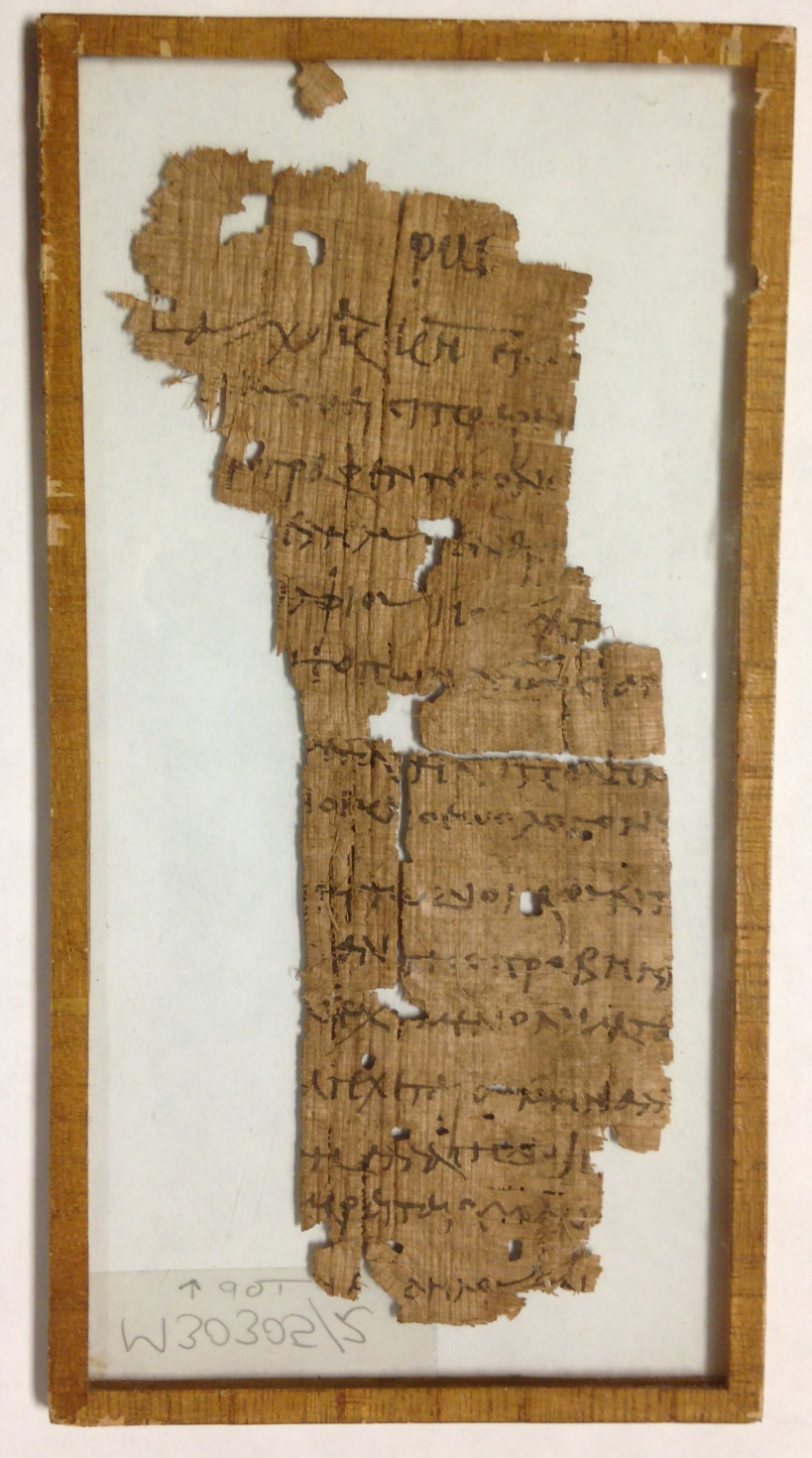
The verso of P. Virginia 1 clearly shows the vertical papyrus strips which form the document’s secondary layer. Additional lines of Greek text–perhaps docketing, or unrelated manuscript notes–are also visible.
Even in fragmentary state, papyrus documents have a great deal to tell us about the cultural, economic, political, and social history of the Ancient World. Deciphering them is the task of papyrologists—classicists who have received specialized training in the skills necessary for working with these documents. First the papyrus pieces need to be cleaned, flattened, fibers straightened, and fragments aligned before the texts can be studied in full. Sealing them between two panes of glass greatly facilitates their handling, study, and long-term preservation. In transcribing and translating the documents, papyrologists face the problems of missing text, poor handwriting, faded or flaking ink, variable spelling and grammar, unfamiliar vocabulary, local dialects &c. Over the past 125 years, however, an impressive corpus of tens of thousands of papyrus texts has been published. These texts are now being digitized and placed online—Papyri.info is a leading web portal—furnishing papyrologists with powerful new tools for comparing texts and readings, and even for locating fragments of the same document scattered in collections around the globe.
Although not complete, U.Va.’s papyrus document—which we will designate as P. [for Papyrus] Virginia 1 (it will also receive a MSS number)—is a large and wonderfully representative example, measuring 16.5 x 8 cm. Probably originating in the Fayyum region southwest of Cairo and dating to the 3rd century CE, the Greek text may be a receipt or tax document concerning grain. Faculty in U.Va.’s Department of Classics are already at work studying the text and planning student practicums for the coming academic year. Soon, we hope to know more about the document and to see it published. Meanwhile, we have begun the search for P. Virginia 2!
![The map, "composed with movable types," bears the imprint of G[uillaume, i.e. Wilhelm] Haas, the Basel [Switzerland] typefounder who cut and cast the special cartographic font.](https://smallnotes.internal.lib.virginia.edu/wp-content/uploads/2015/02/Map2.jpg)
![Public lands in Illinois: January 17, 1839 ... [Vandalia, Ill., 1839] (A 1839 .I55)](https://smallnotes.internal.lib.virginia.edu/wp-content/uploads/2014/11/MG1.jpg)
![Augustus Q. Walton [i.e. Virgil Stewart], A history of the detection, conviction, life and designs of John A. Murel ... (New York, 1839) (A 1839 .W26)](https://smallnotes.internal.lib.virginia.edu/wp-content/uploads/2014/11/MG2.jpg)
![The grant of the Venezuelian Emigration Company, with full explanation of their laudable object ... [St. Louis?, 1866] (A 1866 .G73)](https://smallnotes.internal.lib.virginia.edu/wp-content/uploads/2014/11/MG4.jpg)
![Engraved reproduction of the famous Dove Mosaic discovered by Giuseppe Alessandro Furietti at Hadrian's Villa and now in Rome's Capitoline Museum. Furietti believed it to be the actual mosaic created by Sosus for the royal palace at Pergamon, as described by Pliny the Elder in his Natural History. Giuseppe Alessandro Furietti, De musivis (Rome, 1752), plate [1]. (NA3750 .F8 1752)](https://smallnotes.internal.lib.virginia.edu/wp-content/uploads/2014/05/X1.jpg)
![Two stages in the creation of a lithographic image, from Alphonse Chevallier, Mémoire sur l’art du lithographe (Paris, [1829]) (NE2420 .C54 1829)](https://smallnotes.internal.lib.virginia.edu/wp-content/uploads/2014/04/B5.jpg)
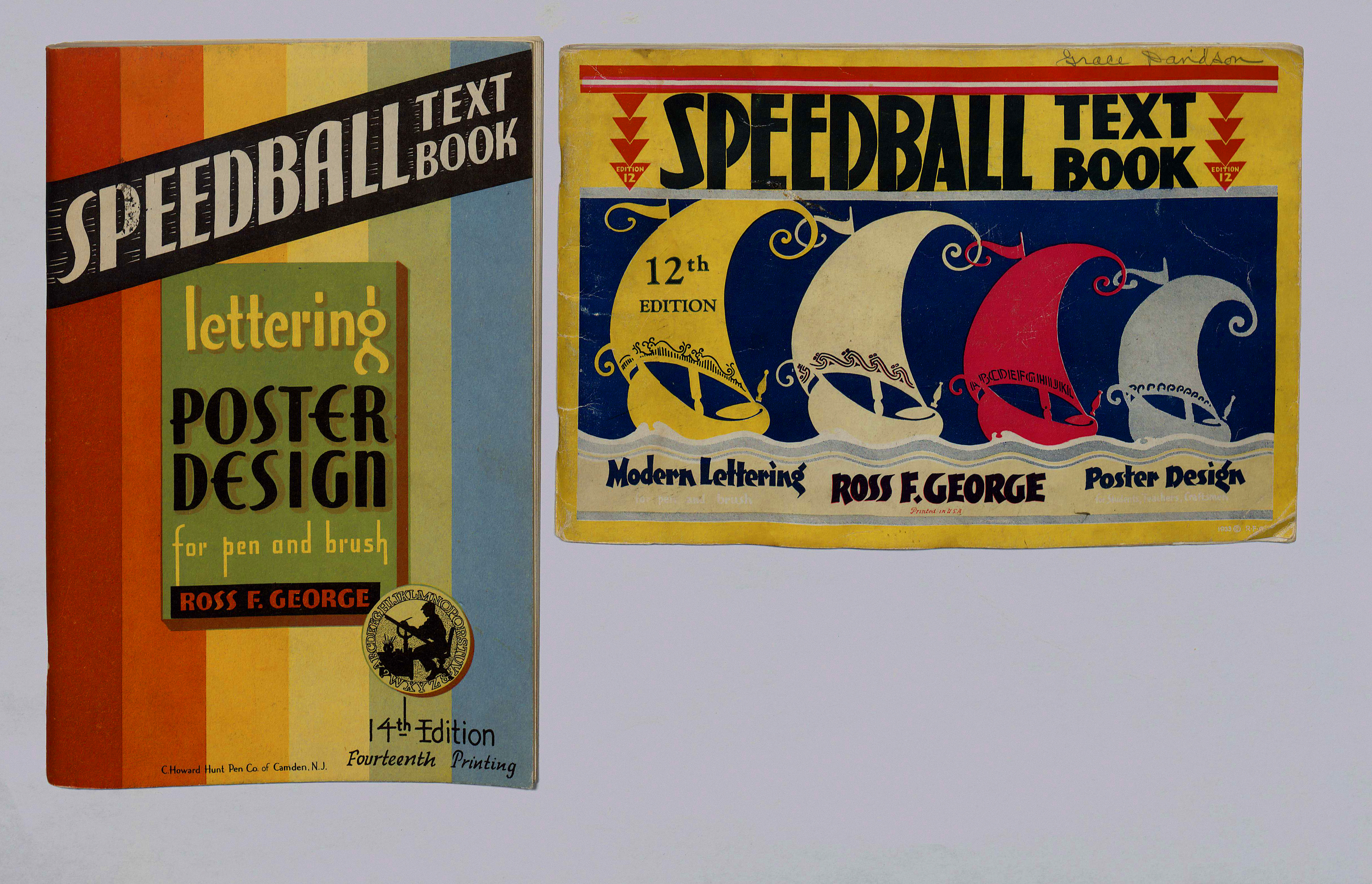
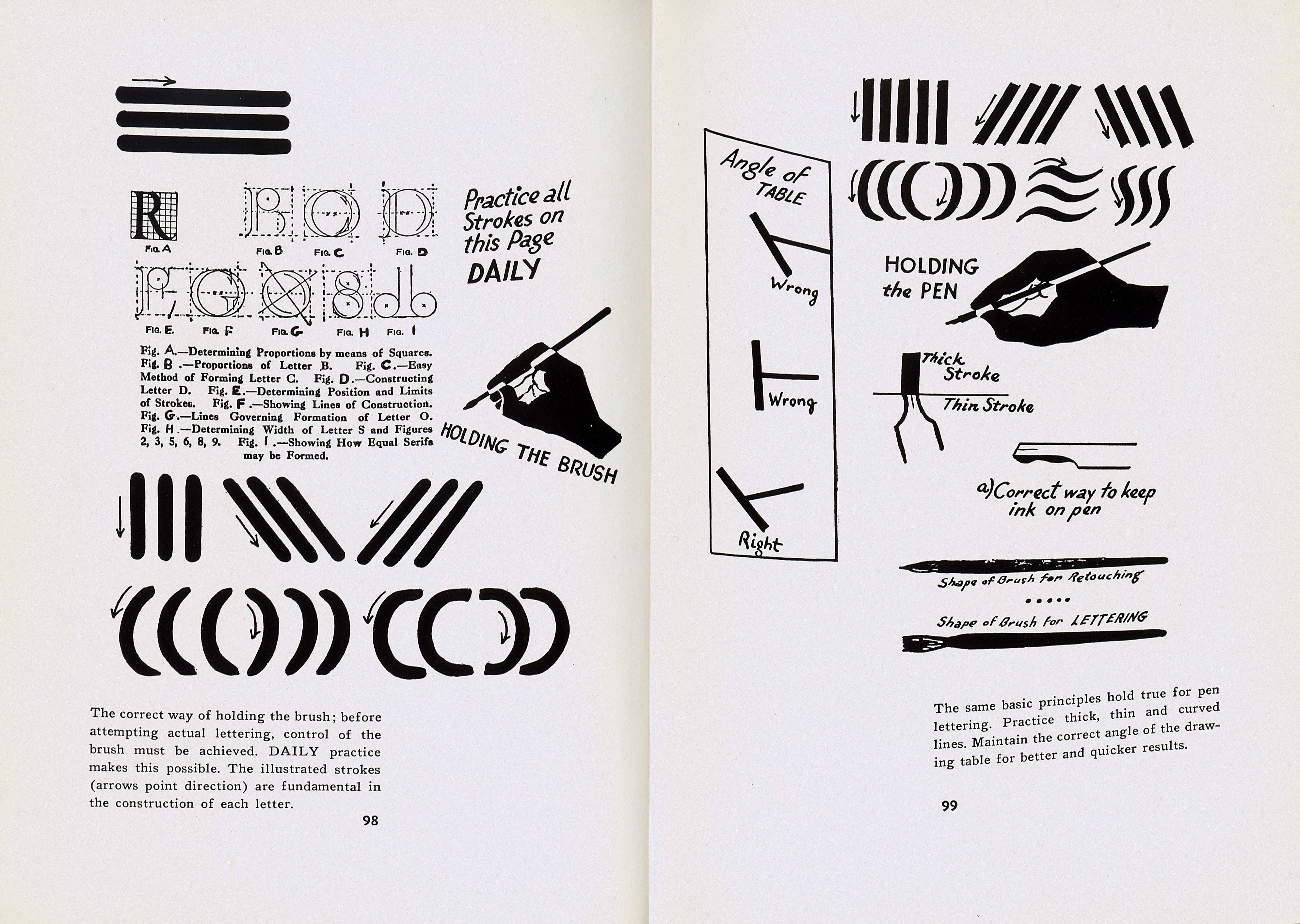
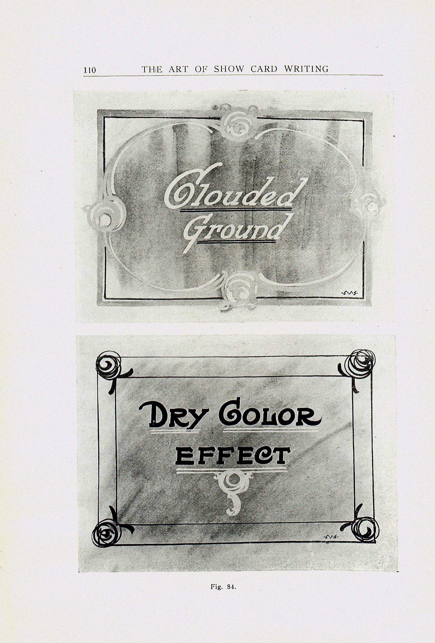
![The books are marvelous specimen collections in their own right. Incidentally, we believe the ancient author of the concept of humours, Galen, would put his stamp of approval on the layout of the recto of this page. From Pen and Brush Lettering and Practical Alphabets (London: Blandford Press, [1947].](https://smallnotes.internal.lib.virginia.edu/wp-content/uploads/2014/04/curtismasculine.jpg)